Wondering how your logo performs? 🧐
Get professional logo reviews in seconds and catch design issues in time.
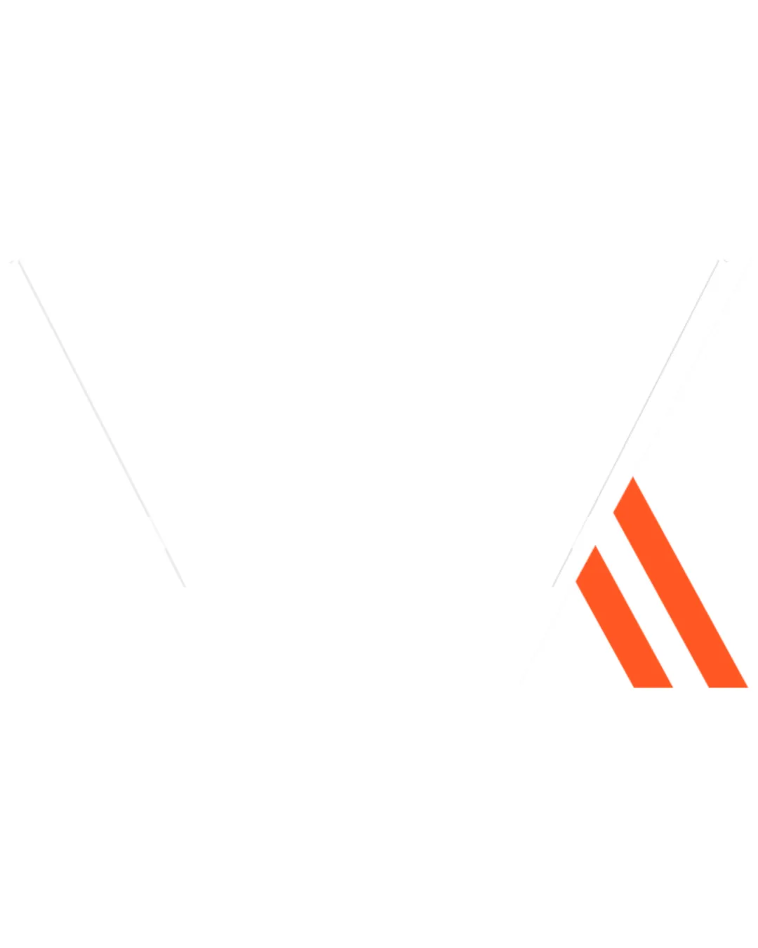
Try it Now!Logo review of W A

 Logo analysis by AI
Logo type:
Style:
Detected symbol:
Detected text:
Business industry:
Review requested by Vvksoni
**If AI can recognize or misinterpret it, so can people.
Structured logo review
Legibility
![]() The angular shapes are bold and highly visible.
The angular shapes are bold and highly visible.![]() The design draws attention with its strong geometry.
The design draws attention with its strong geometry.
![]() Letterforms are abstracted to the point where deciphering 'W' and 'A' is challenging for viewers unfamiliar with the brand.
Letterforms are abstracted to the point where deciphering 'W' and 'A' is challenging for viewers unfamiliar with the brand.![]() Imbalance in color draws visual drag to the orange section, potentially confusing the letter recognition.
Imbalance in color draws visual drag to the orange section, potentially confusing the letter recognition.
Scalability versatility
![]() Strong, thick lines maintain clarity at larger sizes.
Strong, thick lines maintain clarity at larger sizes.![]() Minimal details help prevent clutter at moderate scales.
Minimal details help prevent clutter at moderate scales.
![]() Fine linear spacing risks merging at very small scales, such as a favicon or embroidery.
Fine linear spacing risks merging at very small scales, such as a favicon or embroidery.![]() Negative space may fill in when reduced, diminishing letterform identity.
Negative space may fill in when reduced, diminishing letterform identity.
200x250 px
100×125 px
50×62 px
Balance alignment
![]() Symmetrical black linework gives a sense of stability.
Symmetrical black linework gives a sense of stability.![]() Color separation gives hierarchy to the 'A' form.
Color separation gives hierarchy to the 'A' form.
![]() The orange 'A' is visually lighter and sits off to the right, which creates an unbalanced feel compared to the dominant black 'W'.
The orange 'A' is visually lighter and sits off to the right, which creates an unbalanced feel compared to the dominant black 'W'.![]() Spacing between elements leaves the right side visually heavier due to color contrast.
Spacing between elements leaves the right side visually heavier due to color contrast.

Originality
![]() Creative use of geometric abstraction and linework.
Creative use of geometric abstraction and linework.![]() Distinctive approach to combining two letters in a unified design.
Distinctive approach to combining two letters in a unified design.
![]() Angular, overlapping lines are becoming a common trend—it risks resembling other modern tech marks.
Angular, overlapping lines are becoming a common trend—it risks resembling other modern tech marks.![]() Letter merging is not entirely novel.
Letter merging is not entirely novel.
Aesthetic look
![]() Minimal color palette keeps the look sleek.
Minimal color palette keeps the look sleek.![]() Sharp, geometric styling aligns well with tech-centric aesthetics.
Sharp, geometric styling aligns well with tech-centric aesthetics.
![]() Some visual tension due to right-weighted orange detail.
Some visual tension due to right-weighted orange detail.![]() Rigidity of the lines lessens visual flow.
Rigidity of the lines lessens visual flow.
Dual meaning and misinterpretations
![]() No inappropriate or unintended imagery is present.
No inappropriate or unintended imagery is present.![]() Abstract forms remain clearly letter-based.
Abstract forms remain clearly letter-based.
Color harmony
![]() Black and orange offer strong, energetic contrast.
Black and orange offer strong, energetic contrast.![]() Color distribution draws attention to key elements.
Color distribution draws attention to key elements.
![]() Sudden color shift to orange may be jarring for some viewers.
Sudden color shift to orange may be jarring for some viewers.![]() The orange feels slightly disconnected from the rest of the palette.
The orange feels slightly disconnected from the rest of the palette.
Black
#000000
Orange
#FF5B0B
White
#FFFFFF