Wondering how your logo performs? 🧐
Get professional logo reviews in seconds and catch design issues in time.
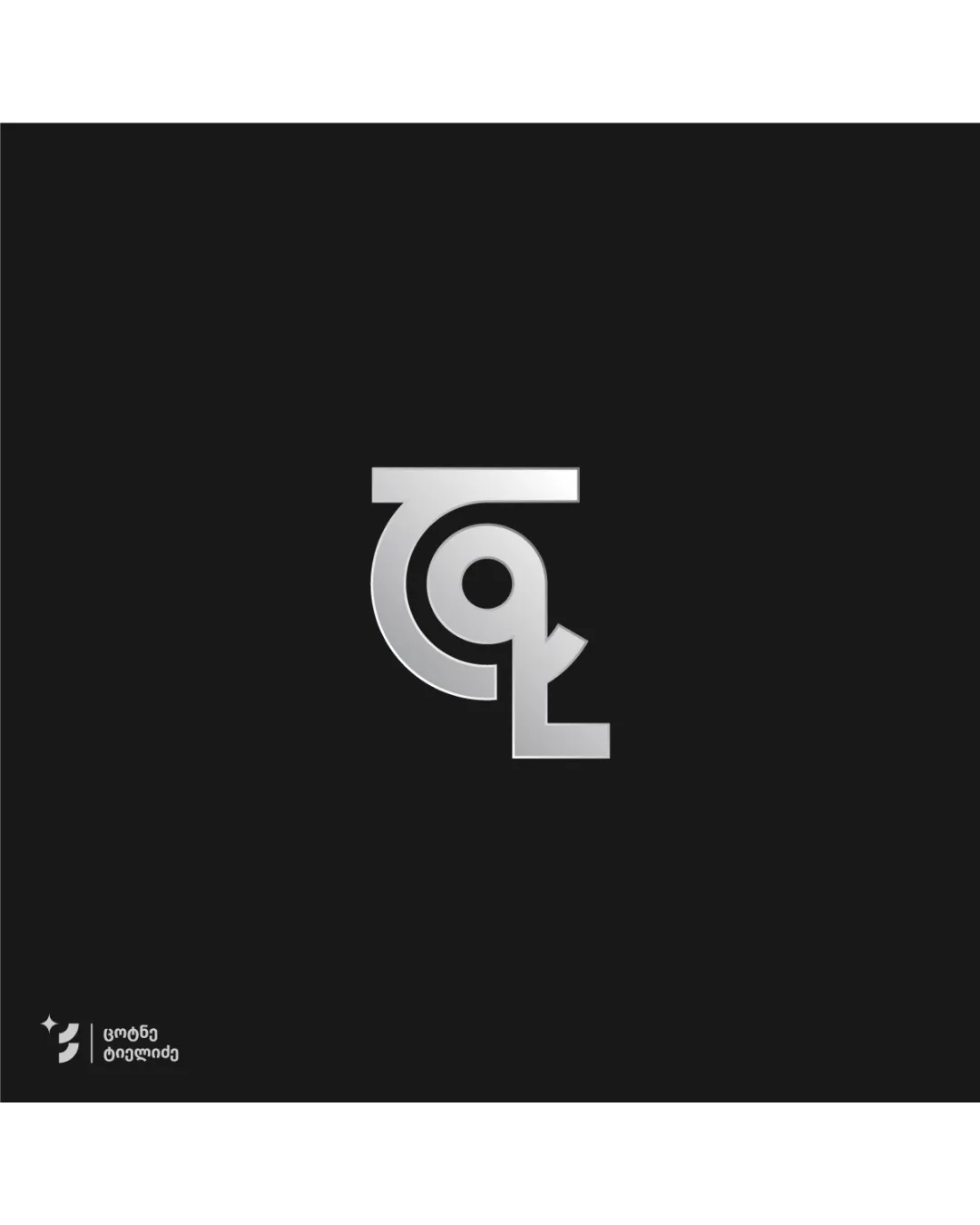
Try it Now!Logo review of G

 Logo analysis by AI
Logo type:
Style:
Detected symbol:
Negative space:
Detected text:
Business industry:
Review requested by Tsotne1
**If AI can recognize or misinterpret it, so can people.
Structured logo review
Legibility
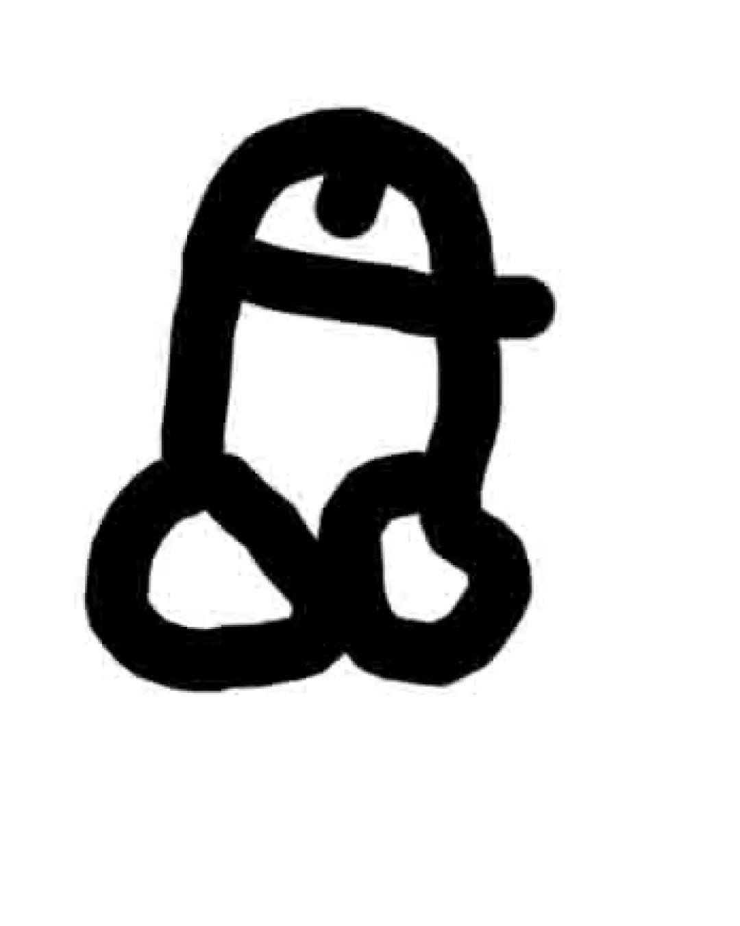
![]() The bold stylized 'G' is immediately recognizable.
The bold stylized 'G' is immediately recognizable.![]() Sharp geometric execution aids visual clarity at various sizes.
Sharp geometric execution aids visual clarity at various sizes.
![]() Highly stylized angles may cause fleeting confusion at first glance.
Highly stylized angles may cause fleeting confusion at first glance.![]() The red square might be mistaken for punctuation or a symbol rather than part of the letter.
The red square might be mistaken for punctuation or a symbol rather than part of the letter.
Scalability versatility
![]() Strong, bold shapes ensure clarity at both large and small sizes.
Strong, bold shapes ensure clarity at both large and small sizes.![]() Simple color palette aids reproduction on multiple mediums (print, digital, apparel).
Simple color palette aids reproduction on multiple mediums (print, digital, apparel).
![]() Thin details where the 'G' opens could blur at extremely small sizes (ex: small favicons).
Thin details where the 'G' opens could blur at extremely small sizes (ex: small favicons).![]() Red accent may lose clarity against certain colored backgrounds.
Red accent may lose clarity against certain colored backgrounds.
200x250 px
100×125 px
50×62 px
Balance alignment
![]() The geometric balance within the letter is strong.
The geometric balance within the letter is strong.![]() The composition feels stable despite the angular design.
The composition feels stable despite the angular design.
![]() The red square feels visually disconnected; its alignment and placement aren't fully integrated with the 'G' form.
The red square feels visually disconnected; its alignment and placement aren't fully integrated with the 'G' form.![]() Negative space between the 'G' and red accent introduces tension, disrupting cohesion.
Negative space between the 'G' and red accent introduces tension, disrupting cohesion.

Originality
![]() The execution of the 'G' with aggressive bold angles is distinctive.
The execution of the 'G' with aggressive bold angles is distinctive.![]() Red accent adds a unique identity element.
Red accent adds a unique identity element.
![]() Lettermark logos with strong geometric forms are somewhat common in sports or gaming industries.
Lettermark logos with strong geometric forms are somewhat common in sports or gaming industries.![]() No deeper symbolism or double meaning elevates the icon beyond its surface execution.
No deeper symbolism or double meaning elevates the icon beyond its surface execution.
Aesthetic look
![]() Visually dynamic and modern; appeals to energetic or tech-focused audiences.
Visually dynamic and modern; appeals to energetic or tech-focused audiences.![]() Sharp contrast and minimal color palette maintain a clean presence.
Sharp contrast and minimal color palette maintain a clean presence.
![]() Red accent, while energetic, feels abrupt and may not universally appeal.
Red accent, while energetic, feels abrupt and may not universally appeal.![]() Small misalignments or mismatch in angular rhythm could be more refined.
Small misalignments or mismatch in angular rhythm could be more refined.
Dual meaning and misinterpretations
![]() No inappropriate dual meanings or accidental symbolism detected.
No inappropriate dual meanings or accidental symbolism detected.
Color harmony
![]() Black and red provide strong color harmony and bold contrast.
Black and red provide strong color harmony and bold contrast.![]() Limited palette enhances memorability and applicability.
Limited palette enhances memorability and applicability.
Black
#000000
Red
#D0021B
White
#FFFFFF