Wondering how your logo performs? 🧐
Get professional logo reviews in seconds and catch design issues in time.
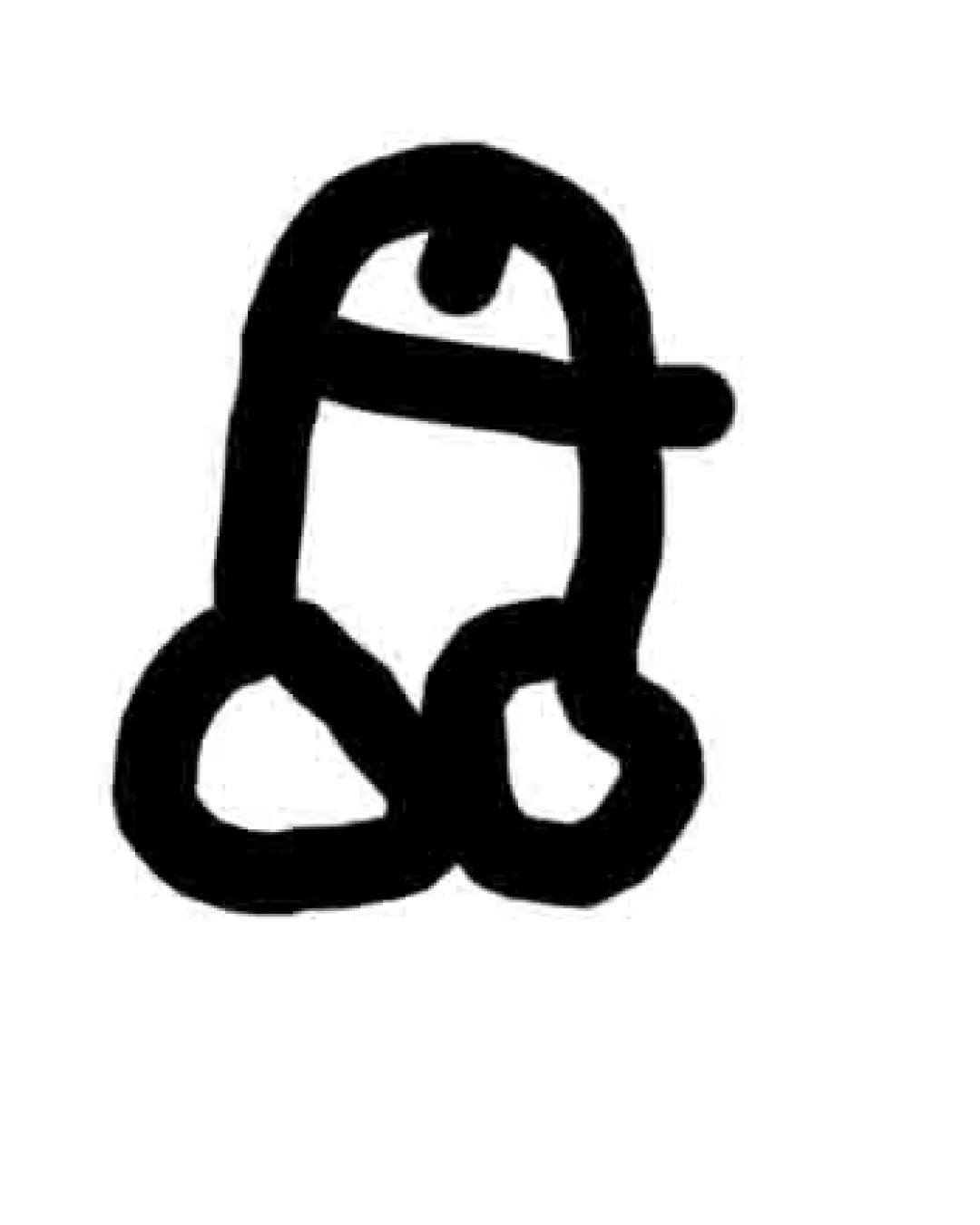
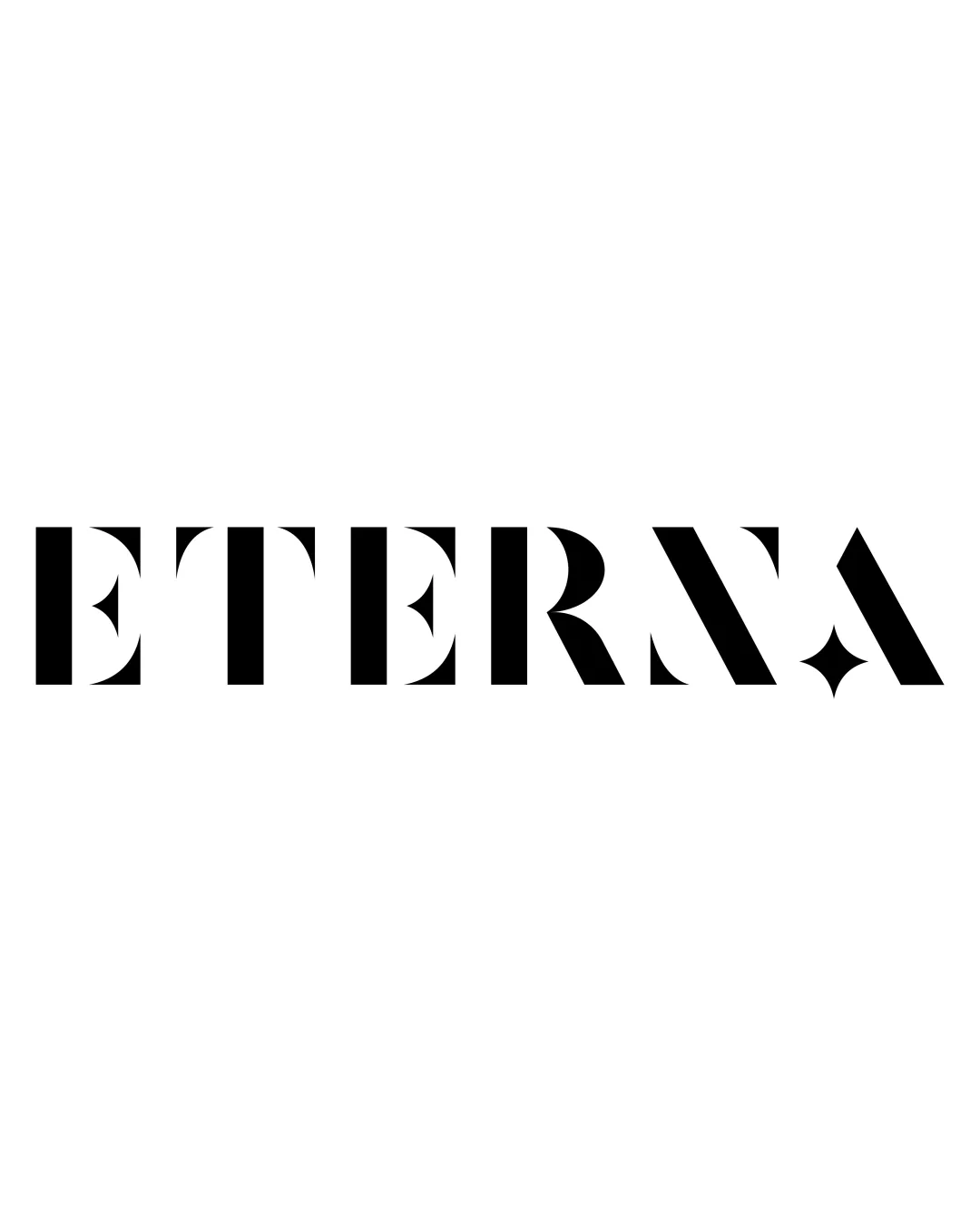
Try it Now!Logo review of ETERNA
 Logo analysis by AI
Logo type:
Style:
Detected symbol:
Negative space:
Detected text:
Business industry:
Review requested by JustinWQ
**If AI can recognize or misinterpret it, so can people.
Structured logo review
Legibility
![]() Most letters are easy to recognize at first glance
Most letters are easy to recognize at first glance![]() High contrast between black wordmark and white background enhances readability
High contrast between black wordmark and white background enhances readability
![]() The creative cuts and star shapes used as negative space in letters like 'E', 'R', 'A' slightly compromise instant readability, especially at smaller scales
The creative cuts and star shapes used as negative space in letters like 'E', 'R', 'A' slightly compromise instant readability, especially at smaller scales
Scalability versatility
![]() Bold, sans-serif letterforms remain visible at small and large sizes
Bold, sans-serif letterforms remain visible at small and large sizes![]() Single color design is suitable for a range of materials including business cards, packaging, and digital use
Single color design is suitable for a range of materials including business cards, packaging, and digital use
![]() Delicate negative space star/diamond details might be lost in very small applications such as favicon or embroidery
Delicate negative space star/diamond details might be lost in very small applications such as favicon or embroidery
200x250 px
100×125 px
50×62 px
Balance alignment
![]() Consistent vertical rhythm across the wordmark gives strong typographic balance
Consistent vertical rhythm across the wordmark gives strong typographic balance![]() Star shapes are evenly distributed throughout for visual harmony
Star shapes are evenly distributed throughout for visual harmony

Originality
![]() Distinctive use of stencil cuts and star shapes creates a unique visual identity
Distinctive use of stencil cuts and star shapes creates a unique visual identity![]() Negative space is thoughtfully used to avoid generic typography
Negative space is thoughtfully used to avoid generic typography
Aesthetic look
![]() Minimalist, modern, and visually striking design
Minimalist, modern, and visually striking design![]() Excellent use of geometric forms and white space, drawing attention and interest
Excellent use of geometric forms and white space, drawing attention and interest
Dual meaning and misinterpretations
![]() Star/diamond shapes add sophistication without causing inappropriate visual associations
Star/diamond shapes add sophistication without causing inappropriate visual associations
Color harmony
![]() Strong monochrome palette offers timeless appeal and professional feel
Strong monochrome palette offers timeless appeal and professional feel![]() Simple black and white scheme makes reproduction easy and versatile
Simple black and white scheme makes reproduction easy and versatile
Black
#000000
White
#FFFFFF