Wondering how your logo performs? 🧐
Get professional logo reviews in seconds and catch design issues in time.
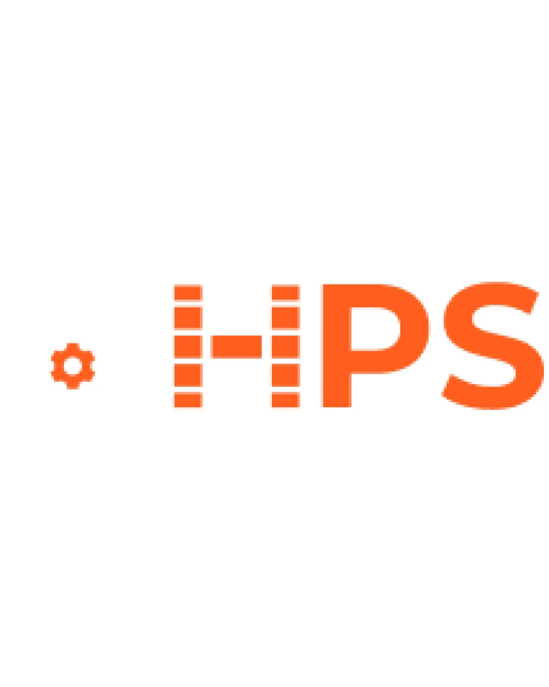
Try it Now!Logo review of HPS
 Logo analysis by AI
Logo type:
Style:
Detected symbol:
Detected text:
Business industry:
Review requested by Tuna
**If AI can recognize or misinterpret it, so can people.
Structured logo review
Legibility
![]() The 'PS' letterforms are very readable
The 'PS' letterforms are very readable![]() Bright color provides strong contrast on white
Bright color provides strong contrast on white
![]() The 'H' is unconventional, which may cause momentary confusion
The 'H' is unconventional, which may cause momentary confusion![]() Gear symbol is small and might not be noticed easily
Gear symbol is small and might not be noticed easily
Scalability versatility
![]() Simple elements ensure some scalability
Simple elements ensure some scalability![]() Few colors aid in versatility
Few colors aid in versatility
![]() Rectangular 'H' details may disappear or blur in small-scale formats like favicons
Rectangular 'H' details may disappear or blur in small-scale formats like favicons![]() Gear symbol risks becoming illegible at reduced sizes
Gear symbol risks becoming illegible at reduced sizes
200x250 px
100×125 px
50×62 px
Balance alignment
![]() Main type seems horizontally aligned
Main type seems horizontally aligned
![]() Gear symbol feels visually disconnected and left-heavy
Gear symbol feels visually disconnected and left-heavy![]() Spacing between the elements lacks cohesion
Spacing between the elements lacks cohesion

Originality
![]() Creative use of rectangles in the 'H' gives a unique touch
Creative use of rectangles in the 'H' gives a unique touch![]() Gear symbol ties to industrial/tech themes
Gear symbol ties to industrial/tech themes
![]() Gear icons are common in tech; could be more inventive
Gear icons are common in tech; could be more inventive
Logomark wordmark fit
![]() Both logomark and wordmark use the same color
Both logomark and wordmark use the same color
![]() Gear icon and main wordmark feel stylistically mismatched
Gear icon and main wordmark feel stylistically mismatched![]() Gear appears too small relative to the wordmark, resulting in poor sizing balance
Gear appears too small relative to the wordmark, resulting in poor sizing balance
Aesthetic look
![]() Minimal color palette prevents clutter
Minimal color palette prevents clutter
![]() Disconnected elements weaken cohesiveness
Disconnected elements weaken cohesiveness![]() Gear icon looks generic and out of place
Gear icon looks generic and out of place
Dual meaning and misinterpretations
![]() No inappropriate or suggestive shapes detected
No inappropriate or suggestive shapes detected
Color harmony
![]() Limited color palette ensures harmony
Limited color palette ensures harmony![]() High contrast between orange and white
High contrast between orange and white
Orange
#FF5C1A
White
#FFFFFF