Wondering how your logo performs? 🧐
Get professional logo reviews in seconds and catch design issues in time.
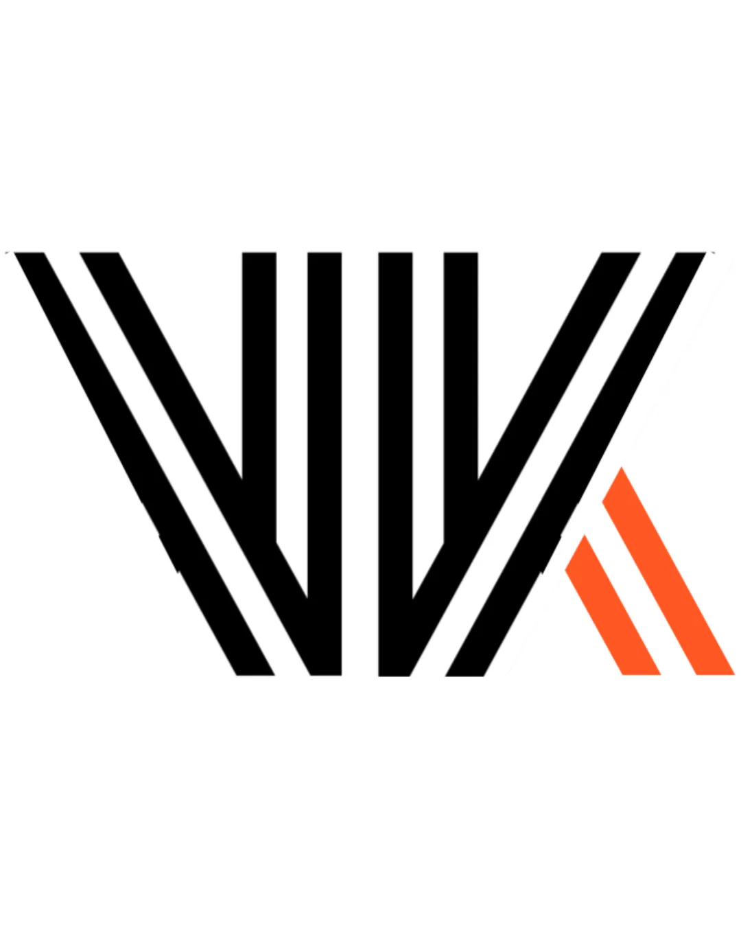
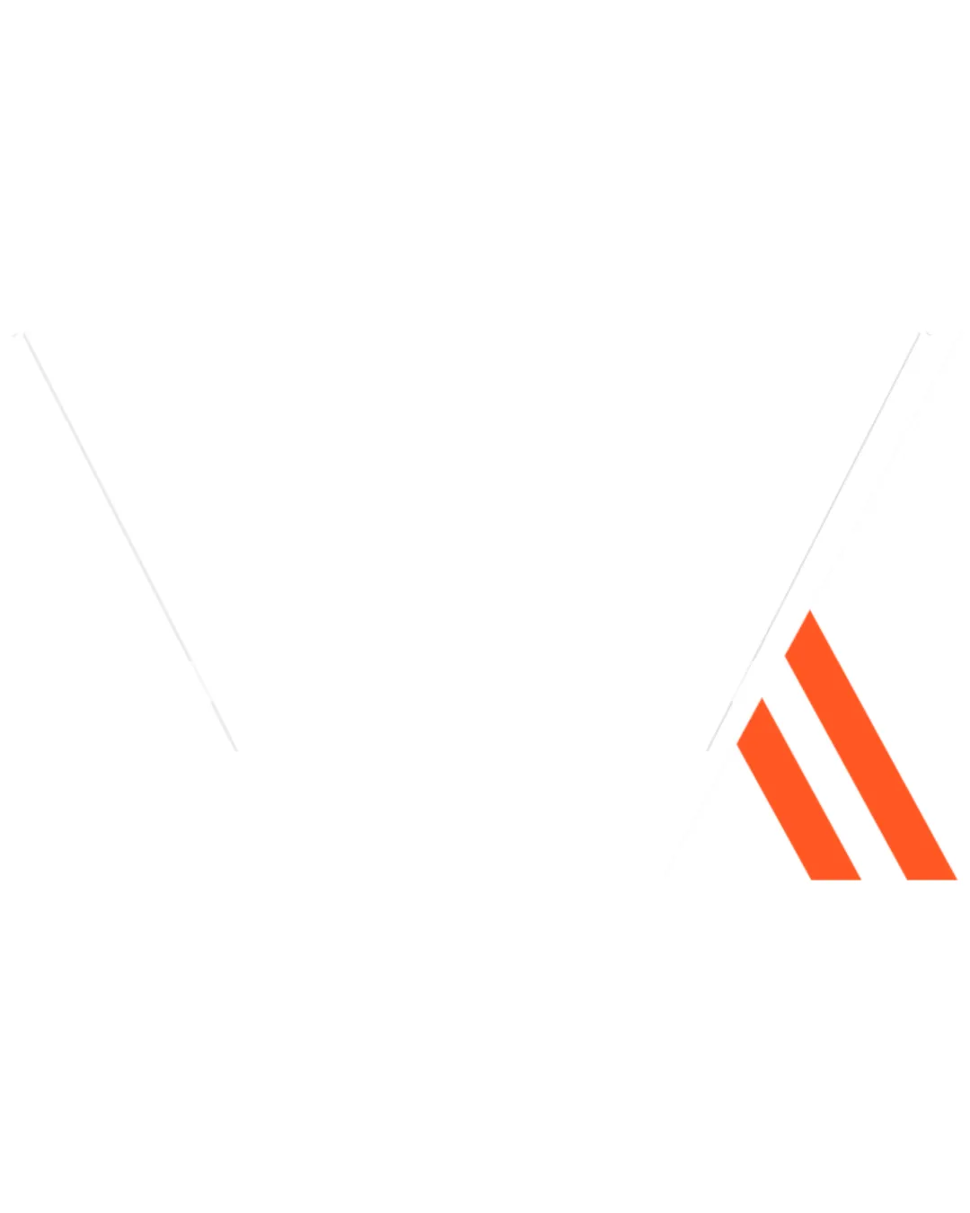
Try it Now!Logo review of three orange diagonal stripes forming a stylized A..
 Logo analysis by AI
Logo type:
Style:
Detected symbol:
Negative space:
Business industry:
Review requested by Vvksoni
**If AI can recognize or misinterpret it, so can people.
Structured logo review
Scalability versatility
![]() Simple geometric shapes ensure clarity when resized.
Simple geometric shapes ensure clarity when resized.![]() Works well for app icons, social media, and signage due to high contrast and minimal detail.
Works well for app icons, social media, and signage due to high contrast and minimal detail.
![]() Thin white lines bounding the orange stripes may get lost at very small scales or against light backgrounds.
Thin white lines bounding the orange stripes may get lost at very small scales or against light backgrounds.![]() May lack recognizability on embroidered merchandise due to fine angles and spacing.
May lack recognizability on embroidered merchandise due to fine angles and spacing.
200x250 px
100×125 px
50×62 px
Balance alignment
![]() Strong visual alignment; the orange stripes are parallel and evenly spaced.
Strong visual alignment; the orange stripes are parallel and evenly spaced.![]() The angled placement creates a dynamic and cohesive feel.
The angled placement creates a dynamic and cohesive feel.
![]() Placement on the right edge feels visually unanchored and could benefit from central alignment or incorporating more balanced elements.
Placement on the right edge feels visually unanchored and could benefit from central alignment or incorporating more balanced elements.

Originality
![]() Minimalist use of repeated geometric stripes is clean and contemporary.
Minimalist use of repeated geometric stripes is clean and contemporary.![]() The negative space forming a stylized 'A' or arrow is a subtle touch.
The negative space forming a stylized 'A' or arrow is a subtle touch.
![]() Diagonal stripes are somewhat overused in tech and construction branding, which reduces uniqueness.
Diagonal stripes are somewhat overused in tech and construction branding, which reduces uniqueness.![]() No other unique design elements or custom shapes set it apart from similar abstract logos.
No other unique design elements or custom shapes set it apart from similar abstract logos.
Aesthetic look
![]() The minimal color palette is modern and eye-catching.
The minimal color palette is modern and eye-catching.![]() Clean lines give it a professional, corporate appearance.
Clean lines give it a professional, corporate appearance.
![]() Sparse use of visual elements makes the logo feel a bit generic and impersonal.
Sparse use of visual elements makes the logo feel a bit generic and impersonal.
Dual meaning and misinterpretations
![]() No inappropriate or unintentional imagery detected.
No inappropriate or unintentional imagery detected.![]() Composition is abstract and inoffensive.
Composition is abstract and inoffensive.
Color harmony
![]() Set of orange and white creates a strong, bold contrast that is memorable.
Set of orange and white creates a strong, bold contrast that is memorable.![]() Limiting the color scheme enhances versatility and brand consistency.
Limiting the color scheme enhances versatility and brand consistency.
Orange
#FF5700
White
#FFFFFF