Wondering how your logo performs? 🧐
Get professional logo reviews in seconds and catch design issues in time.
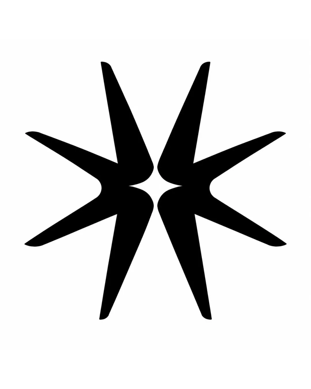
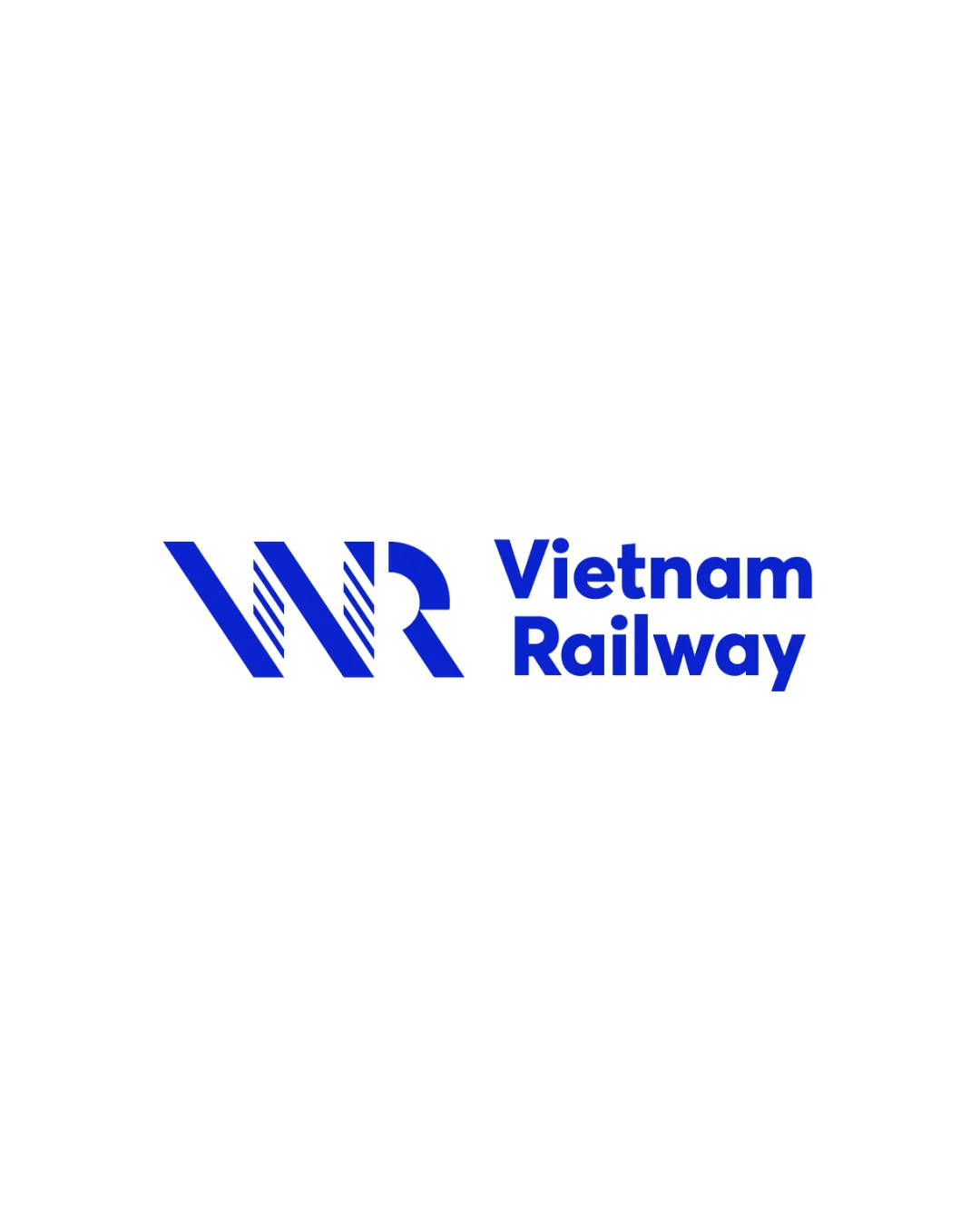
Try it Now!Logo review of Vietnam Railway
 Logo analysis by AI
Logo type:
Style:
Detected symbol:
Detected text:
Business industry:
Review requested by Grit2888
**If AI can recognize or misinterpret it, so can people.
Structured logo review
Legibility
![]() Text is highly readable with excellent contrast.
Text is highly readable with excellent contrast.![]() Font choice is clean, bold, and modern.
Font choice is clean, bold, and modern.
Scalability versatility
![]() Bold lines and shapes will scale well on mediums like train signage, tickets, and digital platforms.
Bold lines and shapes will scale well on mediums like train signage, tickets, and digital platforms.![]() Minimal detail ensures recognizability even at small sizes.
Minimal detail ensures recognizability even at small sizes.
![]() Diagonal accents within the monogram may lose clarity on very small or embroidered applications such as uniform patches or favicons.
Diagonal accents within the monogram may lose clarity on very small or embroidered applications such as uniform patches or favicons.
200x250 px
100×125 px
50×62 px
Balance alignment
![]() Strong horizontal alignment between logomark and wordmark.
Strong horizontal alignment between logomark and wordmark.![]() Excellent visual weight distribution.
Excellent visual weight distribution.

Originality
![]() Nice integration of WR letters with unique linear detailing evokes speed and movement.
Nice integration of WR letters with unique linear detailing evokes speed and movement.![]() Geometric abstraction gives the mark a modern, distinctive touch.
Geometric abstraction gives the mark a modern, distinctive touch.
![]() 'WR' monogram approach is somewhat common in transportation and rail industries, so it isn't visually groundbreaking.
'WR' monogram approach is somewhat common in transportation and rail industries, so it isn't visually groundbreaking.
Logomark wordmark fit
![]() Monogram and wordmark styles complement each other very well.
Monogram and wordmark styles complement each other very well.![]() Equal visual prominence—neither element overpowers the other.
Equal visual prominence—neither element overpowers the other.
Aesthetic look
![]() Simple, clean, and contemporary design.
Simple, clean, and contemporary design.![]() Attractive and visually appealing.
Attractive and visually appealing.![]() Color usage is bold but restrained.
Color usage is bold but restrained.
Dual meaning and misinterpretations
![]() No apparent risk of inappropriate or accidental meanings.
No apparent risk of inappropriate or accidental meanings.
Color harmony
![]() Uses a single primary color for a strong, unified brand presence.
Uses a single primary color for a strong, unified brand presence.![]() Excellent contrast ensures readability and visual clarity.
Excellent contrast ensures readability and visual clarity.
Blue
#0047FF
White
#FFFFFF