Wondering how your logo performs? 🧐
Get professional logo reviews in seconds and catch design issues in time.
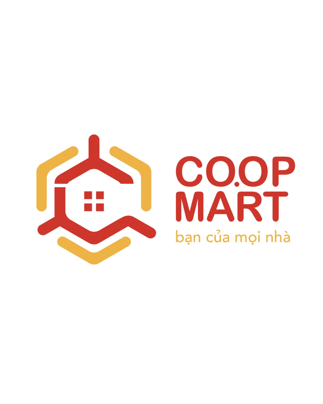
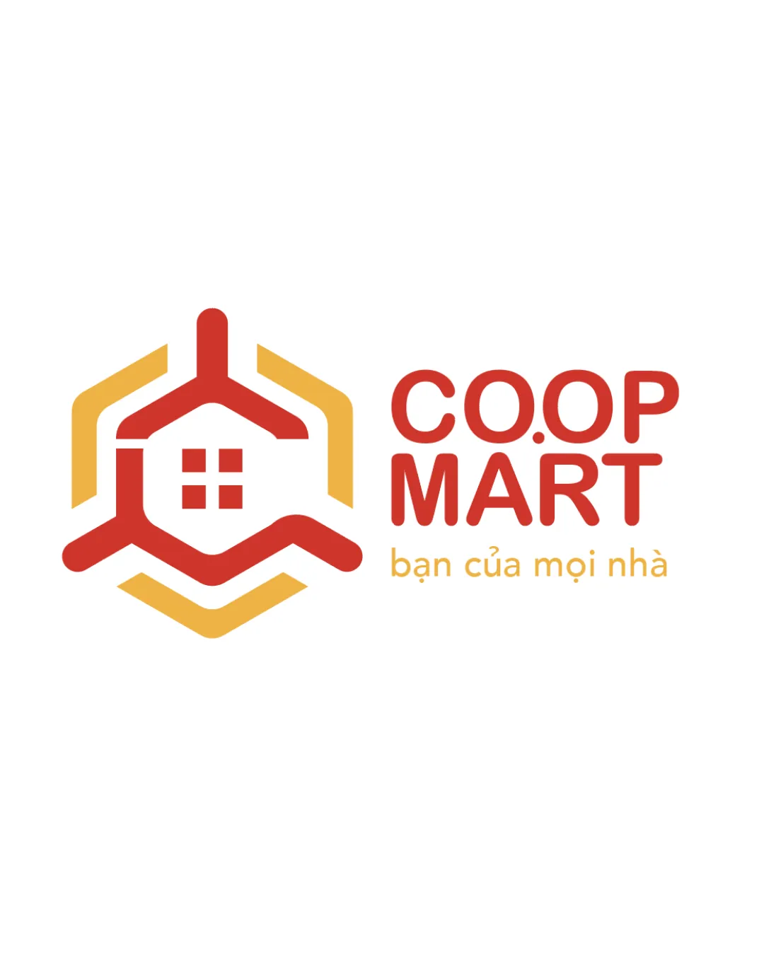
Try it Now!Logo review of CO.OP MART, bạn của mọi nhà
 Logo analysis by AI
Logo type:
Style:
Detected symbol:
Negative space:
Detected text:
Business industry:
Review requested by Grit2888
**If AI can recognize or misinterpret it, so can people.
Structured logo review
Legibility
![]() The primary text 'CO.OP MART' is highly readable with a clean sans-serif typeface.
The primary text 'CO.OP MART' is highly readable with a clean sans-serif typeface.![]() The tagline is also legible despite being in a smaller font size, with adequate color contrast.
The tagline is also legible despite being in a smaller font size, with adequate color contrast.
Scalability versatility
![]() The symbol is simple and should scale well on most applications such as business cards, packaging, and store signage.
The symbol is simple and should scale well on most applications such as business cards, packaging, and store signage.![]() The design maintains clarity at most sizes.
The design maintains clarity at most sizes.
![]() The tagline may become unreadable at very small scales, such as favicons or embroidery.
The tagline may become unreadable at very small scales, such as favicons or embroidery.![]() The detail in the window squares might blur in very small renders.
The detail in the window squares might blur in very small renders.
200x250 px
100×125 px
50×62 px
Balance alignment
![]() The hexagon and house elements are visually centered and balanced within the symbol.
The hexagon and house elements are visually centered and balanced within the symbol.![]() The text is aligned well in relation to the logomark, maintaining a stable left-right proportion.
The text is aligned well in relation to the logomark, maintaining a stable left-right proportion.
![]() The weight of the logomark slightly overwhelms the size of the text, especially at smaller scales.
The weight of the logomark slightly overwhelms the size of the text, especially at smaller scales.

Originality
![]() The combination of a house silhouette within a hexagon is moderately original for a retail market.
The combination of a house silhouette within a hexagon is moderately original for a retail market.
![]() Hexagonal house icons are quite common in the industry, making it feel somewhat generic.
Hexagonal house icons are quite common in the industry, making it feel somewhat generic.![]() The use of a window inside a house outline is a frequent motif in retail and home-related logos.
The use of a window inside a house outline is a frequent motif in retail and home-related logos.
Logomark wordmark fit
![]() Color palette and rounded geometric styles are unified between logomark and wordmark.
Color palette and rounded geometric styles are unified between logomark and wordmark.![]() Both elements use a similar visual language.
Both elements use a similar visual language.
![]() Slight imbalance in visual weight, as the thick logomark can overpower the text in smaller applications.
Slight imbalance in visual weight, as the thick logomark can overpower the text in smaller applications.
Aesthetic look
![]() The use of color blocking is eye-catching but not overwhelming.
The use of color blocking is eye-catching but not overwhelming.![]() The overall look is clean, modern, and accessible.
The overall look is clean, modern, and accessible.
![]() The geometric forms could feel a bit sterile or uninspired if not paired with friendly brand messaging.
The geometric forms could feel a bit sterile or uninspired if not paired with friendly brand messaging.
Dual meaning and misinterpretations
![]() No inappropriate or ambiguous imagery detected.
No inappropriate or ambiguous imagery detected.![]() The symbol is immediately interpretable as a house and is unlikely to cause misinterpretation.
The symbol is immediately interpretable as a house and is unlikely to cause misinterpretation.
Color harmony
![]() The palette is harmonious and limited to two main colors, enhancing brand recognition.
The palette is harmonious and limited to two main colors, enhancing brand recognition.![]() Contrast between red and yellow/orange is visually appealing and effective.
Contrast between red and yellow/orange is visually appealing and effective.
Cinnabar
#E74C3C
Sandy brown
#F5C15B
White
#FFFFFF