Wondering how your logo performs? 🧐
Get professional logo reviews in seconds and catch design issues in time.
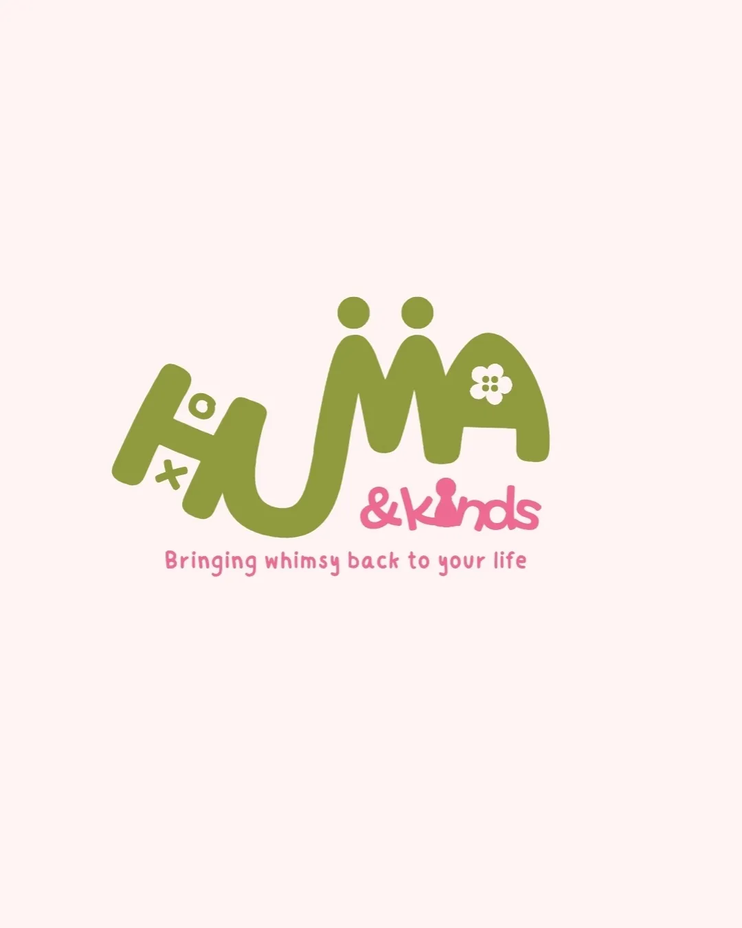
Try it Now!Logo review of HuMA & kinds Bringing whimsy back to your life
 Logo analysis by AI
Logo type:
Style:
Detected symbol:
Negative space:
Detected text:
Business industry:
Review requested by Fadillaz
**If AI can recognize or misinterpret it, so can people.
Structured logo review
Legibility
![]() Distinctive, playful custom typography fits the theme.
Distinctive, playful custom typography fits the theme.![]() Slogan is legible in supporting text.
Slogan is legible in supporting text.
![]() The main wordmark 'HuMA' has inconsistent baselines and stylizations which decrease immediate legibility—particularly where 'H' and 'u' blend.
The main wordmark 'HuMA' has inconsistent baselines and stylizations which decrease immediate legibility—particularly where 'H' and 'u' blend.![]() The '&kinds' merges an ampersand with a character graphic, which is clever but causes readability issues.
The '&kinds' merges an ampersand with a character graphic, which is clever but causes readability issues.![]() The tilted 'H' and added 'x o' can confuse the reading flow.
The tilted 'H' and added 'x o' can confuse the reading flow.
Scalability versatility
![]() Bold, simple forms aid scalability at most sizes.
Bold, simple forms aid scalability at most sizes.![]() Color blocking and outlined shapes help with clarity at moderate scale.
Color blocking and outlined shapes help with clarity at moderate scale.
![]() Small intricate details (flower in 'A', thin elements of the ampersand character) could get lost at small sizes, like on a favicon or embroidery.
Small intricate details (flower in 'A', thin elements of the ampersand character) could get lost at small sizes, like on a favicon or embroidery.![]() Fine type for the tagline becomes illegible when dramatically reduced.
Fine type for the tagline becomes illegible when dramatically reduced.
200x250 px
100×125 px
50×62 px
Balance alignment
![]() Visual weight and playful arrangement match the whimsical brand idea.
Visual weight and playful arrangement match the whimsical brand idea.![]() Use of ascending dots and unique letter treatments create a childlike, energetic feel.
Use of ascending dots and unique letter treatments create a childlike, energetic feel.
![]() The 'H' leans left and sits lower, making the left side feel heavy.
The 'H' leans left and sits lower, making the left side feel heavy.![]() The baseline and height differences are visually playful, but detract from overall alignment and optical stability.
The baseline and height differences are visually playful, but detract from overall alignment and optical stability.![]() Overlapping motifs and letter spacing further reduce balance.
Overlapping motifs and letter spacing further reduce balance.

Originality
![]() Creative, unique hand-drawn style sets the logo apart in the children’s space.
Creative, unique hand-drawn style sets the logo apart in the children’s space.![]() Clever incorporation of a flower in the 'A' and a human-figure ampersand.
Clever incorporation of a flower in the 'A' and a human-figure ampersand.
![]() Multiple whimsical clichés (dots, flowers, character ampersand) in one wordmark may appear a bit forced or overused in this category.
Multiple whimsical clichés (dots, flowers, character ampersand) in one wordmark may appear a bit forced or overused in this category.![]() Heavily stylized approach can limit brand expansion outside of the current target market.
Heavily stylized approach can limit brand expansion outside of the current target market.
Logomark wordmark fit
![]() Symbolism in the flower and character shapes are integrated fluidly into the custom wordmark.
Symbolism in the flower and character shapes are integrated fluidly into the custom wordmark.![]() Color and style consistency unify the elements.
Color and style consistency unify the elements.
![]() ‘&kinds’ styling feels different from main 'HuMA,' which creates a subtle disconnect.
‘&kinds’ styling feels different from main 'HuMA,' which creates a subtle disconnect.
Aesthetic look
![]() Fun, whimsical, and friendly aesthetic with approachable colors and shapes.
Fun, whimsical, and friendly aesthetic with approachable colors and shapes.![]() Suited for children’s products or playful brands.
Suited for children’s products or playful brands.
![]() Some elements verge on busy or overworked (x/o details, mixed symbols).
Some elements verge on busy or overworked (x/o details, mixed symbols).![]() Not minimalist—visual impact may suffer in highly professional, restrained contexts.
Not minimalist—visual impact may suffer in highly professional, restrained contexts.
Dual meaning and misinterpretations
![]() No inappropriate or ambiguous visual associations.
No inappropriate or ambiguous visual associations.![]() Childlike forms are suitable for the target audience.
Childlike forms are suitable for the target audience.
Color harmony
![]() Color palette is harmonious, gender-inclusive, and well-balanced.
Color palette is harmonious, gender-inclusive, and well-balanced.![]() Green and pink provide contrast that is energetic but not overwhelming.
Green and pink provide contrast that is energetic but not overwhelming.
Olive Green
#B2B871
Pink
#EE7EA5
Very Light Pink Background
#FCEFEF