Wondering how your logo performs? 🧐
Get professional logo reviews in seconds and catch design issues in time.
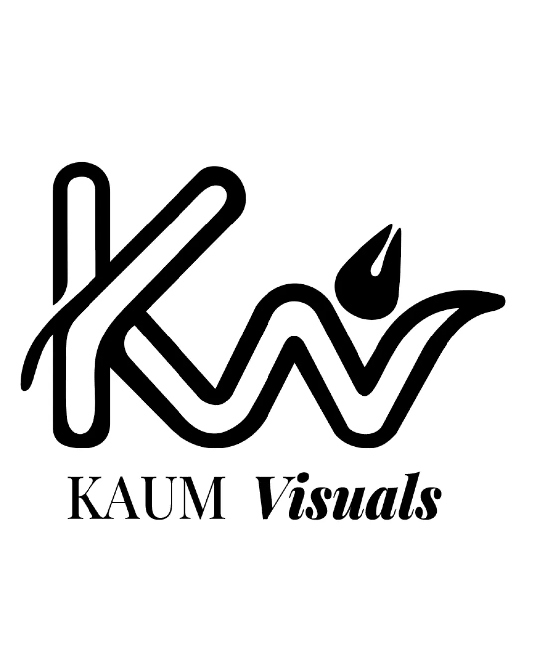
Try it Now!Logo review of Kw
 Logo analysis by AI
Logo type:
Style:
Detected symbol:
Detected text:
Business industry:
Review requested by Abyko444
**If AI can recognize or misinterpret it, so can people.
Structured logo review
Legibility
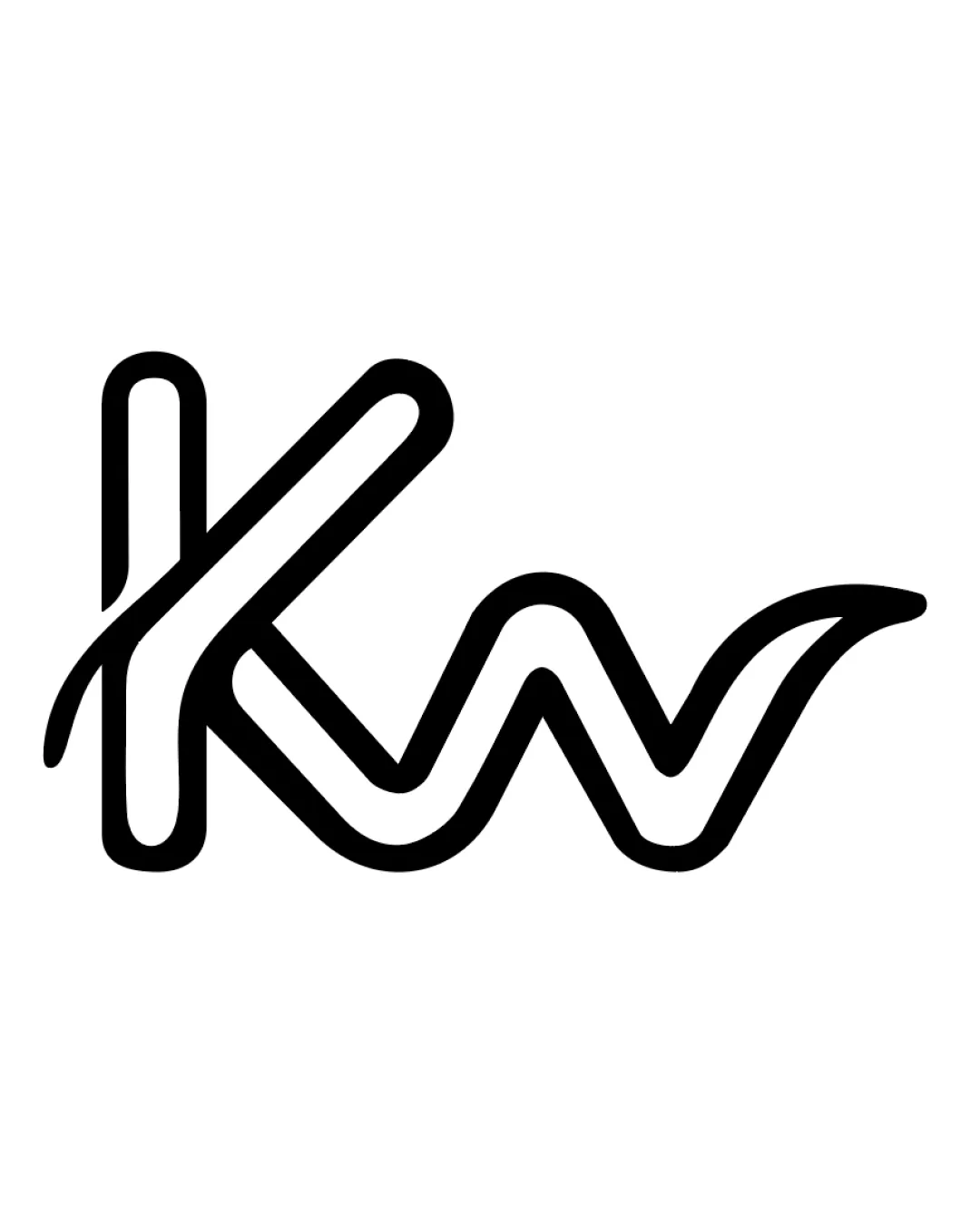
![]() Both 'K' and 'w' are distinguishable and easily readable.
Both 'K' and 'w' are distinguishable and easily readable.![]() Simple, continuous line makes for clear character shapes.
Simple, continuous line makes for clear character shapes.
![]() Overlapping strokes in 'K' could cause some confusion at smaller sizes.
Overlapping strokes in 'K' could cause some confusion at smaller sizes.
Scalability versatility
![]() Thick stroke ensures adequate visibility at small sizes.
Thick stroke ensures adequate visibility at small sizes.![]() Will work on a broad range of applications such as business cards, signage, and digital icons.
Will work on a broad range of applications such as business cards, signage, and digital icons.
![]() Line intersections may close up or blur at very small scales, like favicons or embroidery.
Line intersections may close up or blur at very small scales, like favicons or embroidery.
200x250 px
100×125 px
50×62 px
Balance alignment
![]() The flow from 'K' to 'w' feels unified and organic.
The flow from 'K' to 'w' feels unified and organic.![]() Consistent stroke width maintains harmony.
Consistent stroke width maintains harmony.
![]() Initial downstroke of 'K' is more pronounced, which slightly disrupts optical balance.
Initial downstroke of 'K' is more pronounced, which slightly disrupts optical balance.

Originality
![]() Smooth, monoline design gives a modern edge compared to standard serifs/sans-serifs.
Smooth, monoline design gives a modern edge compared to standard serifs/sans-serifs.![]() Distinct integration of 'K' and 'w' into a flowing form.
Distinct integration of 'K' and 'w' into a flowing form.
![]() Lettermark approach is common; execution is strong but not highly unique within typographic logos.
Lettermark approach is common; execution is strong but not highly unique within typographic logos.
Aesthetic look
![]() Minimalist look is professional and avoids clutter.
Minimalist look is professional and avoids clutter.![]() The logo is inviting and modern, conveying a sense of approachability.
The logo is inviting and modern, conveying a sense of approachability.
![]() The unique shape of the 'w' could be polarizing as it diverges from standard forms.
The unique shape of the 'w' could be polarizing as it diverges from standard forms.
Dual meaning and misinterpretations
![]() No obvious inappropriate or unintended secondary meanings present.
No obvious inappropriate or unintended secondary meanings present.![]() Clear, friendly appearance.
Clear, friendly appearance.
Color harmony
![]() Black and white palette ensures maximum versatility and contrast.
Black and white palette ensures maximum versatility and contrast.![]() Simple color palette does not distract from forms.
Simple color palette does not distract from forms.
White
#FFFFFF
Black
#000000