Wondering how your logo performs? 🧐
Get professional logo reviews in seconds and catch design issues in time.
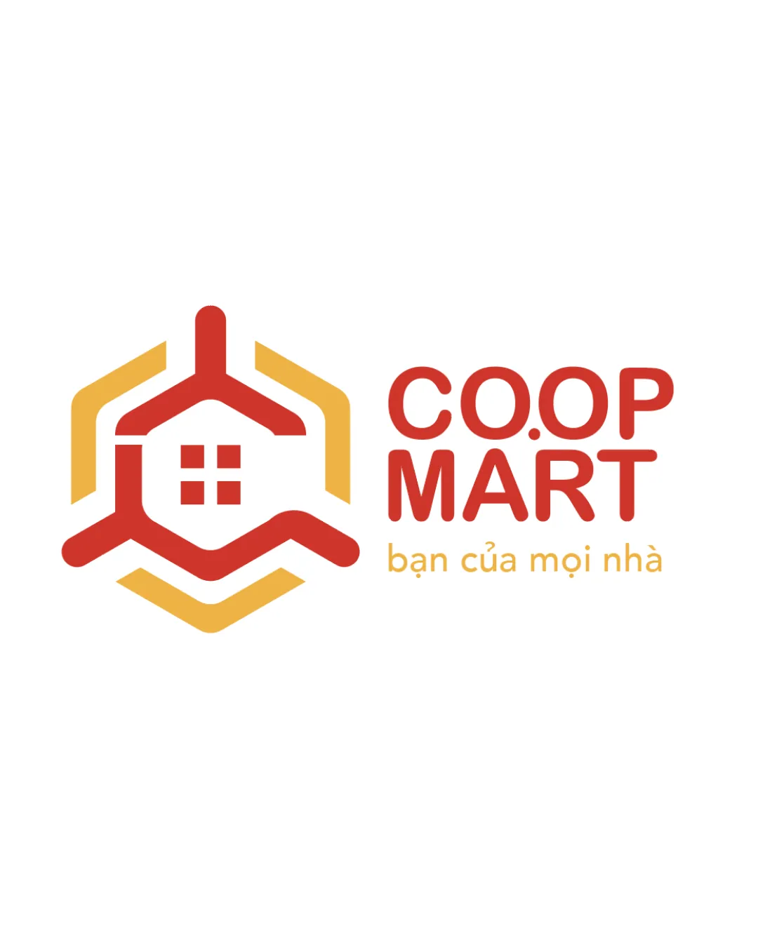
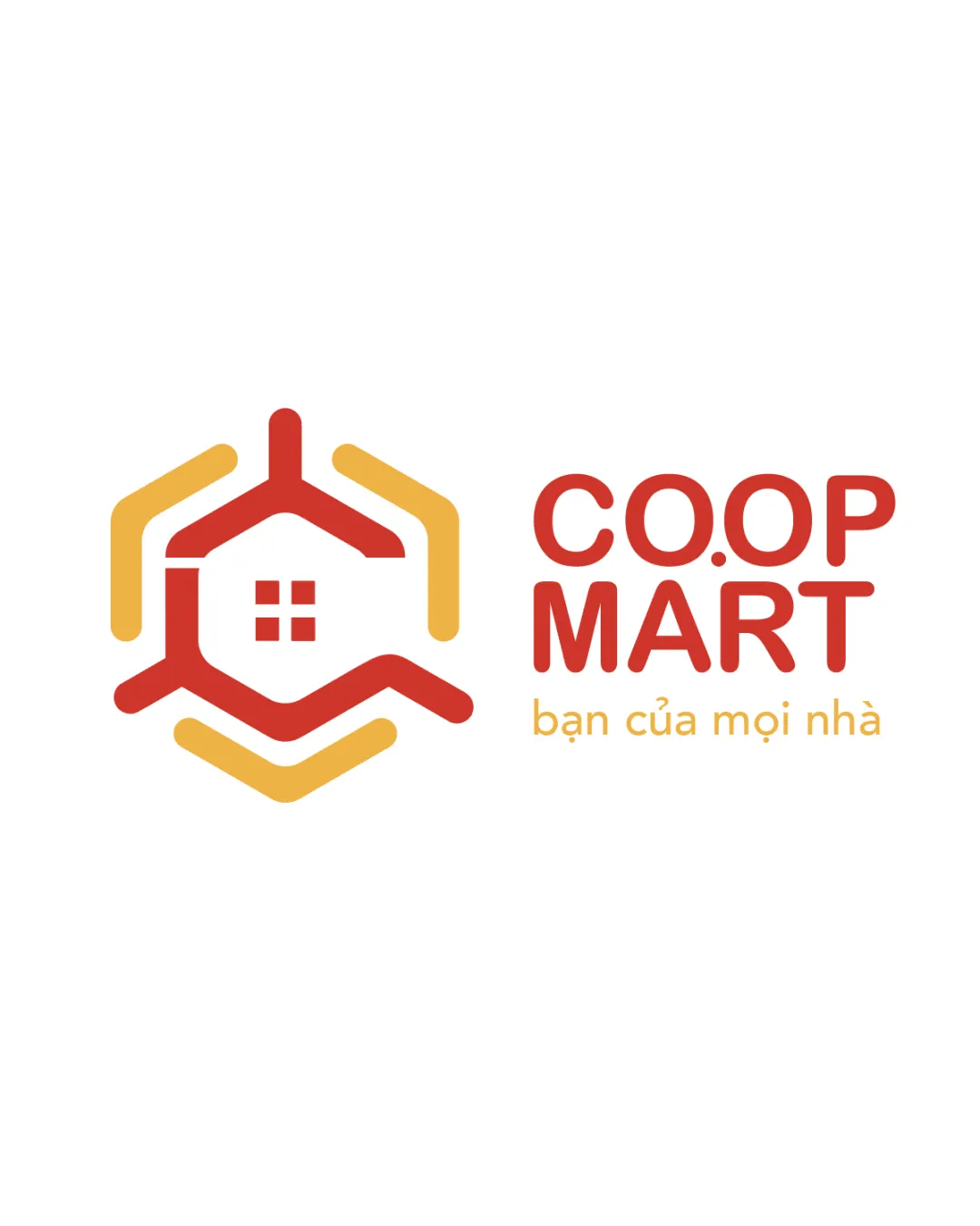
Try it Now!Logo review of CO.OP MART, bạn của mọi nhà
 Logo analysis by AI
Logo type:
Style:
Detected symbol:
Negative space:
Detected text:
Business industry:
Review requested by Grit2888
**If AI can recognize or misinterpret it, so can people.
Structured logo review
Legibility
![]() Text is clear and easily readable at multiple sizes.
Text is clear and easily readable at multiple sizes.![]() Contrast against the white background enhances visibility.
Contrast against the white background enhances visibility.
Scalability versatility
![]() Simple shapes and bold lines maintain clarity when scaled down.
Simple shapes and bold lines maintain clarity when scaled down.![]() Design will work well on signage, packaging, and digital platforms.
Design will work well on signage, packaging, and digital platforms.
![]() Small window elements may lose definition at very small sizes such as favicons or embroidery.
Small window elements may lose definition at very small sizes such as favicons or embroidery.
200x250 px
100×125 px
50×62 px
Balance alignment
![]() Symbol and wordmark are well-balanced horizontally.
Symbol and wordmark are well-balanced horizontally.
![]() Slight disconnect in visual weight between the thick symbol and lighter subtitle.
Slight disconnect in visual weight between the thick symbol and lighter subtitle.

Originality
![]() Geometric interpretation of a house paired with a hexagonal form adds some character.
Geometric interpretation of a house paired with a hexagonal form adds some character.
![]() House symbols are very common in the retail and home industry; lacks a strong, unique twist.
House symbols are very common in the retail and home industry; lacks a strong, unique twist.![]() Hexagonal element is generic and doesn't strongly differentiate the brand.
Hexagonal element is generic and doesn't strongly differentiate the brand.
Logomark wordmark fit
![]() Rounded corners of the symbol reflect the rounded typeface, ensuring visual consistency.
Rounded corners of the symbol reflect the rounded typeface, ensuring visual consistency.
![]() Color intensity between the symbol and tagline text differs, creating minor dissonance.
Color intensity between the symbol and tagline text differs, creating minor dissonance.
Aesthetic look
![]() Clean, modern lines and consistent rounded corners give it an inviting feel.
Clean, modern lines and consistent rounded corners give it an inviting feel.![]() Good color combination for a retail setting.
Good color combination for a retail setting.
![]() Visual complexity is slightly elevated with the three hexagonal arms, risking busyness.
Visual complexity is slightly elevated with the three hexagonal arms, risking busyness.
Dual meaning and misinterpretations
![]() No inappropriate or confusing visual interpretations detected.
No inappropriate or confusing visual interpretations detected.
Color harmony
![]() Red and orange work harmoniously and evoke energy and friendliness.
Red and orange work harmoniously and evoke energy and friendliness.![]() Color separation between text and symbol aids legibility.
Color separation between text and symbol aids legibility.
Cinnabar
#E74D2F
Saffron
#F6B745
White
#FFFFFF