Wondering how your logo performs? 🧐
Get professional logo reviews in seconds and catch design issues in time.
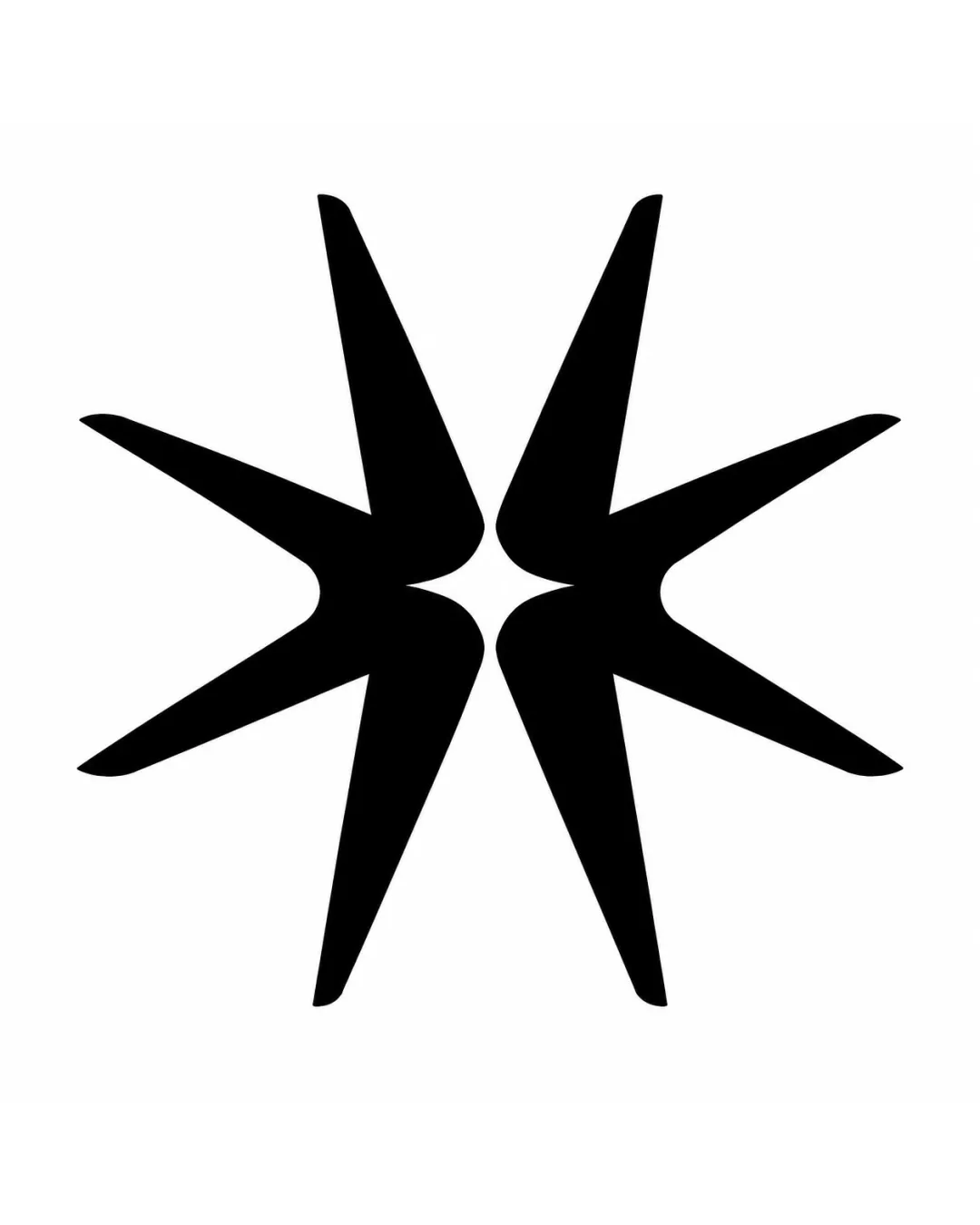
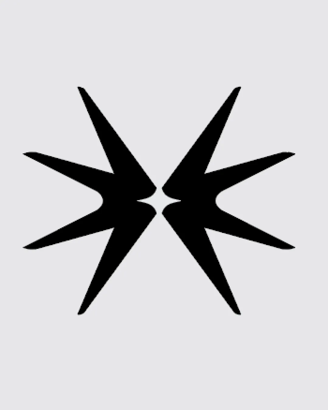
Try it Now!Logo review of mirrored, spiked abstract starbursts facing each o..
 Logo analysis by AI
Logo type:
Style:
Detected symbol:
Negative space:
Business industry:
Review requested by Kozmik
**If AI can recognize or misinterpret it, so can people.
Structured logo review
Scalability versatility
![]() Bold, simple shape ensures clarity at all sizes.
Bold, simple shape ensures clarity at all sizes.![]() No fine details, making it suitable for small applications (e.g., mobile icons, embroidery).
No fine details, making it suitable for small applications (e.g., mobile icons, embroidery).![]() Strong silhouette will stand out on various backgrounds.
Strong silhouette will stand out on various backgrounds.
200x250 px
100×125 px
50×62 px
Balance alignment
![]() Symmetrical composition creates visual stability.
Symmetrical composition creates visual stability.![]() Mirrored elements are well-aligned, adding to the sharp modern appeal.
Mirrored elements are well-aligned, adding to the sharp modern appeal.
![]() Slightly aggressive spikes may make the logo feel tense rather than approachable.
Slightly aggressive spikes may make the logo feel tense rather than approachable.

Originality
![]() Dual starburst concept with mirrored symmetry is less commonly seen.
Dual starburst concept with mirrored symmetry is less commonly seen.
![]() Overall generic abstract spikes—doesn't immediately evoke a unique concept or identity.
Overall generic abstract spikes—doesn't immediately evoke a unique concept or identity.![]() Potential resemblance to generic 'explosion' or 'collision' icons.
Potential resemblance to generic 'explosion' or 'collision' icons.
Aesthetic look
![]() Visually striking and memorable due to strong contrast.
Visually striking and memorable due to strong contrast.![]() Clean geometric execution gives it an edgy, tech-oriented aesthetic.
Clean geometric execution gives it an edgy, tech-oriented aesthetic.
![]() Aggressiveness of spikes may detract from brand warmth or versatility for broader use.
Aggressiveness of spikes may detract from brand warmth or versatility for broader use.![]() Could be polarizing in industries needing a softer or more approachable image.
Could be polarizing in industries needing a softer or more approachable image.
Dual meaning and misinterpretations
![]() Abstract enough to avoid explicit offensive forms.
Abstract enough to avoid explicit offensive forms.
![]() Possible interpretation as a clash, explosion, or confrontation, which might carry unintended aggressive connotations.
Possible interpretation as a clash, explosion, or confrontation, which might carry unintended aggressive connotations.![]() Negative space could be perceived as an abstract X or arrow, which may cause mixed messaging.
Negative space could be perceived as an abstract X or arrow, which may cause mixed messaging.
Color harmony
![]() High contrast black on light gray is visually effective.
High contrast black on light gray is visually effective.![]() Single-color approach enhances logo clarity and versatility.
Single-color approach enhances logo clarity and versatility.
Black
#000000
PaleGray
#E5E5E5