Wondering how your logo performs? 🧐
Get professional logo reviews in seconds and catch design issues in time.
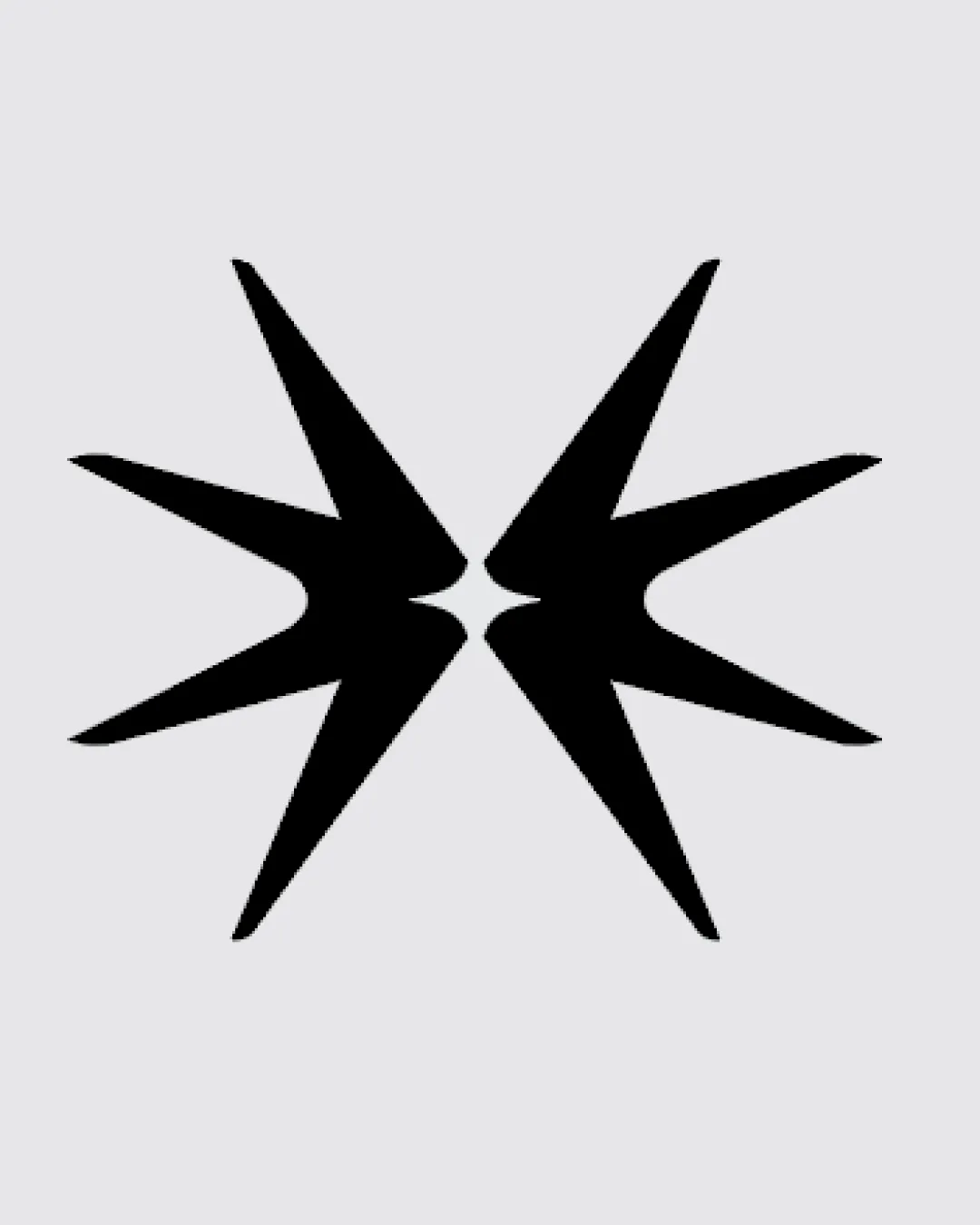
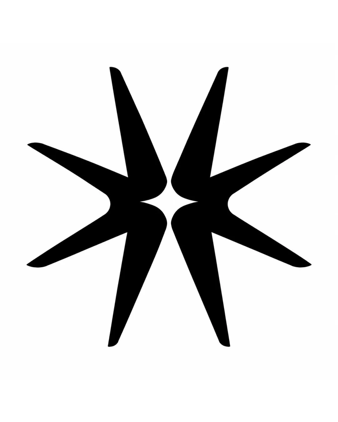
Try it Now!Logo review of abstract starburst or mirrored arrow shapes
 Logo analysis by AI
Logo type:
Style:
Detected symbol:
Negative space:
Business industry:
Review requested by Kozmik
**If AI can recognize or misinterpret it, so can people.
Structured logo review
Scalability versatility
![]() Bold, simple forms retain clarity at all sizes.
Bold, simple forms retain clarity at all sizes.![]() Works well for digital icons, app favicons, and embroidery.
Works well for digital icons, app favicons, and embroidery.![]() Reproducible in black and white, on screens and in print.
Reproducible in black and white, on screens and in print.
200x250 px
100×125 px
50×62 px
Balance alignment
![]() Symmetrical and visually centered.
Symmetrical and visually centered.![]() Even visual weight between left and right halves.
Even visual weight between left and right halves.
![]() Points are very elongated, introducing slight tension at each tip; could feel slightly sharp or confrontational rather than harmonious.
Points are very elongated, introducing slight tension at each tip; could feel slightly sharp or confrontational rather than harmonious.

Originality
![]() Unique composition with mirrored geometric shapes.
Unique composition with mirrored geometric shapes.![]() Negative space use is distinctive and memorable.
Negative space use is distinctive and memorable.
![]() Starburst/arrow motifs are common abstract tropes; not entirely new, but executed with good distinction.
Starburst/arrow motifs are common abstract tropes; not entirely new, but executed with good distinction.
Aesthetic look
![]() Modern, minimal, professional aesthetic.
Modern, minimal, professional aesthetic.![]() Clean use of positive and negative space.
Clean use of positive and negative space.
![]() May feel overly sharp or aggressive to some audiences.
May feel overly sharp or aggressive to some audiences.![]() Abstract nature can be interpreted inconsistently.
Abstract nature can be interpreted inconsistently.
Dual meaning and misinterpretations
![]() No overt inappropriate shapes or symbols.
No overt inappropriate shapes or symbols.
![]() Mirrored forms could be misread as stylized insects, claws, or weapon points in certain contexts.
Mirrored forms could be misread as stylized insects, claws, or weapon points in certain contexts.
Color harmony
![]() Classical high contrast black and white, universally readable.
Classical high contrast black and white, universally readable.![]() Versatile for single-color reproduction.
Versatile for single-color reproduction.
Black
#000000
White
#FFFFFF