Wondering how your logo performs? 🧐
Get professional logo reviews in seconds and catch design issues in time.
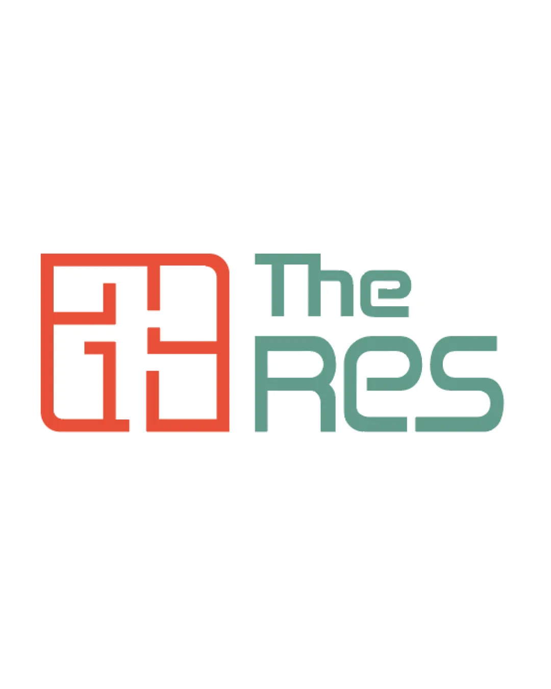
Try it Now!Logo review of The Res
 Logo analysis by AI
Logo type:
Style:
Detected symbol:
Negative space:
Detected text:
Business industry:
Review requested by Chanda212
**If AI can recognize or misinterpret it, so can people.
Structured logo review
Legibility
![]() All letterforms in 'The Res' are mostly clear and easy to read
All letterforms in 'The Res' are mostly clear and easy to read![]() Good spacing between words
Good spacing between words
![]() The monogram does not clearly communicate specific letters at first glance, creating slight ambiguity
The monogram does not clearly communicate specific letters at first glance, creating slight ambiguity
Scalability versatility
![]() Bold and simple forms will print well on large formats such as billboards and storefront signage
Bold and simple forms will print well on large formats such as billboards and storefront signage![]() Minimal detail allows decent reproduction on most digital media
Minimal detail allows decent reproduction on most digital media
![]() Thin lines in the symbol might lose clarity at very small sizes (e.g., favicons, business cards)
Thin lines in the symbol might lose clarity at very small sizes (e.g., favicons, business cards)![]() The horizontal layout may not work well as a social media icon or app icon
The horizontal layout may not work well as a social media icon or app icon
200x250 px
100×125 px
50×62 px
Balance alignment
![]() Symbol and wordmark are well-aligned horizontally
Symbol and wordmark are well-aligned horizontally![]() Overall visual weight is fairly balanced between elements
Overall visual weight is fairly balanced between elements
![]() The boldness of the symbol overpowers the lighter, thinner type, slightly affecting visual harmony
The boldness of the symbol overpowers the lighter, thinner type, slightly affecting visual harmony

Originality
![]() Monogram has potential for unique interpretation as rooms or a floor plan
Monogram has potential for unique interpretation as rooms or a floor plan
![]() The geometric monogram is similar to many generic real estate or architecture logos
The geometric monogram is similar to many generic real estate or architecture logos![]() Does not clearly form unique or memorable letter shapes
Does not clearly form unique or memorable letter shapes
Logomark wordmark fit
![]() Both adopt clean, modern aesthetics
Both adopt clean, modern aesthetics
![]() The monogram's line weight is slightly heavier than the wordmark, causing a mismatch
The monogram's line weight is slightly heavier than the wordmark, causing a mismatch![]() The symbol's visual complexity and grid style contrast with the softer, rounded typeface
The symbol's visual complexity and grid style contrast with the softer, rounded typeface
Aesthetic look
![]() Strong modern feel and appealing color pairing
Strong modern feel and appealing color pairing![]() Clean and uncluttered design
Clean and uncluttered design
![]() Edge curves of symbol and squared terminals of the typeface create a slight stylistic clash
Edge curves of symbol and squared terminals of the typeface create a slight stylistic clash
Dual meaning and misinterpretations
![]() No inappropriate or confusing shapes present upon inspection
No inappropriate or confusing shapes present upon inspection
Color harmony
![]() Only two main hues used, creating good contrast
Only two main hues used, creating good contrast![]() Palette is easily adjustable for different applications
Palette is easily adjustable for different applications
Red Orange
#E04A39
Muted Green
#75A69E
White
#FFFFFF