Wondering how your logo performs? 🧐
Get professional logo reviews in seconds and catch design issues in time.
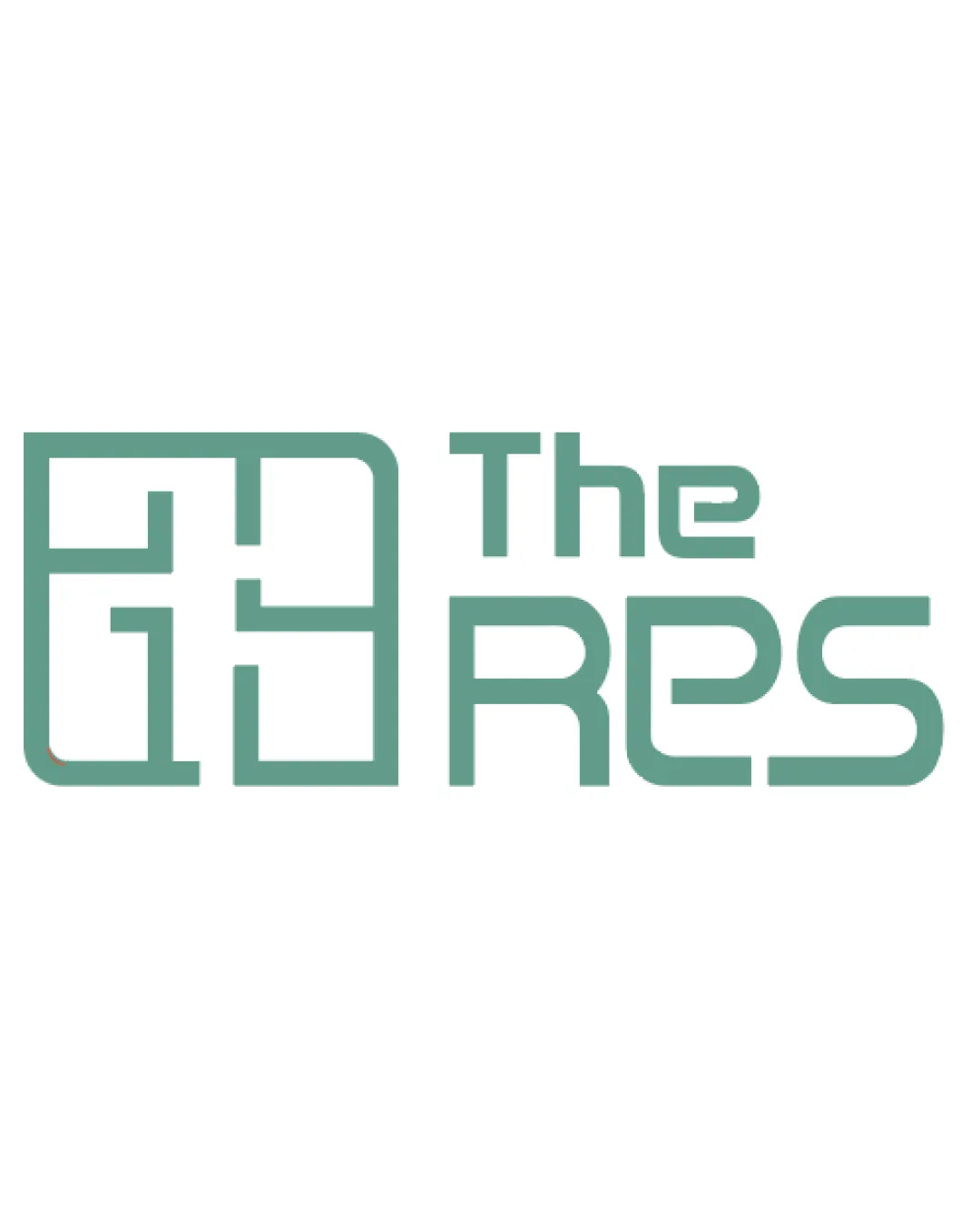
Try it Now!Logo review of The Res
 Logo analysis by AI
Logo type:
Style:
Detected symbol:
Negative space:
Detected text:
Business industry:
Review requested by Chanda212
**If AI can recognize or misinterpret it, so can people.
Structured logo review
Legibility
![]() Wordmark is mostly readable with consistent line weight.
Wordmark is mostly readable with consistent line weight.![]() 'The Res' stands out from the geometric symbol.
'The Res' stands out from the geometric symbol.
![]() The wordmark's 'R' and 'e' may be initially misread due to the stylized geometry.
The wordmark's 'R' and 'e' may be initially misread due to the stylized geometry.![]() 'The' and 'Res' appear with different visual weight, slightly reducing clarity.
'The' and 'Res' appear with different visual weight, slightly reducing clarity.
Scalability versatility
![]() Simple, bold lines ensure some level of scalability.
Simple, bold lines ensure some level of scalability.![]() Works decently on signage or digital uses.
Works decently on signage or digital uses.
![]() Fine interior lines in the symbol may become unclear at small sizes (e.g., business cards or app favicons).
Fine interior lines in the symbol may become unclear at small sizes (e.g., business cards or app favicons).![]() Overlapping lines could create visual clutter when downsized or embroidered.
Overlapping lines could create visual clutter when downsized or embroidered.
200x250 px
100×125 px
50×62 px
Balance alignment
![]() Overall composition is well-structured with clear separation between symbol and text.
Overall composition is well-structured with clear separation between symbol and text.![]() Symbol aligns horizontally with the text block, creating visual harmony.
Symbol aligns horizontally with the text block, creating visual harmony.
![]() The blocky symbol feels heavier than the lighter wordmark, causing slight imbalance.
The blocky symbol feels heavier than the lighter wordmark, causing slight imbalance.

Originality
![]() Abstract grid-like symbol interprets residential space creatively.
Abstract grid-like symbol interprets residential space creatively.![]() Connection of floor plan with text is a distinctive touch.
Connection of floor plan with text is a distinctive touch.
![]() Geometric 'floor plan' symbols are common in real estate.
Geometric 'floor plan' symbols are common in real estate.![]() No highly unique twist—feels familiar within the industry.
No highly unique twist—feels familiar within the industry.
Logomark wordmark fit
![]() Both symbol and wordmark use similar line thickness and rounding.
Both symbol and wordmark use similar line thickness and rounding.
![]() Symbol feels more complex than the simplified text, resulting in some stylistic mismatch.
Symbol feels more complex than the simplified text, resulting in some stylistic mismatch.![]() Visual weight of the mark overshadows the wordmark.
Visual weight of the mark overshadows the wordmark.
Aesthetic look
![]() Minimal color palette feels modern and professional.
Minimal color palette feels modern and professional.![]() Overall style is clean and visually appealing.
Overall style is clean and visually appealing.
![]() The interior grid structure can make the left symbol look busy at a glance.
The interior grid structure can make the left symbol look busy at a glance.
Dual meaning and misinterpretations
![]() No inappropriate or misleading imagery detected; shapes are abstract and safe.
No inappropriate or misleading imagery detected; shapes are abstract and safe.
Color harmony
![]() Monotone green-gray palette is harmonious and on-trend for real estate.
Monotone green-gray palette is harmonious and on-trend for real estate.![]() Strong contrast against the white background.
Strong contrast against the white background.
Green
#669F92
White
#FFFFFF