Wondering how your logo performs? 🧐
Get professional logo reviews in seconds and catch design issues in time.
Try it Now!Logo review of rafi Butik Collection

 Logo analysis by AI
Logo type:
Style:
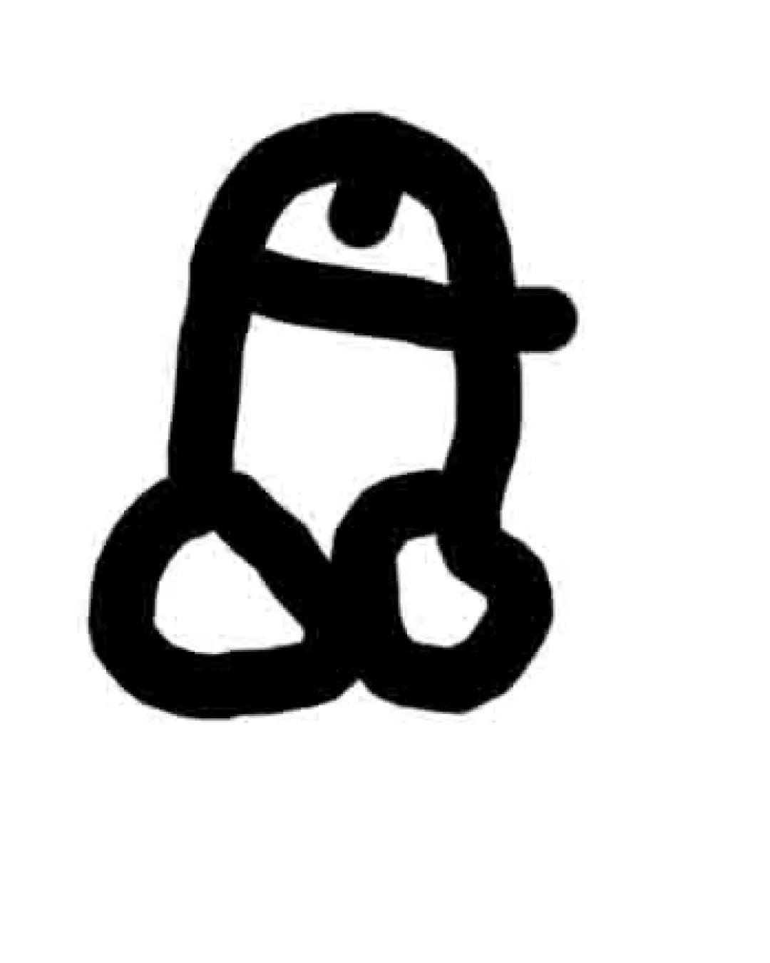
Detected symbol:
Negative space:
Detected text:
Business industry:
Review requested by Mufii.std
**If AI can recognize or misinterpret it, so can people.
Structured logo review
Legibility
![]() 'Butik Collection' in a serif typeface is decently legible.
'Butik Collection' in a serif typeface is decently legible.
![]() 'rafi' suffers from over-decoration which impairs readability.
'rafi' suffers from over-decoration which impairs readability.![]() The stylized curls and hat make some letters ambiguous, especially at small sizes or a glance.
The stylized curls and hat make some letters ambiguous, especially at small sizes or a glance.
Scalability versatility
![]() Bold shapes maintain some presence when scaled down, primarily in 'Butik Collection'.
Bold shapes maintain some presence when scaled down, primarily in 'Butik Collection'.
![]() Intricate decorations and flourishes in 'rafi' will blur or become indistinct at small sizes or on embroidered surfaces.
Intricate decorations and flourishes in 'rafi' will blur or become indistinct at small sizes or on embroidered surfaces.![]() Hat illustration will be lost in smaller applications.
Hat illustration will be lost in smaller applications.![]() Does not adapt well for app icons, badges, or minimal usage.
Does not adapt well for app icons, badges, or minimal usage.
200x250 px
100×125 px
50×62 px
Balance alignment
![]() 'Butik Collection' is centered below, providing some structural balance.
'Butik Collection' is centered below, providing some structural balance.![]() Color blocking (cream and red) adds visual interest.
Color blocking (cream and red) adds visual interest.
![]() Top-heavy due to the hat and flourish, making it visually unstable.
Top-heavy due to the hat and flourish, making it visually unstable.![]() The differing character widths and decorative elements create uneven negative space and optical imbalance.
The differing character widths and decorative elements create uneven negative space and optical imbalance.

Originality
![]() Use of a hat and vintage flourishes over a classic wordmark is somewhat distinctive.
Use of a hat and vintage flourishes over a classic wordmark is somewhat distinctive.![]() Curled terminals on 'fi' are uncommon.
Curled terminals on 'fi' are uncommon.
![]() Hat concept is not particularly unique in the fashion space.
Hat concept is not particularly unique in the fashion space.![]() Heavily stylized letterforms border on generic vintage when not executed with restraint.
Heavily stylized letterforms border on generic vintage when not executed with restraint.![]() No innovative use of negative space or letter integration.
No innovative use of negative space or letter integration.
Logomark wordmark fit
![]() Attempt to integrate the hat with the type adds synergy.
Attempt to integrate the hat with the type adds synergy.
![]() Hat illustration feels disconnected from the letterforms; not seamlessly integrated.
Hat illustration feels disconnected from the letterforms; not seamlessly integrated.![]() 'Butik Collection' feels almost like an afterthought below the decorative main mark, lacking aesthetic unity.
'Butik Collection' feels almost like an afterthought below the decorative main mark, lacking aesthetic unity.
Aesthetic look
![]() Color pairing fits vintage/fashion vibes.
Color pairing fits vintage/fashion vibes.![]() Decorative details provide some personality.
Decorative details provide some personality.
![]() Overall look is cluttered and overdone.
Overall look is cluttered and overdone.![]() Logo is aesthetically unrefined, with clashing flourishes and inconsistent detailing.
Logo is aesthetically unrefined, with clashing flourishes and inconsistent detailing.![]() Feels busy and distracts from brand clarity, leaning towards kitsch rather than elegance.
Feels busy and distracts from brand clarity, leaning towards kitsch rather than elegance.
Dual meaning and misinterpretations
![]() No major inappropriate shapes or misinterpretations detected.
No major inappropriate shapes or misinterpretations detected.
Color harmony
![]() Only three main colors; harmonious vintage palette.
Only three main colors; harmonious vintage palette.
![]() High contrast between the cream and red sections can appear harsh on some backgrounds.
High contrast between the cream and red sections can appear harsh on some backgrounds.![]() Dark background limits usage on light media unless reversed or adapted.
Dark background limits usage on light media unless reversed or adapted.
cream
#F2DCB6
deep red
#A02C2C
dark grey
#232323