Wondering how your logo performs? 🧐
Get professional logo reviews in seconds and catch design issues in time.
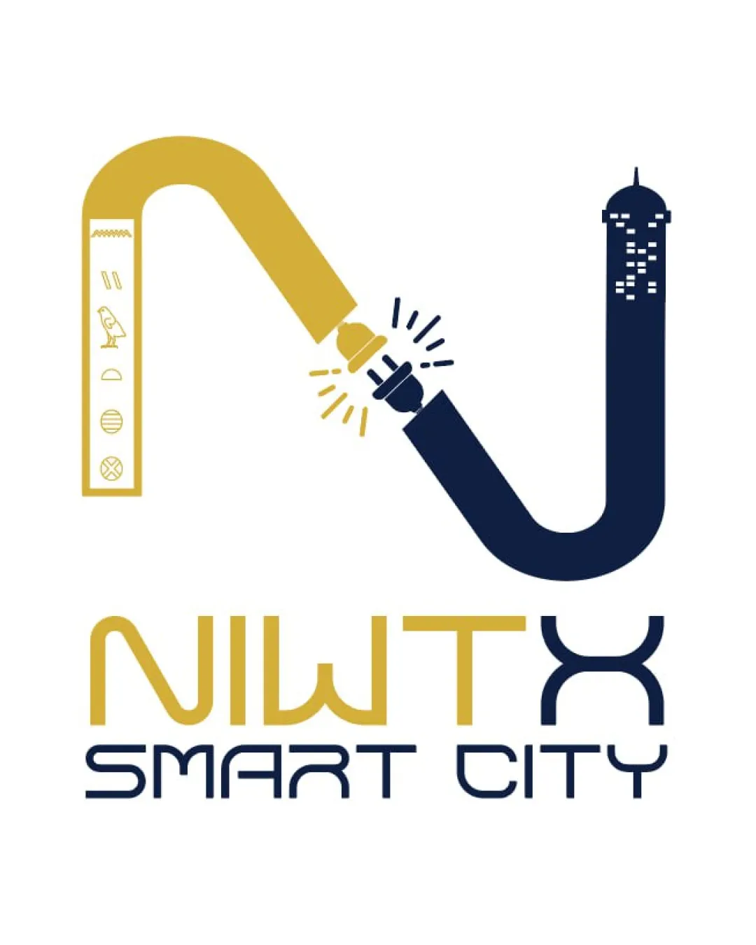
Try it Now!Logo review of NIWTX SMART CITY
 Logo analysis by AI
Logo type:
Style:
Detected symbol:
Detected text:
Business industry:
Review requested by Hossam_Shams
**If AI can recognize or misinterpret it, so can people.
Structured logo review
Legibility
![]() Text is generally readable in both 'NIWTX' and 'SMART CITY'.
Text is generally readable in both 'NIWTX' and 'SMART CITY'.![]() Color contrast is sufficient for legibility.
Color contrast is sufficient for legibility.
![]() 'NIWTX' may be misread due to the nonstandard arrangement and excessive stylization of the 'X'.
'NIWTX' may be misread due to the nonstandard arrangement and excessive stylization of the 'X'.![]() 'SMART CITY' is cramped due to letter spacing and the weight of the font.
'SMART CITY' is cramped due to letter spacing and the weight of the font.![]() Unconventional 'N' and decorated 'T' could cause legibility issues at a small size.
Unconventional 'N' and decorated 'T' could cause legibility issues at a small size.
Scalability versatility
![]() Color contrast would generally work against light backgrounds.
Color contrast would generally work against light backgrounds.![]() Can be reproduced in print if simplified.
Can be reproduced in print if simplified.
![]() Complex illustrative details inside the 'N' (hieroglyphs, spark effect, window details) will be lost or muddy at small sizes or embroidery.
Complex illustrative details inside the 'N' (hieroglyphs, spark effect, window details) will be lost or muddy at small sizes or embroidery.![]() The thin lines and decorative accents make it impractical for use as a favicon, small app icon, or small merchandise.
The thin lines and decorative accents make it impractical for use as a favicon, small app icon, or small merchandise.![]() The overall composition is too busy for minimalist applications like signage, caps, or pens.
The overall composition is too busy for minimalist applications like signage, caps, or pens.
200x250 px
100×125 px
50×62 px
Balance alignment
![]() The main elements are horizontally centered.
The main elements are horizontally centered.
![]() Weight and visual density are heavily skewed to the right (the city tower 'J' form is much bolder than the left-hand hieroglyphic staff).
Weight and visual density are heavily skewed to the right (the city tower 'J' form is much bolder than the left-hand hieroglyphic staff).![]() The interaction between the two main arms ('N') lacks symmetry and feels visually awkward.
The interaction between the two main arms ('N') lacks symmetry and feels visually awkward.![]() Disconnect between the density of 'SMART CITY' text and the lighter 'NIWTX' text adds to imbalance.
Disconnect between the density of 'SMART CITY' text and the lighter 'NIWTX' text adds to imbalance.

Originality
![]() Creative fusion of Egyptian symbolism and modern city imagery—unique concept.
Creative fusion of Egyptian symbolism and modern city imagery—unique concept.![]() Distinctive approach not commonly seen in technology branding.
Distinctive approach not commonly seen in technology branding.
![]() While symbolically rich, the execution borders on illustrative rather than iconic, which may reduce mainstream visual recognition.
While symbolically rich, the execution borders on illustrative rather than iconic, which may reduce mainstream visual recognition.![]() Some illustrative elements (hieroglyphics, spark) are quite literal, somewhat reducing abstract intrigue.
Some illustrative elements (hieroglyphics, spark) are quite literal, somewhat reducing abstract intrigue.
Logomark wordmark fit
![]() Palette is shared between symbol and wordmark.
Palette is shared between symbol and wordmark.
![]() Lettering style of 'SMART CITY' feels mismatched with rounded, historic look of the illustrated 'N' and 'X'.
Lettering style of 'SMART CITY' feels mismatched with rounded, historic look of the illustrated 'N' and 'X'.![]() 'NIWTX' and the logomark are tightly integrated but do not visually harmonize—the historic and geometric themes clash rather than complement.
'NIWTX' and the logomark are tightly integrated but do not visually harmonize—the historic and geometric themes clash rather than complement.
Aesthetic look
![]() Strong, intentional use of color adds sophistication.
Strong, intentional use of color adds sophistication.![]() Interesting illustrative detail attracts attention.
Interesting illustrative detail attracts attention.
![]() Logo feels crowded with illustrative and geometric elements fighting for focus.
Logo feels crowded with illustrative and geometric elements fighting for focus.![]() The clash of styles (historic vs. modern tech) creates visual confusion.
The clash of styles (historic vs. modern tech) creates visual confusion.![]() The overall look is too busy for simple branding applications; lacks clean punch of top-tier tech logos.
The overall look is too busy for simple branding applications; lacks clean punch of top-tier tech logos.
Dual meaning and misinterpretations
![]() No inappropriate shapes or accidental offensive connotations detected.
No inappropriate shapes or accidental offensive connotations detected.
Color harmony
![]() Color palette is limited, sophisticated, and well considered.
Color palette is limited, sophisticated, and well considered.![]() Gold and dark blue contrast well, presenting a modern, luxurious look.
Gold and dark blue contrast well, presenting a modern, luxurious look.
Teak
#B7996E
Dark Blue
#232941
White
#FFFFFF