Wondering how your logo performs? 🧐
Get professional logo reviews in seconds and catch design issues in time.
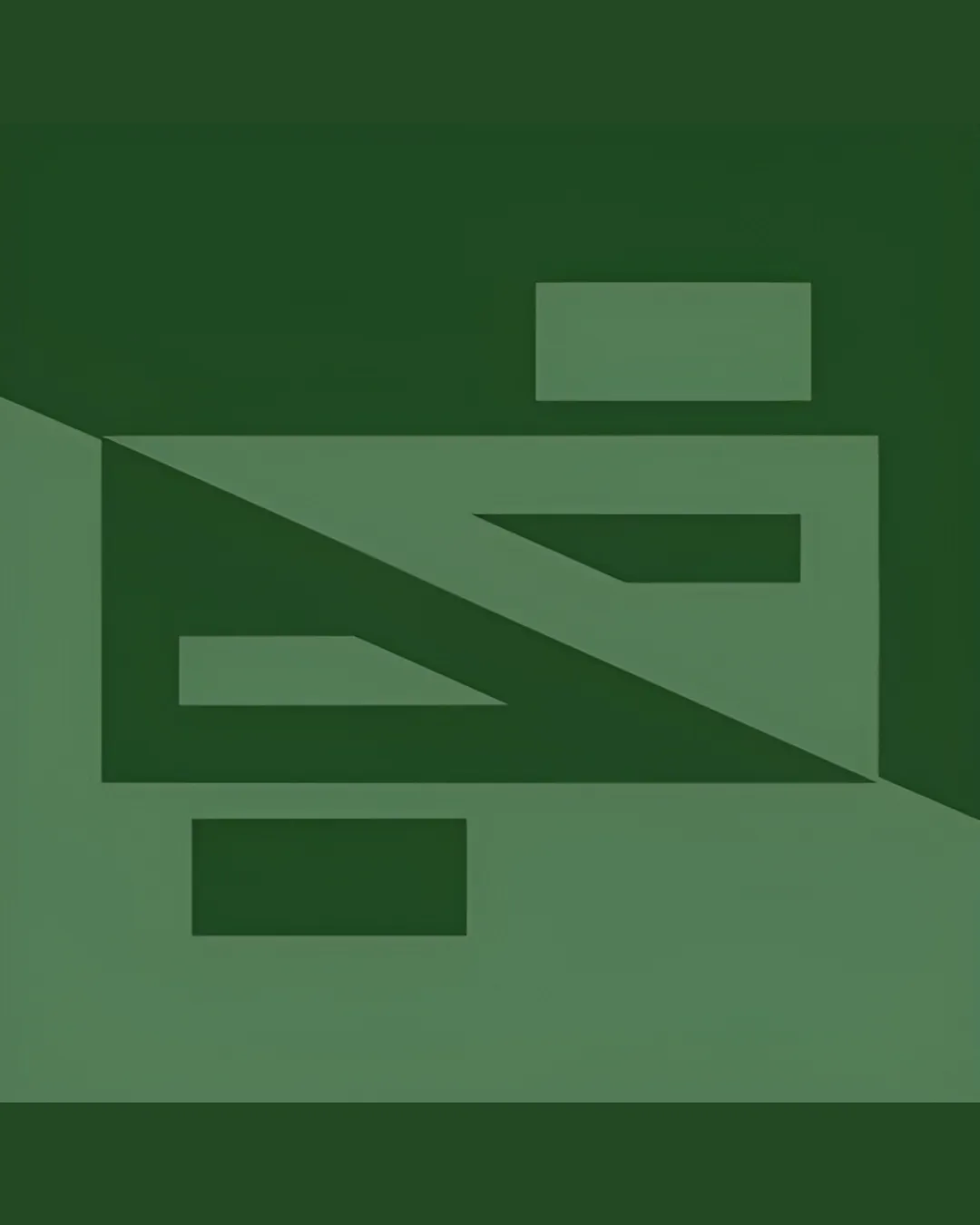
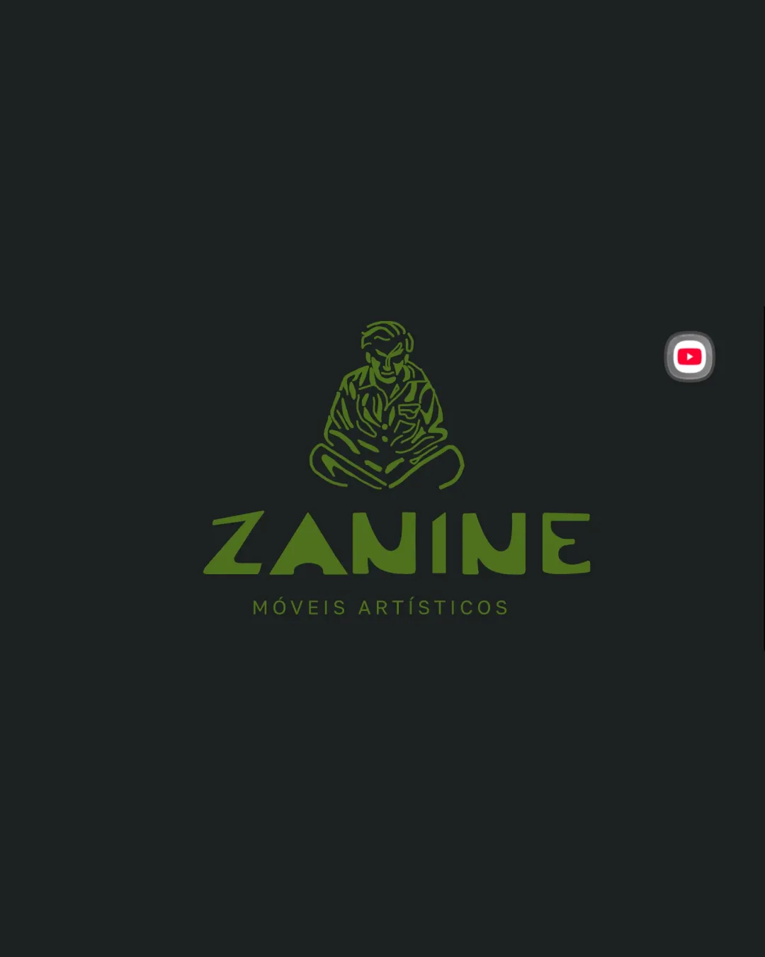
Try it Now!Logo review of ZANINE, MÓVEIS ARTÍSTICOS
 Logo analysis by AI
Logo type:
Style:
Detected symbol:
Detected text:
Business industry:
Review requested by Emyle
**If AI can recognize or misinterpret it, so can people.
Structured logo review
Legibility
![]() Unique typeface for 'ZANINE' is readable, especially at medium to large scale.
Unique typeface for 'ZANINE' is readable, especially at medium to large scale.![]() Supporting text 'MÓVEIS ARTÍSTICOS' is clear and well-spaced.
Supporting text 'MÓVEIS ARTÍSTICOS' is clear and well-spaced.
![]() Letterforms in 'ZANINE' are stylized and could lose clarity at very small sizes, particularly the 'A' and 'N'.
Letterforms in 'ZANINE' are stylized and could lose clarity at very small sizes, particularly the 'A' and 'N'.
Scalability versatility
![]() Suitable for print, digital branding, signage, and packaging at moderate to large scales.
Suitable for print, digital branding, signage, and packaging at moderate to large scales.![]() Simple color palette aids recognizability.
Simple color palette aids recognizability.
![]() Intricate lines in the hand-drawn symbol may not reproduce well when scaled down (e.g., favicons, business cards, or embroidery).
Intricate lines in the hand-drawn symbol may not reproduce well when scaled down (e.g., favicons, business cards, or embroidery).![]() Fine details will be lost at small sizes.
Fine details will be lost at small sizes.
200x250 px
100×125 px
50×62 px
Balance alignment
![]() Symbol and wordmark are visually centered and well-composed.
Symbol and wordmark are visually centered and well-composed.![]() Vertical hierarchy is clear, with symbol above brand name and descriptor beneath.
Vertical hierarchy is clear, with symbol above brand name and descriptor beneath.
![]() Weight of the upper symbol might slightly overpower the lighter descriptor line; minor tweaks could improve vertical harmony.
Weight of the upper symbol might slightly overpower the lighter descriptor line; minor tweaks could improve vertical harmony.

Originality
![]() Hand-drawn seated figure is highly distinctive and not generic.
Hand-drawn seated figure is highly distinctive and not generic.![]() Custom typography with unique twists in 'ZANINE' increases memorability.
Custom typography with unique twists in 'ZANINE' increases memorability.
Logomark wordmark fit
![]() Both elements share an artistic and geometric sensibility, working well together.
Both elements share an artistic and geometric sensibility, working well together.![]() Color and style are consistent between logomark and wordmark.
Color and style are consistent between logomark and wordmark.
![]() Slight style gap between the very organic symbol and the sharper, geometric sans-serif wordmark could be harmonized even more.
Slight style gap between the very organic symbol and the sharper, geometric sans-serif wordmark could be harmonized even more.
Aesthetic look
![]() Fresh and creative, with visually pleasing color contrast.
Fresh and creative, with visually pleasing color contrast.![]() Balanced negative space and unique hand-drawn quality offer a sophisticated appearance.
Balanced negative space and unique hand-drawn quality offer a sophisticated appearance.
![]() Some may find the symbol overly detailed depending on brand application.
Some may find the symbol overly detailed depending on brand application.
Dual meaning and misinterpretations
![]() No inappropriate or accidental interpretations detected. The figure is clearly human and non-controversial.
No inappropriate or accidental interpretations detected. The figure is clearly human and non-controversial.
Color harmony
![]() Restrained use of two harmonious colors adds to the elegant and artistic aesthetic.
Restrained use of two harmonious colors adds to the elegant and artistic aesthetic.![]() Olive green on dark background provides strong readability and premium vibe.
Olive green on dark background provides strong readability and premium vibe.
Olive Green
#70843E
Jet Black
#232826