Wondering how your logo performs? 🧐
Get professional logo reviews in seconds and catch design issues in time.
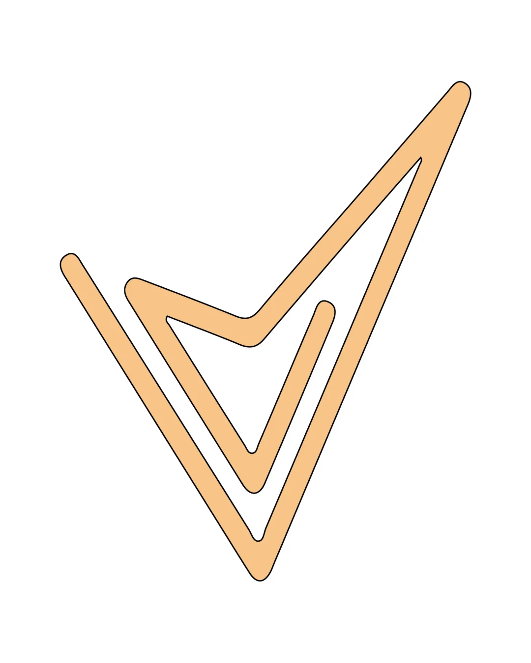
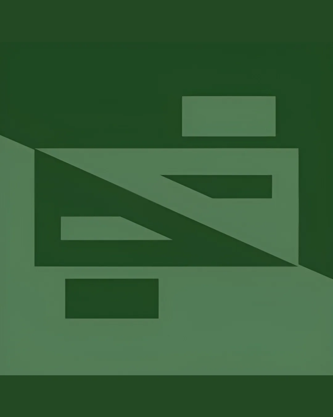
Try it Now!Logo review of ambiguous; could be interpreted as stylized 'E', '..
 Logo analysis by AI
Logo type:
Style:
Detected symbol:
Negative space:
Detected text:
Business industry:
Review requested by LoneToned
**If AI can recognize or misinterpret it, so can people.
Structured logo review
Legibility
![]() Distinct geometric forms are crisp and visible due to contrast between the two greens
Distinct geometric forms are crisp and visible due to contrast between the two greens
![]() The actual letters or intent are unclear, making it difficult to associate with a specific brand or name
The actual letters or intent are unclear, making it difficult to associate with a specific brand or name![]() Ambiguous readability limits recognition and memorability
Ambiguous readability limits recognition and memorability
Scalability versatility
![]() Bold, simple geometric forms ensure excellent scalability
Bold, simple geometric forms ensure excellent scalability![]() Minimal detail maintains clarity at tiny sizes, suitable for app icons or favicons
Minimal detail maintains clarity at tiny sizes, suitable for app icons or favicons![]() Works well for screen printing or laser engraving
Works well for screen printing or laser engraving
![]() Lack of a clear, readable wordmark or recognizable letterform might cause confusion in logo-only applications (e.g., signage or branded merchandise with no text)
Lack of a clear, readable wordmark or recognizable letterform might cause confusion in logo-only applications (e.g., signage or branded merchandise with no text)
200x250 px
100×125 px
50×62 px
Balance alignment
![]() Strong visual alignment; the design is well-centered within the square boundary
Strong visual alignment; the design is well-centered within the square boundary![]() Shapes feel properly distributed and not top- or bottom-heavy
Shapes feel properly distributed and not top- or bottom-heavy
![]() Diagonal split may make the left half feel visually heavier than the right, especially in certain contexts
Diagonal split may make the left half feel visually heavier than the right, especially in certain contexts

Originality
![]() Abstract approach and the diagonal bisecting create intrigue with a modern twist
Abstract approach and the diagonal bisecting create intrigue with a modern twist
![]() Geometric monograms are fairly common in tech branding
Geometric monograms are fairly common in tech branding![]() Does not push symbolic boundaries or present a unique conceptual story beyond shape arrangement
Does not push symbolic boundaries or present a unique conceptual story beyond shape arrangement
Aesthetic look
![]() Clean, sharp geometric alignment gives a modern and professional feel
Clean, sharp geometric alignment gives a modern and professional feel
![]() Color choices lack vibrancy and may feel dull for some sectors
Color choices lack vibrancy and may feel dull for some sectors![]() Possible perceived coldness due to strict geometry and monochrome presentation
Possible perceived coldness due to strict geometry and monochrome presentation
Dual meaning and misinterpretations
![]() No inappropriate or ambiguous imagery detected; the composition remains professional and neutral
No inappropriate or ambiguous imagery detected; the composition remains professional and neutral
Color harmony
![]() Restrained use of two analogous greens creates cohesion and calmness
Restrained use of two analogous greens creates cohesion and calmness
![]() Low contrast between shades may present legibility issues on certain displays or print media
Low contrast between shades may present legibility issues on certain displays or print media![]() Palette feels somewhat generic and uninspired
Palette feels somewhat generic and uninspired
Viridian Green
#445D42
Laurel Green
#697857