Wondering how your logo performs? 🧐
Get professional logo reviews in seconds and catch design issues in time.
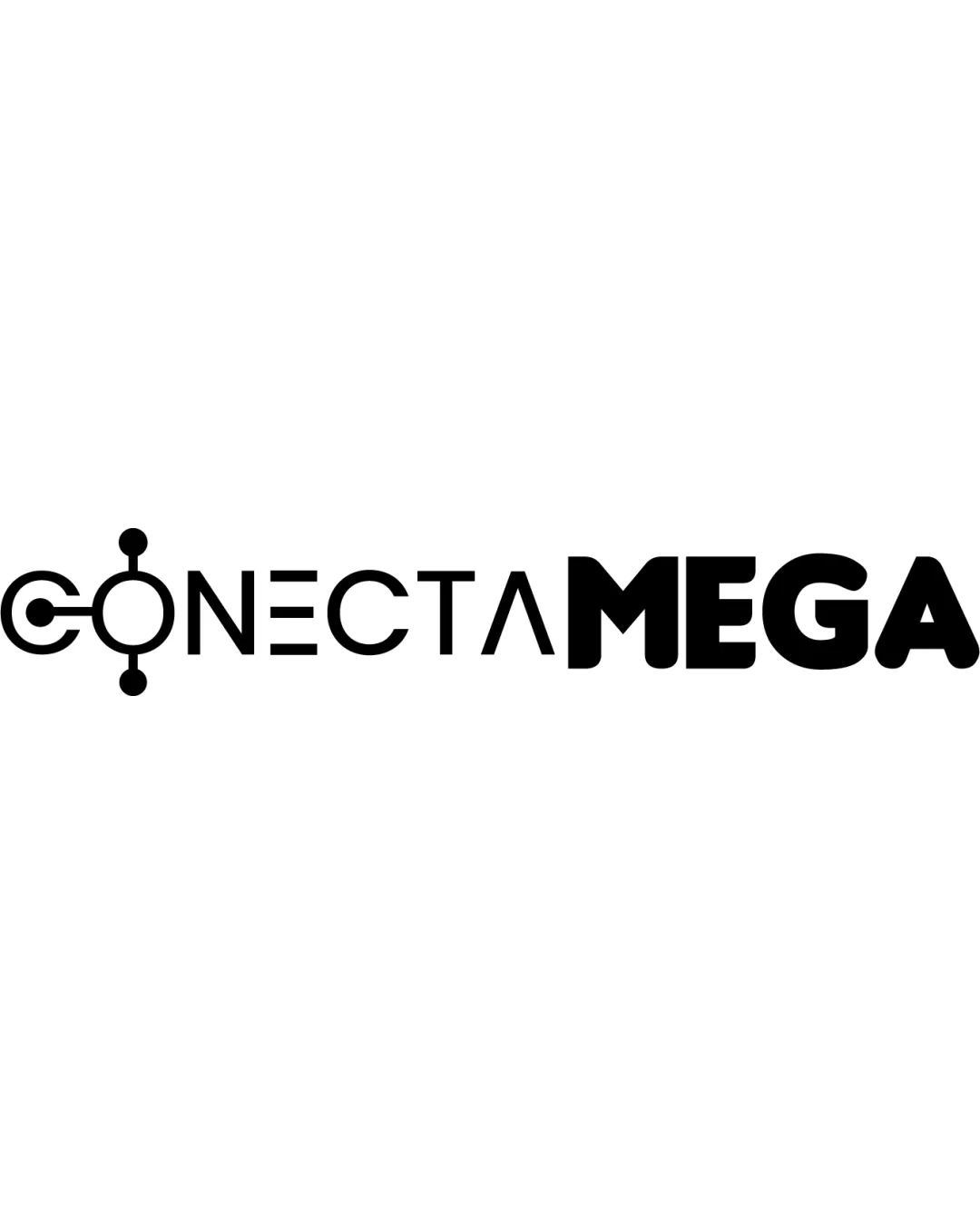
Try it Now!Logo review of CONECTAMEGA
 Logo analysis by AI
Logo type:
Style:
Detected symbol:
Negative space:
Detected text:
Business industry:
Review requested by Kaio.Designer.Mega
**If AI can recognize or misinterpret it, so can people.
Structured logo review
Legibility
![]() All letters are generally distinguishable and readable.
All letters are generally distinguishable and readable.![]() Contrast between black text and white background is excellent.
Contrast between black text and white background is excellent.
![]() The stylized 'O' in 'CONECTA' may be misinterpreted as a symbol by some viewers.
The stylized 'O' in 'CONECTA' may be misinterpreted as a symbol by some viewers.![]() The 'A' in 'CONECTA' uses a triangle, which could momentarily slow recognition.
The 'A' in 'CONECTA' uses a triangle, which could momentarily slow recognition.
Scalability versatility
![]() Simple forms allow for decent downscaling, especially the 'MEGA' portion and main wordmark.
Simple forms allow for decent downscaling, especially the 'MEGA' portion and main wordmark.![]() Contrast will translate well in most applications, including monochrome formats.
Contrast will translate well in most applications, including monochrome formats.
![]() Fine details in the 'O' symbol (dots and lines) may get lost or muddy at very small sizes, such as favicons or embroidery.
Fine details in the 'O' symbol (dots and lines) may get lost or muddy at very small sizes, such as favicons or embroidery.![]() The difference in stroke weight between 'CONECTA' and 'MEGA' may not always scale harmoniously.
The difference in stroke weight between 'CONECTA' and 'MEGA' may not always scale harmoniously.
200x250 px
100×125 px
50×62 px
Balance alignment
![]() Horizontal balance is maintained with a continuous baseline.
Horizontal balance is maintained with a continuous baseline.![]() Strong alignment between most characters.
Strong alignment between most characters.
![]() The weight and size contrast between 'CONECTA' and 'MEGA' creates visual imbalance, making the right side appear heavier.
The weight and size contrast between 'CONECTA' and 'MEGA' creates visual imbalance, making the right side appear heavier.![]() The connector lines on the 'O' slightly disrupt the horizontal flow.
The connector lines on the 'O' slightly disrupt the horizontal flow.

Originality
![]() Innovative integration of technology/network node symbolism into the letter 'O.'
Innovative integration of technology/network node symbolism into the letter 'O.'![]() Unique approach within the context of tech industry logos.
Unique approach within the context of tech industry logos.
![]() Network node/circuit metaphors are fairly common in tech logos—execution here is a bit more creative but not groundbreaking.
Network node/circuit metaphors are fairly common in tech logos—execution here is a bit more creative but not groundbreaking.
Logomark wordmark fit
![]() The symbol is smoothly integrated into the wordmark by forming the 'O'.
The symbol is smoothly integrated into the wordmark by forming the 'O'.![]() Style is mostly consistent throughout.
Style is mostly consistent throughout.
![]() Boldness and thickness of 'MEGA' contrasts noticeably with the lighter 'CONECTA,' slightly disrupting unity.
Boldness and thickness of 'MEGA' contrasts noticeably with the lighter 'CONECTA,' slightly disrupting unity.
Aesthetic look
![]() Clean, modern aesthetic with good use of geometry.
Clean, modern aesthetic with good use of geometry.![]() Minimalist palette keeps it visually appealing and professional.
Minimalist palette keeps it visually appealing and professional.
![]() The 'MEGA' portion feels heavy compared to 'CONECTA,' introducing minor visual clashing.
The 'MEGA' portion feels heavy compared to 'CONECTA,' introducing minor visual clashing.![]() The stylized 'A' may appear a bit generic compared to the clever 'O.'
The stylized 'A' may appear a bit generic compared to the clever 'O.'
Dual meaning and misinterpretations
![]() No inappropriate or suggestive double meanings detected.
No inappropriate or suggestive double meanings detected.![]() Tech symbolism is clear and appropriate for the industry.
Tech symbolism is clear and appropriate for the industry.
Color harmony
![]() Excellent color harmony with a single black tone, ensuring broad compatibility.
Excellent color harmony with a single black tone, ensuring broad compatibility.![]() Easy to inverse for light or dark backgrounds.
Easy to inverse for light or dark backgrounds.
Black
#000000
White
#FFFFFF