Wondering how your logo performs? 🧐
Get professional logo reviews in seconds and catch design issues in time.
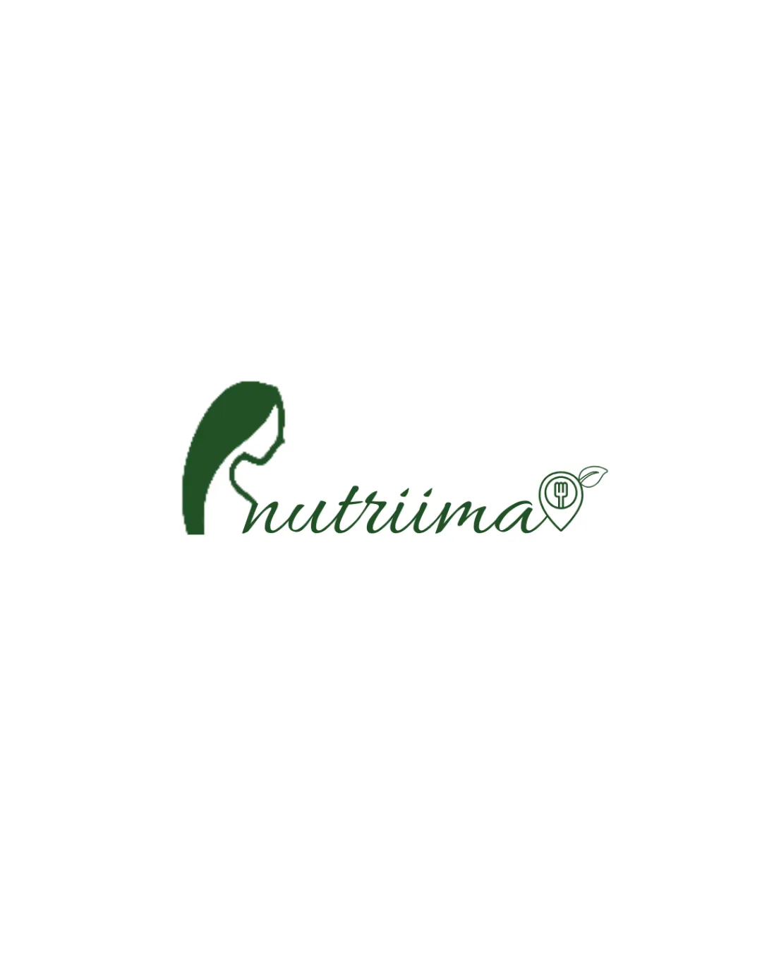
Try it Now!Logo review of nutriima
 Logo analysis by AI
Logo type:
Style:
Detected symbol:
Detected text:
Business industry:
Review requested by Connectus
**If AI can recognize or misinterpret it, so can people.
Structured logo review
Legibility
![]() Script font is elegant and generally clear.
Script font is elegant and generally clear.![]() Text contrasts well against the background.
Text contrasts well against the background.
![]() The connected script and unique 't' with a long ascender can potentially cause minor readability issues, especially at small sizes.
The connected script and unique 't' with a long ascender can potentially cause minor readability issues, especially at small sizes.
Scalability versatility
![]() Simple icon silhouette and limited color palette enhance adaptability on flat backgrounds.
Simple icon silhouette and limited color palette enhance adaptability on flat backgrounds.![]() Could work on business cards, digital headers, and social media displays.
Could work on business cards, digital headers, and social media displays.
![]() The intricate fork/spoon detail in the pin may be lost on very small prints (like favicons or embroidery).
The intricate fork/spoon detail in the pin may be lost on very small prints (like favicons or embroidery).![]() The script font may lose legibility at smaller sizes.
The script font may lose legibility at smaller sizes.
200x250 px
100×125 px
50×62 px
Balance alignment
![]() Symbol and text have a conceptual link.
Symbol and text have a conceptual link.
![]() The left-heavy woman’s silhouette dominates visually, creating imbalance, especially as the additional icon on the right is smaller and lighter.
The left-heavy woman’s silhouette dominates visually, creating imbalance, especially as the additional icon on the right is smaller and lighter.![]() The spacing between the logomark, the script text, and the map pin is inconsistent, making the composition feel loosely assembled.
The spacing between the logomark, the script text, and the map pin is inconsistent, making the composition feel loosely assembled.

Originality
![]() Combining a woman’s profile and healthy food reference is tailored for a nutrition/health brand.
Combining a woman’s profile and healthy food reference is tailored for a nutrition/health brand.![]() Custom touch with the leafy map pin.
Custom touch with the leafy map pin.
![]() Uses common nutritional/health symbolism (profile, leaf, map pin, utensils), which diminishes uniqueness.
Uses common nutritional/health symbolism (profile, leaf, map pin, utensils), which diminishes uniqueness.![]() No particularly clever use of negative space or highly memorable visual twist.
No particularly clever use of negative space or highly memorable visual twist.
Logomark wordmark fit
![]() Both logomark and wordmark share a clean, smooth line style.
Both logomark and wordmark share a clean, smooth line style.
![]() The weight of the logomark visually outweighs the script wordmark, making the left side feel much heavier.
The weight of the logomark visually outweighs the script wordmark, making the left side feel much heavier.![]() Styles between the soft profile and the outlined utensil map pin do not fully harmonize.
Styles between the soft profile and the outlined utensil map pin do not fully harmonize.
Aesthetic look
![]() Minimalist style and considered color palette are visually appealing.
Minimalist style and considered color palette are visually appealing.![]() Design aligns with health/wellness industry standards.
Design aligns with health/wellness industry standards.
![]() Slightly busy due to multiple icons (profile and pin with detail), which could be simplified for a sleeker look.
Slightly busy due to multiple icons (profile and pin with detail), which could be simplified for a sleeker look.
Dual meaning and misinterpretations
![]() No inappropriate or ambiguous visual elements detected.
No inappropriate or ambiguous visual elements detected.
Color harmony
![]() Limited, well-matched greens reinforce the healthy theme.
Limited, well-matched greens reinforce the healthy theme.![]() Strong contrast against white background.
Strong contrast against white background.
Deep Green
#284D32
White
#FFFFFF