Wondering how your logo performs? 🧐
Get professional logo reviews in seconds and catch design issues in time.
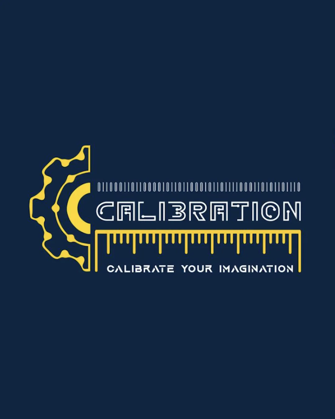
Try it Now!Logo review of CALIBRATION, CALIBRATE YOUR IMAGINATION
 Logo analysis by AI
Logo type:
Style:
Detected symbol:
Detected text:
Business industry:
Review requested by Ferdoussur
**If AI can recognize or misinterpret it, so can people.
Structured logo review
Legibility
![]() Primary word 'CALIBRATION' is prominent
Primary word 'CALIBRATION' is prominent![]() Contrasting colors help key text stand out
Contrasting colors help key text stand out
![]() Letterforms, especially 'B' and some geometric elements, may reduce readability at smaller sizes
Letterforms, especially 'B' and some geometric elements, may reduce readability at smaller sizes![]() Font for tagline is small and loses clarity against busy background elements
Font for tagline is small and loses clarity against busy background elements
Scalability versatility
![]() Simple outline style helps in larger formats like posters or signage
Simple outline style helps in larger formats like posters or signage
![]() Thin lines of gear/ruler and tagline will not reproduce well on small applications (e.g. app icons, embroidered patches)
Thin lines of gear/ruler and tagline will not reproduce well on small applications (e.g. app icons, embroidered patches)![]() Complex combination of symbols and tiny divisions in ruler decrease clarity when scaled down
Complex combination of symbols and tiny divisions in ruler decrease clarity when scaled down
200x250 px
100×125 px
50×62 px
Balance alignment
![]() Horizontal layout creates a clear axis; ruler adds horizontal stability
Horizontal layout creates a clear axis; ruler adds horizontal stability
![]() Left-heavy due to bold half-gear contrasted with thin ruler lines on right, resulting in visual imbalance
Left-heavy due to bold half-gear contrasted with thin ruler lines on right, resulting in visual imbalance![]() Alignment between the wordmark and tagline is off, with visual weight favoring left
Alignment between the wordmark and tagline is off, with visual weight favoring left

Originality
![]() Creative integration of measurement tools tied to 'calibration' theme
Creative integration of measurement tools tied to 'calibration' theme
![]() Use of gears and rulers is somewhat clichéd in engineering or tech branding
Use of gears and rulers is somewhat clichéd in engineering or tech branding![]() No distinctive twist in the geometric elements—follows expected iconography for the field
No distinctive twist in the geometric elements—follows expected iconography for the field
Logomark wordmark fit
![]() Gear, ruler, and geometric wordmark are all stylistically coherent
Gear, ruler, and geometric wordmark are all stylistically coherent![]() Industrial motif matches the technical themed typeface
Industrial motif matches the technical themed typeface
![]() Integration between the mark (gear) and the text could be smoother, current form feels cut-and-paste
Integration between the mark (gear) and the text could be smoother, current form feels cut-and-paste
Aesthetic look
![]() Modern outlined style is visually appealing and contemporary
Modern outlined style is visually appealing and contemporary
![]() Visual busyness from overlapping geometric elements and tightly clustered tag/text
Visual busyness from overlapping geometric elements and tightly clustered tag/text![]() Somewhat generic due to common use of engineering motifs
Somewhat generic due to common use of engineering motifs
Dual meaning and misinterpretations
![]() No inappropriate or misleading secondary imagery detected
No inappropriate or misleading secondary imagery detected
Color harmony
![]() Effective use of two complementary colors enhances visibility and impact
Effective use of two complementary colors enhances visibility and impact![]() Strong contrast between gold and dark blue creates professional look
Strong contrast between gold and dark blue creates professional look
Pickled Bluewood
#232F45
Gold
#FFD700