Wondering how your logo performs? 🧐
Get professional logo reviews in seconds and catch design issues in time.
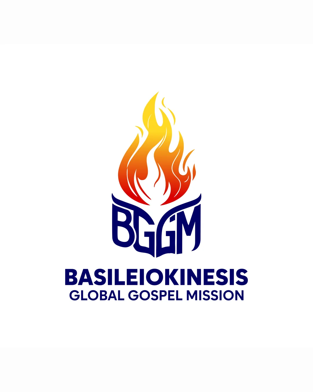
Try it Now!Logo review of BGGM, BASILEIOKINESIS, GLOBAL GOSPEL MISSION
 Logo analysis by AI
Logo type:
Style:
Detected symbol:
Detected text:
Business industry:
Review requested by Pgstudiong25
**If AI can recognize or misinterpret it, so can people.
Structured logo review
Legibility
![]() Primary text (BASILEIOKINESIS, GLOBAL GOSPEL MISSION) is clear and easy to read.
Primary text (BASILEIOKINESIS, GLOBAL GOSPEL MISSION) is clear and easy to read.![]() Custom font for BGGM is unique and mostly legible.
Custom font for BGGM is unique and mostly legible.
![]() BGGM letters are visually merged, making quick reading a bit difficult, especially at small sizes.
BGGM letters are visually merged, making quick reading a bit difficult, especially at small sizes.![]() Letter 'G' and 'M' integration could cause confusion.
Letter 'G' and 'M' integration could cause confusion.
Scalability versatility
![]() Design is bold enough for uses like banners or digital headers.
Design is bold enough for uses like banners or digital headers.![]() Simple enough for most print materials.
Simple enough for most print materials.
![]() Flame gradient and thin internal lines may not reproduce well at small sizes (e.g., embroidery, favicons).
Flame gradient and thin internal lines may not reproduce well at small sizes (e.g., embroidery, favicons).![]() Detailed color gradients are hard to replicate on single-color print applications.
Detailed color gradients are hard to replicate on single-color print applications.
200x250 px
100×125 px
50×62 px
Balance alignment
![]() Vertical alignment between symbol, BGGM monogram, and text is well-executed.
Vertical alignment between symbol, BGGM monogram, and text is well-executed.![]() Logo feels centered and proportionate overall.
Logo feels centered and proportionate overall.
![]() The lower curve of BGGM feels slightly heavy compared to the flame, causing a minor imbalance.
The lower curve of BGGM feels slightly heavy compared to the flame, causing a minor imbalance.

Originality
![]() Integrating lettermark into a flame is a creative approach.
Integrating lettermark into a flame is a creative approach.
![]() Flame as a religious/gospel symbol is common and makes the concept less distinctive.
Flame as a religious/gospel symbol is common and makes the concept less distinctive.![]() Letter integration technique is not particularly unique for the industry.
Letter integration technique is not particularly unique for the industry.
Logomark wordmark fit
![]() Consistent use of bold blue color ties the logomark and wordmark together.
Consistent use of bold blue color ties the logomark and wordmark together.![]() Both symbol and wordmark feel visually unified.
Both symbol and wordmark feel visually unified.
![]() Wordmark is much more readable and modern than the custom BGGM type, creating a slight stylistic mismatch.
Wordmark is much more readable and modern than the custom BGGM type, creating a slight stylistic mismatch.
Aesthetic look
![]() Color gradient in the flame adds vibrancy.
Color gradient in the flame adds vibrancy.![]() Overall look is clean and modern.
Overall look is clean and modern.
![]() BGGM letter area makes the flame appear bottom-heavy, detracting from elegance.
BGGM letter area makes the flame appear bottom-heavy, detracting from elegance.![]() Slight busyness from intricate letter integration.
Slight busyness from intricate letter integration.
Dual meaning and misinterpretations
![]() No inappropriate or confusing symbolism detected.
No inappropriate or confusing symbolism detected.![]() The flame and letters are clearly intended and context-appropriate.
The flame and letters are clearly intended and context-appropriate.
Color harmony
![]() Warm flame gradient contrasts well with deep blue, reflecting passion and authority.
Warm flame gradient contrasts well with deep blue, reflecting passion and authority.![]() Clear color scheme improves brand recognition.
Clear color scheme improves brand recognition.
![]() Gradient use could challenge reproducibility for single/simplified color applications.
Gradient use could challenge reproducibility for single/simplified color applications.
Yellow
#F9D923
Orange
#F05A28
Dark Blue
#0A1D62
White
#FFFFFF