Wondering how your logo performs? 🧐
Get professional logo reviews in seconds and catch design issues in time.
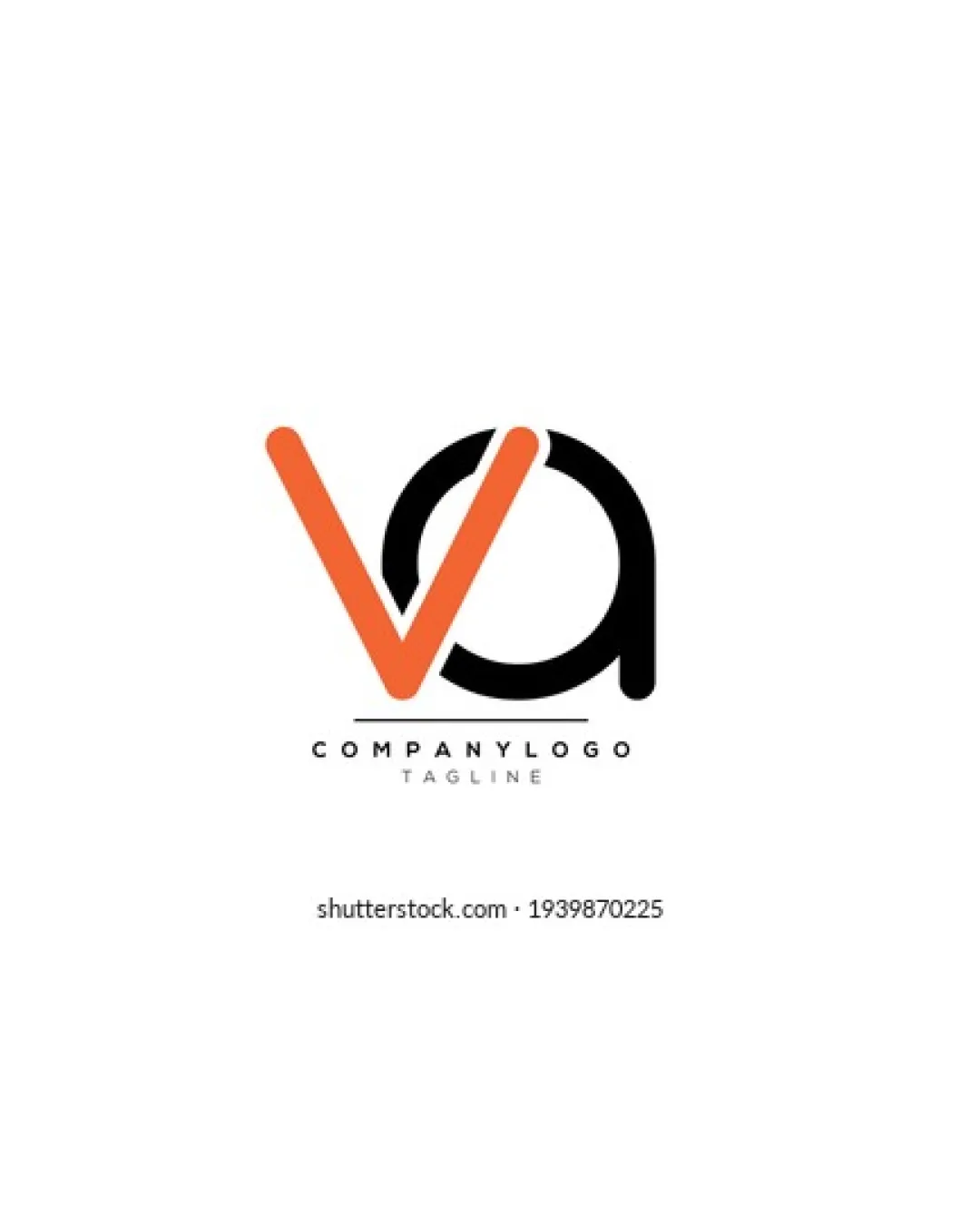
Try it Now!Logo review of COMPANYLOGO, TAGLINE
 Logo analysis by AI
Logo type:
Style:
Detected symbol:
Detected text:
Business industry:
Review requested by Wiviniqi
**If AI can recognize or misinterpret it, so can people.
Structured logo review
Legibility
![]() Main monogram (V and A) is clearly visible and distinguishable.
Main monogram (V and A) is clearly visible and distinguishable.![]() Supporting text 'COMPANYLOGO' is highly readable due to simple sans-serif font and high contrast.
Supporting text 'COMPANYLOGO' is highly readable due to simple sans-serif font and high contrast.
![]() Minor collision of the V and A could make it less legible at extremely small sizes.
Minor collision of the V and A could make it less legible at extremely small sizes.![]() Secondary text 'TAGLINE' is thin and could lose clarity in small sizes.
Secondary text 'TAGLINE' is thin and could lose clarity in small sizes.
Scalability versatility
![]() Minimal design allows for moderate scalability.
Minimal design allows for moderate scalability.![]() Logo would print well at medium to large sizes, such as on signage or digital headers.
Logo would print well at medium to large sizes, such as on signage or digital headers.
![]() Thin strokes and spacing between the V and A monogram could blend together or lose impact at small sizes, such as business cards or mobile app icons.
Thin strokes and spacing between the V and A monogram could blend together or lose impact at small sizes, such as business cards or mobile app icons.![]() Thin tagline will not be legible on very small formats or embroidery.
Thin tagline will not be legible on very small formats or embroidery.
200x250 px
100×125 px
50×62 px
Balance alignment
![]() Visual weight of orange V and black A is well distributed.
Visual weight of orange V and black A is well distributed.![]() Text alignment beneath the monogram maintains clean and professional balance.
Text alignment beneath the monogram maintains clean and professional balance.
![]() Very slight imbalance due to the boldness difference between the orange and black segments.
Very slight imbalance due to the boldness difference between the orange and black segments.

Originality
![]() Modern and professional integration of two letters shows some creativity.
Modern and professional integration of two letters shows some creativity.
![]() Monogram styling of overlapping letters is a very common approach and lacks uniqueness.
Monogram styling of overlapping letters is a very common approach and lacks uniqueness.![]() No creative use of negative space or unexpected twist in letter integration.
No creative use of negative space or unexpected twist in letter integration.
Logomark wordmark fit
![]() Wordmark and monogram share similar minimalist, sans-serif qualities, which maintains stylistic coherence.
Wordmark and monogram share similar minimalist, sans-serif qualities, which maintains stylistic coherence.![]() Proportions between the logomark and wordmark are fairly well-matched.
Proportions between the logomark and wordmark are fairly well-matched.
![]() Minor disconnect between the stylized monogram and the simplistic wordmark.
Minor disconnect between the stylized monogram and the simplistic wordmark.
Aesthetic look
![]() Clean lines and color contrast achieve a visually pleasing minimalism.
Clean lines and color contrast achieve a visually pleasing minimalism.![]() Simplicity makes for a modern, professional look.
Simplicity makes for a modern, professional look.
![]() Feels generic and could be mistaken for many other monogram logos.
Feels generic and could be mistaken for many other monogram logos.
Dual meaning and misinterpretations
![]() No inappropriate, violent, or unintended suggestive shapes detected.
No inappropriate, violent, or unintended suggestive shapes detected.
Color harmony
![]() Limited and tasteful palette of orange, black, and white enhances professionalism.
Limited and tasteful palette of orange, black, and white enhances professionalism.![]() Good contrast between background and logo elements.
Good contrast between background and logo elements.
Orange
#F37022
Black
#000000
White
#FFFFFF