Wondering how your logo performs? 🧐
Get professional logo reviews in seconds and catch design issues in time.
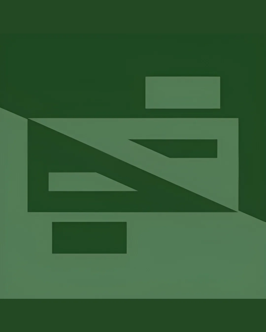
Try it Now!Logo review of abstract geometric shape with two rectangles and a..

 Logo analysis by AI
Logo type:
Style:
Detected symbol:
Negative space:
Business industry:
Review requested by LoneToned
**If AI can recognize or misinterpret it, so can people.
Structured logo review
Scalability versatility
![]() Strong, simple geometric shapes retain clarity even at small sizes.
Strong, simple geometric shapes retain clarity even at small sizes.![]() Works on both light and dark backgrounds due to strong contrast.
Works on both light and dark backgrounds due to strong contrast.
![]() Thin diagonal line detail may blur if the logo is shrunk excessively, such as on embroidered apparel or favicons.
Thin diagonal line detail may blur if the logo is shrunk excessively, such as on embroidered apparel or favicons.
200x250 px
100×125 px
50×62 px
Balance alignment
![]() Rectangles above and below create visual anchoring.
Rectangles above and below create visual anchoring.![]() Diagonal split introduces dynamism.
Diagonal split introduces dynamism.
![]() The two rectangles are not perfectly centered with the main mark, which disrupts visual harmony.
The two rectangles are not perfectly centered with the main mark, which disrupts visual harmony.![]() Diagonal split creates a slight imbalance in weight between top and bottom halves.
Diagonal split creates a slight imbalance in weight between top and bottom halves.

Originality
![]() Abstract approach offers some uniqueness.
Abstract approach offers some uniqueness.![]() Use of negative space and splitting geometry is creative.
Use of negative space and splitting geometry is creative.
![]() Abstract shapes are somewhat generic and do not clearly communicate a distinct concept or memorable brand identity.
Abstract shapes are somewhat generic and do not clearly communicate a distinct concept or memorable brand identity.![]() No clear representation of business or initials makes the mark less distinctive.
No clear representation of business or initials makes the mark less distinctive.
Aesthetic look
![]() Modern minimalist look feels current.
Modern minimalist look feels current.![]() Monochromatic green palette is visually appealing and contemporary.
Monochromatic green palette is visually appealing and contemporary.
![]() Feels generic and lacks an iconic hook; abstractness may limit emotional engagement with the audience.
Feels generic and lacks an iconic hook; abstractness may limit emotional engagement with the audience.
Dual meaning and misinterpretations
![]() No inappropriate or confusing secondary meanings detected.
No inappropriate or confusing secondary meanings detected.
Color harmony
![]() Consistent, harmonious use of greens.
Consistent, harmonious use of greens.![]() Good contrast with white background.
Good contrast with white background.
![]() Monochrome approach is safe, but lacks vibrancy; may feel flat on certain applications or fail to stand out among competitors.
Monochrome approach is safe, but lacks vibrancy; may feel flat on certain applications or fail to stand out among competitors.
PineGreen
#395F39
Oxley
#5F8669
White
#FFFFFF