Wondering how your logo performs? 🧐
Get professional logo reviews in seconds and catch design issues in time.
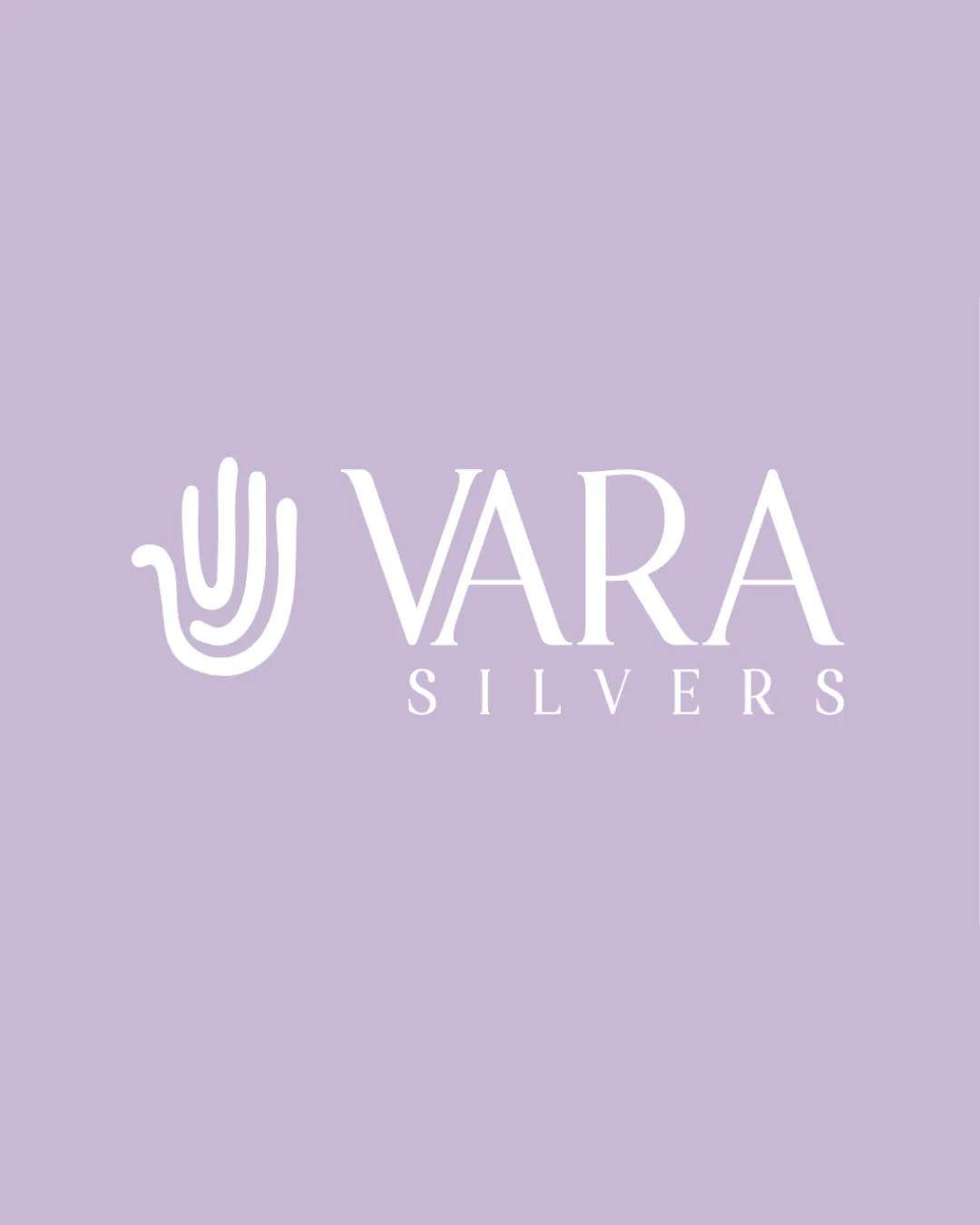
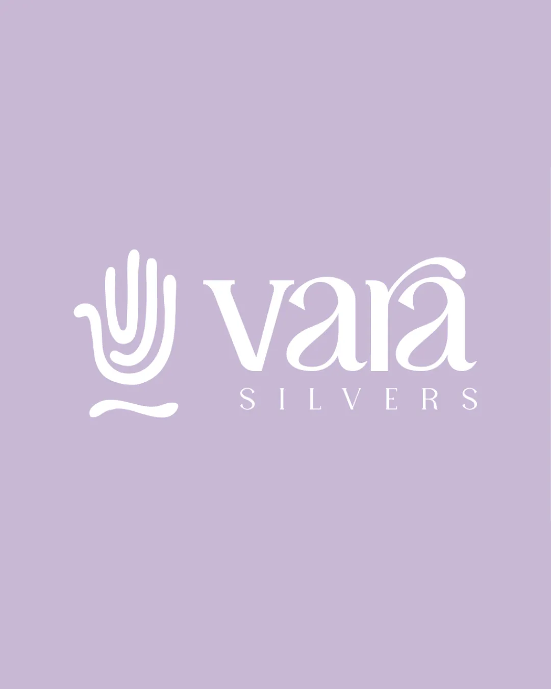
Try it Now!Logo review of vara SILVERS
 Logo analysis by AI
Logo type:
Style:
Detected symbol:
Detected text:
Business industry:
Review requested by Siddharth_G
**If AI can recognize or misinterpret it, so can people.
Structured logo review
Legibility
![]() Main brand name 'vara' is quite readable despite flourishes.
Main brand name 'vara' is quite readable despite flourishes.![]() Supporting text 'SILVERS' is clear and in simple uppercase.
Supporting text 'SILVERS' is clear and in simple uppercase.
![]() The flourish on the 'r' and 'a' creates slight ambiguity and affects instant recognition.
The flourish on the 'r' and 'a' creates slight ambiguity and affects instant recognition.![]() The accent above 'a' is stylized, may confuse some viewers as a diacritic or decoration.
The accent above 'a' is stylized, may confuse some viewers as a diacritic or decoration.
Scalability versatility
![]() Hand symbol and clean serif font should remain distinct at medium sizes, suitable for jewelry packaging, business cards, and website headers.
Hand symbol and clean serif font should remain distinct at medium sizes, suitable for jewelry packaging, business cards, and website headers.![]() Color contrast works well against the background.
Color contrast works well against the background.
![]() Thin lines and small text 'SILVERS' may be lost at small sizes—favicons or fine jewelry engraving will lose detail.
Thin lines and small text 'SILVERS' may be lost at small sizes—favicons or fine jewelry engraving will lose detail.![]() Flourishes and details in text could blur on embroidery or stamp applications.
Flourishes and details in text could blur on embroidery or stamp applications.
200x250 px
100×125 px
50×62 px
Balance alignment
![]() Good spatial relationship between the symbol and wordmark.
Good spatial relationship between the symbol and wordmark.![]() Vertical alignment is harmonious and the hand icon complements the type.
Vertical alignment is harmonious and the hand icon complements the type.
![]() Lower baseline of the hand icon compared to the text creates a mild imbalance.
Lower baseline of the hand icon compared to the text creates a mild imbalance.![]() The wave motif beneath hand disrupts visual foundation slightly.
The wave motif beneath hand disrupts visual foundation slightly.

Originality
![]() Hand icon feels personal and connects to craftsmanship—relevant for jewelry.
Hand icon feels personal and connects to craftsmanship—relevant for jewelry.![]() Serif font with custom flourishes adds a touch of uniqueness.
Serif font with custom flourishes adds a touch of uniqueness.
![]() Hand motif is somewhat common in the artisanal/craft industry.
Hand motif is somewhat common in the artisanal/craft industry.![]() Text modifications are elegant but not groundbreaking in approach.
Text modifications are elegant but not groundbreaking in approach.
Logomark wordmark fit
![]() Visual weights of symbol and text are mostly well matched.
Visual weights of symbol and text are mostly well matched.![]() Motifs feel related in mood and style.
Motifs feel related in mood and style.
![]() Hand and wave motif style is softer and less formal compared to crisp edges of serif letters, leading to a minor stylistic disconnect.
Hand and wave motif style is softer and less formal compared to crisp edges of serif letters, leading to a minor stylistic disconnect.
Aesthetic look
![]() Elegant, light, and modern feel suits a jewelry brand well.
Elegant, light, and modern feel suits a jewelry brand well.![]() Color palette is refined and uncluttered.
Color palette is refined and uncluttered.
![]() Flourishes risk feeling slightly decorative rather than iconic, which can date the design or reduce impact.
Flourishes risk feeling slightly decorative rather than iconic, which can date the design or reduce impact.
Dual meaning and misinterpretations
![]() No inappropriate or confusing symbols detected.
No inappropriate or confusing symbols detected.![]() Hand symbol is clear in meaning.
Hand symbol is clear in meaning.
Color harmony
![]() Limited color palette; white on lavender is soft and consistent with jewelry branding.
Limited color palette; white on lavender is soft and consistent with jewelry branding.![]() Color balance feels premium and contemporary.
Color balance feels premium and contemporary.
Lavender
#D1BFDE
White
#FFFFFF