Wondering how your logo performs? 🧐
Get professional logo reviews in seconds and catch design issues in time.
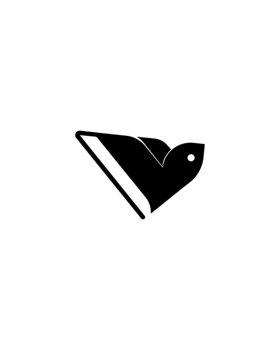
Try it Now!Logo review of stylized bird in flight, geometric shape

 Logo analysis by AI
Logo type:
Style:
Detected symbol:
Negative space:
Business industry:
Review requested by Frydtycgvg
**If AI can recognize or misinterpret it, so can people.
Structured logo review
Scalability versatility
![]() Simple, solid form preserves integrity at all sizes.
Simple, solid form preserves integrity at all sizes.![]() Works on small formats like app icons and business cards.
Works on small formats like app icons and business cards.![]() Highly flexible for embroidery, signage, and digital use.
Highly flexible for embroidery, signage, and digital use.
200x250 px
100×125 px
50×62 px
Balance alignment
![]() Geometric balance between wing, head, and body.
Geometric balance between wing, head, and body.![]() Centralized mark with even weight distribution.
Centralized mark with even weight distribution.

Originality
![]() Abstract shape offers a fresh, modern interpretation of a bird.
Abstract shape offers a fresh, modern interpretation of a bird.![]() Subtle use of negative space for feather detail is a unique touch.
Subtle use of negative space for feather detail is a unique touch.
![]() Bird motifs are common across eco/enviro brands, reducing uniqueness.
Bird motifs are common across eco/enviro brands, reducing uniqueness.
Aesthetic look
![]() Minimalism is visually pleasing and timeless.
Minimalism is visually pleasing and timeless.![]() Transitions and curves are crisp and modern.
Transitions and curves are crisp and modern.![]() Monochrome enhances sophistication.
Monochrome enhances sophistication.
Dual meaning and misinterpretations
![]() No inappropriate or unintended visual interpretation.
No inappropriate or unintended visual interpretation.
Color harmony
![]() Flawless monochrome—no color conflicts.
Flawless monochrome—no color conflicts.![]() Logo will adapt well to any brand palette.
Logo will adapt well to any brand palette.
Black
#000000
White
#FFFFFF