Wondering how your logo performs? 🧐
Get professional logo reviews in seconds and catch design issues in time.
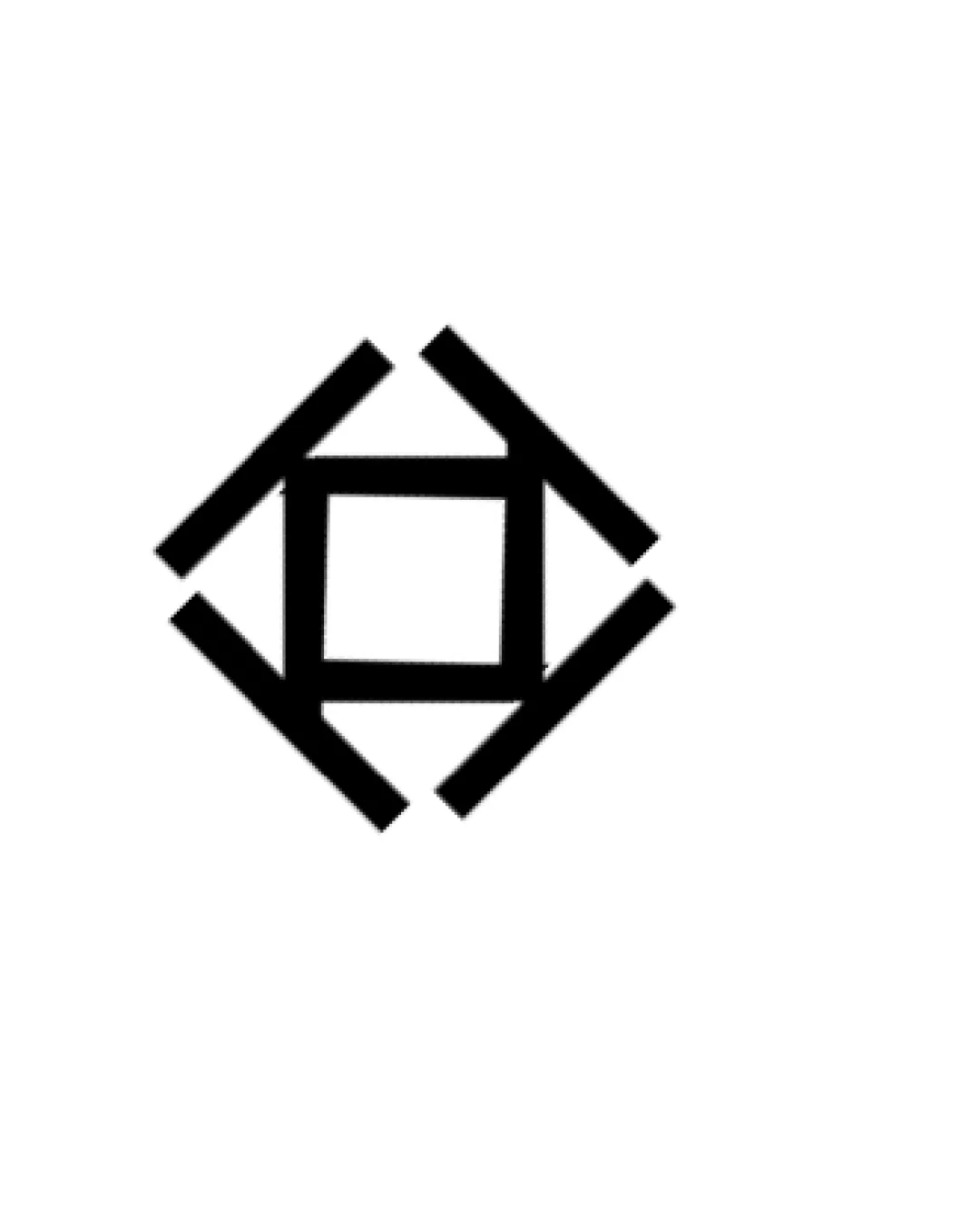
Try it Now!Logo review of bird integrated with an open book

 Logo analysis by AI
Logo type:
Style:
Detected symbol:
Negative space:
Business industry:
Review requested by Frydtycgvg
**If AI can recognize or misinterpret it, so can people.
Structured logo review
Scalability versatility
![]() Simple, bold shapes guarantee clarity from large signage to small-scale uses like favicons or embroidery.
Simple, bold shapes guarantee clarity from large signage to small-scale uses like favicons or embroidery.![]() Flat styling avoids detail loss at tiny sizes.
Flat styling avoids detail loss at tiny sizes.
200x250 px
100×125 px
50×62 px
Balance alignment
![]() Excellent geometric balance; the bird and book form a unified silhouette.
Excellent geometric balance; the bird and book form a unified silhouette.![]() Symmetry and visual weight are managed well, resulting in a cohesive mark.
Symmetry and visual weight are managed well, resulting in a cohesive mark.

Originality
![]() Creative dual imagery by merging a bird and a book yields strong conceptual uniqueness.
Creative dual imagery by merging a bird and a book yields strong conceptual uniqueness.![]() Negative space is cleverly executed for symbolism.
Negative space is cleverly executed for symbolism.
Aesthetic look
![]() Minimalist elegance with a memorable, modern shape.
Minimalist elegance with a memorable, modern shape.
Dual meaning and misinterpretations
![]() Dual imagery is clear and purposeful (bird/book), with no inappropriate or confusing connotations.
Dual imagery is clear and purposeful (bird/book), with no inappropriate or confusing connotations.
Color harmony
![]() Restrained black-and-white palette ensures maximum flexibility and timelessness.
Restrained black-and-white palette ensures maximum flexibility and timelessness.![]() No unnecessary colors or gradients.
No unnecessary colors or gradients.
Black
#000000
White
#FFFFFF