Wondering how your logo performs? 🧐
Get professional logo reviews in seconds and catch design issues in time.
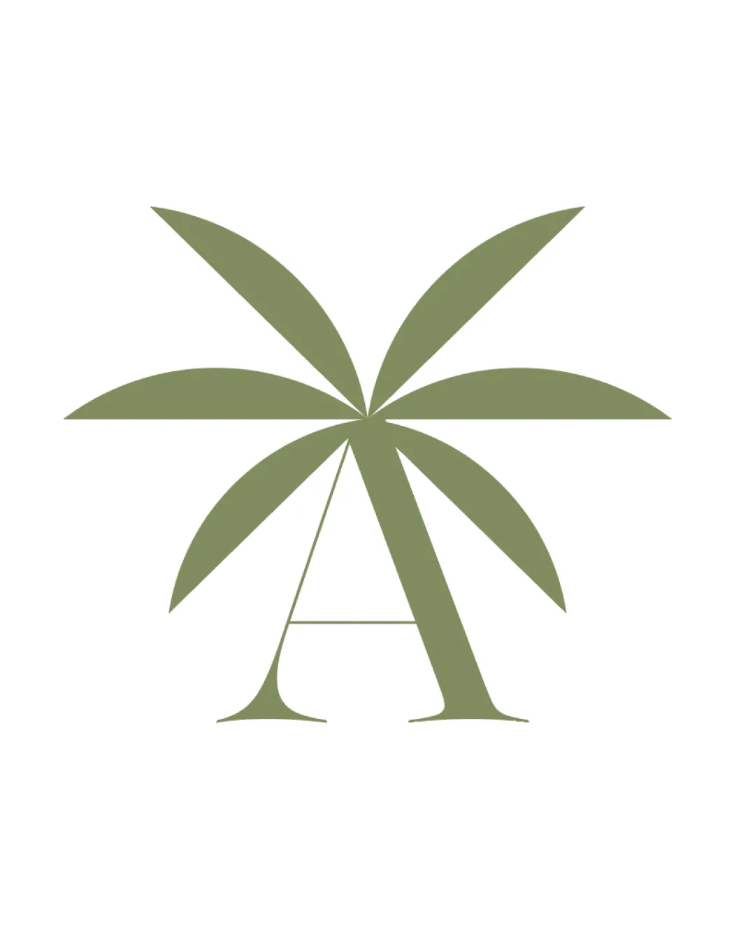
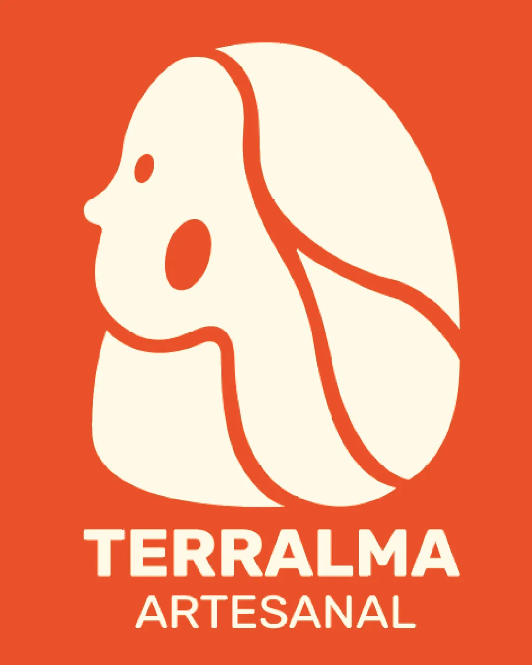
Try it Now!Logo review of TERRALMA ARTESANAL
 Logo analysis by AI
Logo type:
Style:
Detected symbol:
Detected text:
Business industry:
Review requested by Jabztract
**If AI can recognize or misinterpret it, so can people.
Structured logo review
Legibility
![]() Text is highly legible with a bold sans-serif typeface.
Text is highly legible with a bold sans-serif typeface.![]() Strong contrast between background and text enhances readability.
Strong contrast between background and text enhances readability.![]() No unnecessary decoration or effects on the text.
No unnecessary decoration or effects on the text.
Scalability versatility
![]() Logo mark has bold lines and simple forms and will scale well for most applications such as packaging, signage, and web.
Logo mark has bold lines and simple forms and will scale well for most applications such as packaging, signage, and web.![]() Text remains clear and readable even at smaller sizes.
Text remains clear and readable even at smaller sizes.
![]() Details in the logo mark, such as the cheek mark and linework, could lose some clarity at extremely small sizes or embroidery.
Details in the logo mark, such as the cheek mark and linework, could lose some clarity at extremely small sizes or embroidery.![]() Might lose impact when reduced to a favicon or very small social media icons.
Might lose impact when reduced to a favicon or very small social media icons.
200x250 px
100×125 px
50×62 px
Balance alignment
![]() Symbol and wordmark are well-centered and visually balanced.
Symbol and wordmark are well-centered and visually balanced.![]() Spacing between icon and text is harmonious.
Spacing between icon and text is harmonious.![]() Text aligns cleanly under the mark.
Text aligns cleanly under the mark.

Originality
![]() Abstract face profile with artistic linework is unique and memorable.
Abstract face profile with artistic linework is unique and memorable.![]() Mark integrates organic and human elements, conveying artisanal qualities.
Mark integrates organic and human elements, conveying artisanal qualities.
![]() Abstract face motifs are trending in arts/crafts logos, so there’s moderate risk of similarity to other artisan brands.
Abstract face motifs are trending in arts/crafts logos, so there’s moderate risk of similarity to other artisan brands.
Logomark wordmark fit
![]() Both mark and wordmark share an organic, soft yet bold visual character.
Both mark and wordmark share an organic, soft yet bold visual character.![]() Typography choice complements the mark’s contemporary feel.
Typography choice complements the mark’s contemporary feel.
Aesthetic look
![]() Color palette is warm and appealing.
Color palette is warm and appealing.![]() Design is modern, clean, and visually cohesive.
Design is modern, clean, and visually cohesive.![]() Icon is engaging and memorable.
Icon is engaging and memorable.
Dual meaning and misinterpretations
![]() Abstract face and hair are interpreted as human and organic; no inappropriate visual associations.
Abstract face and hair are interpreted as human and organic; no inappropriate visual associations.
Color harmony
![]() Palette is limited to two harmonious colors.
Palette is limited to two harmonious colors.![]() Contrast is strong and visually attractive.
Contrast is strong and visually attractive.![]() Colors fit the artisanal/craft context.
Colors fit the artisanal/craft context.
Orange
#F15C2A
Cream
#FFF6DF