Wondering how your logo performs? 🧐
Get professional logo reviews in seconds and catch design issues in time.
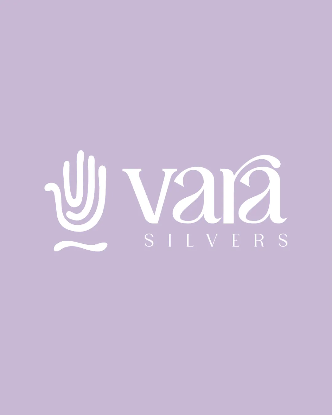
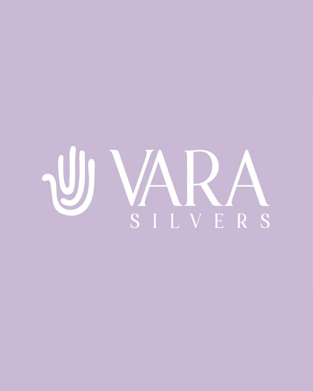
Try it Now!Logo review of VARA SILVERS
 Logo analysis by AI
Logo type:
Style:
Detected symbol:
Detected text:
Business industry:
Review requested by Siddharth_G
**If AI can recognize or misinterpret it, so can people.
Structured logo review
Legibility
![]() The text is highly readable with a clear typeface.
The text is highly readable with a clear typeface.![]() Letter spacing maintains clarity at multiple sizes.
Letter spacing maintains clarity at multiple sizes.
Scalability versatility
![]() The minimal hand symbol and simple typography will scale effectively for most applications.
The minimal hand symbol and simple typography will scale effectively for most applications.![]() Will work on packaging, digital use, and signage.
Will work on packaging, digital use, and signage.
![]() Fine lines in the hand symbol may lose definition at very small sizes or in embroidery.
Fine lines in the hand symbol may lose definition at very small sizes or in embroidery.![]() The long word 'SILVERS' in all caps can be harder to read when scaled down on small merchandise like jewelry tags.
The long word 'SILVERS' in all caps can be harder to read when scaled down on small merchandise like jewelry tags.
200x250 px
100×125 px
50×62 px
Balance alignment
![]() Excellent centering between symbol and wordmark.
Excellent centering between symbol and wordmark.![]() Strong vertical alignment and white space utilization.
Strong vertical alignment and white space utilization.

Originality
![]() Abstract interpretation of a hand mark is fairly unique for the jewelry sector.
Abstract interpretation of a hand mark is fairly unique for the jewelry sector.![]() Typography provides an elegant character distinct from generic sans-serifs.
Typography provides an elegant character distinct from generic sans-serifs.
![]() Hand motif is slightly common, though stylization helps overcome this.
Hand motif is slightly common, though stylization helps overcome this.
Logomark wordmark fit
![]() The modern, minimal style of the hand pairs well with the elegant serif font.
The modern, minimal style of the hand pairs well with the elegant serif font.![]() Sizing is harmonious, avoiding overpowering elements.
Sizing is harmonious, avoiding overpowering elements.
![]() The abstract hand's thickness is bolder than the delicate typeface, creating subtle weight imbalance.
The abstract hand's thickness is bolder than the delicate typeface, creating subtle weight imbalance.
Aesthetic look
![]() Modern, luxurious aesthetic; visually pleasing composition.
Modern, luxurious aesthetic; visually pleasing composition.![]() Color palette feels sophisticated and fitting for the industry.
Color palette feels sophisticated and fitting for the industry.
Dual meaning and misinterpretations
![]() No inappropriate or confusing symbols detected. The hand shape communicates protection, craftsmanship, and quality.
No inappropriate or confusing symbols detected. The hand shape communicates protection, craftsmanship, and quality.
Color harmony
![]() Soft, harmonious color pairing between lavender and white enhances elegance.
Soft, harmonious color pairing between lavender and white enhances elegance.![]() The palette is clean, with strong contrast and no excess hues.
The palette is clean, with strong contrast and no excess hues.
Lavender
#DED1EA
White
#FFFFFF