Wondering how your logo performs? 🧐
Get professional logo reviews in seconds and catch design issues in time.
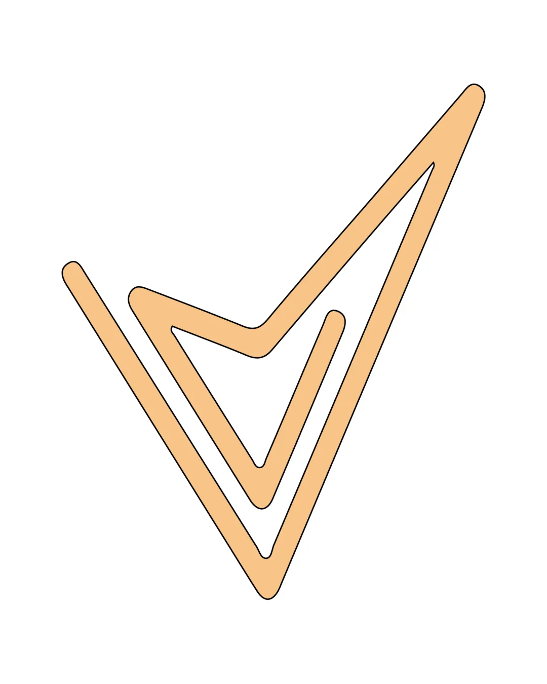
Try it Now!Logo review of hockey stick and puck forming a person

 Logo analysis by AI
Logo type:
Style:
Detected symbol:
Business industry:
Review requested by Lex2250
**If AI can recognize or misinterpret it, so can people.
Structured logo review
Legibility
Scalability versatility
![]() Design is simple and clear, making it versatile for various applications.
Design is simple and clear, making it versatile for various applications.![]() Works well in both small and large formats, due to the minimal detail.
Works well in both small and large formats, due to the minimal detail.
200x250 px
100×125 px
50×62 px
Balance alignment
![]() Balanced composition with the circular element adding stability.
Balanced composition with the circular element adding stability.![]() Elements are well-proportioned relative to each other.
Elements are well-proportioned relative to each other.
![]() Minor imbalance due to the extension of the stick.
Minor imbalance due to the extension of the stick.

Originality
![]() Creative integration of hockey stick and puck to form a figure.
Creative integration of hockey stick and puck to form a figure.![]() Unique representation of the sports theme.
Unique representation of the sports theme.
![]() Concept might have limited distinctiveness in a crowded sports market.
Concept might have limited distinctiveness in a crowded sports market.
Aesthetic look
![]() Aesthetically pleasing with a clean and modern approach.
Aesthetically pleasing with a clean and modern approach.![]() Minimalist design enhances visual appeal.
Minimalist design enhances visual appeal.
Dual meaning and misinterpretations
![]() No inappropriate interpretations detected.
No inappropriate interpretations detected.
Color harmony
![]() Monochromatic scheme ensures harmonious and simple color use.
Monochromatic scheme ensures harmonious and simple color use.![]() High contrast for easy visibility.
High contrast for easy visibility.