Wondering how your logo performs? 🧐
Get professional logo reviews in seconds and catch design issues in time.
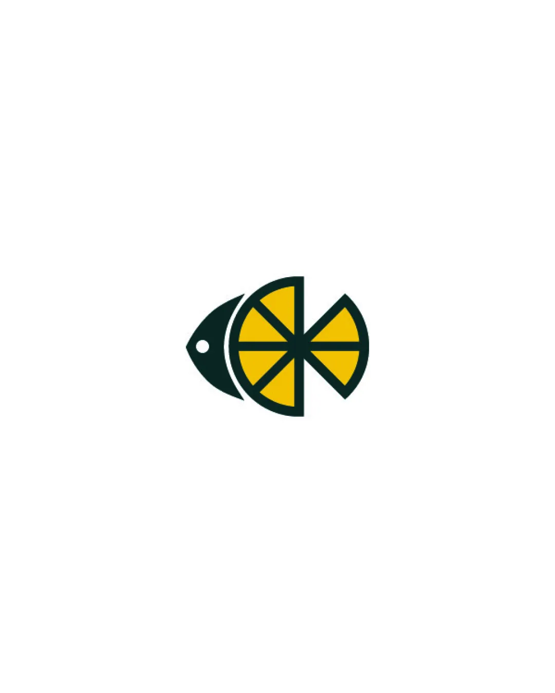
Try it Now!Logo review of fish formed by a lemon slice
 Logo analysis by AI
Logo type:
Style:
Detected symbol:
Negative space:
Business industry:
Review requested by Frydtycgvg
**If AI can recognize or misinterpret it, so can people.
Structured logo review
Scalability versatility
![]() Strong geometric forms maintain clarity at smaller sizes
Strong geometric forms maintain clarity at smaller sizes![]() Simple color palette and bold lines work well for digital icons, packaging, and signage
Simple color palette and bold lines work well for digital icons, packaging, and signage
![]() Fine inner lemon lines may become less noticeable at very small sizes like favicons or embroidery
Fine inner lemon lines may become less noticeable at very small sizes like favicons or embroidery
200x250 px
100×125 px
50×62 px
Balance alignment
![]() Visual weight is well-distributed between the fish and lemon
Visual weight is well-distributed between the fish and lemon![]() Symmetrical construction feels intentional and cohesive
Symmetrical construction feels intentional and cohesive

Originality
![]() Clever fusion of food imagery (fish and lemon), creating a memorable concept
Clever fusion of food imagery (fish and lemon), creating a memorable concept![]() Use of dual-meaning without relying on clichés
Use of dual-meaning without relying on clichés
Aesthetic look
![]() Minimalist execution looks modern and appealing
Minimalist execution looks modern and appealing![]() Color contrast enhances visual pop without overwhelming
Color contrast enhances visual pop without overwhelming
Dual meaning and misinterpretations
![]() Dual imagery is well integrated and immediately recognizable as food-related
Dual imagery is well integrated and immediately recognizable as food-related
Color harmony
![]() Limited, harmonious palette fits the food/fresh theme well
Limited, harmonious palette fits the food/fresh theme well![]() Yellow and green provide good contrast and necessary vibrancy
Yellow and green provide good contrast and necessary vibrancy
Green
#102716
Yellow
#F6C646
White
#FFFFFF