Wondering how your logo performs? 🧐
Get professional logo reviews in seconds and catch design issues in time.
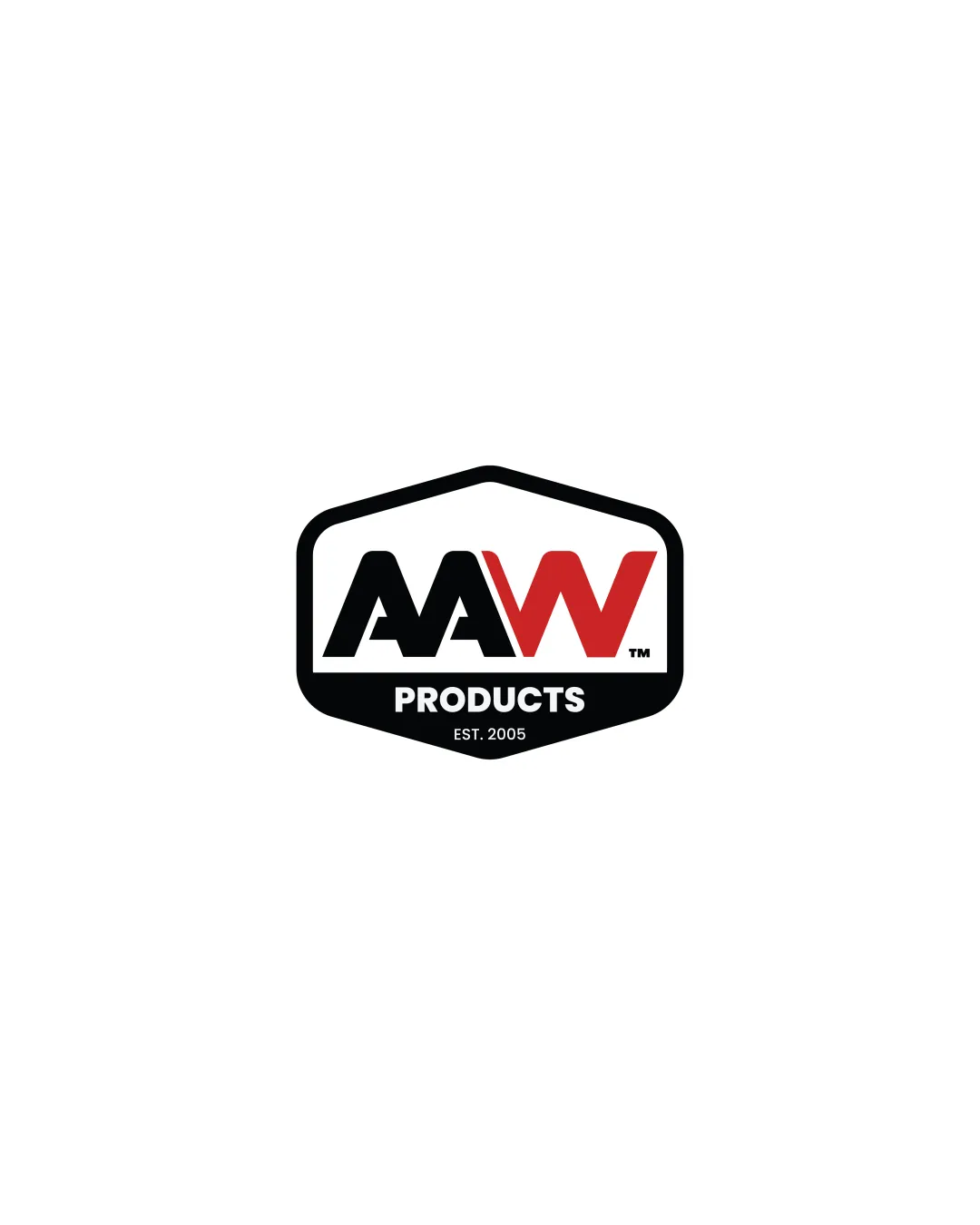
Try it Now!Logo review of AAW PRODUCTS EST. 2005
 Logo analysis by AI
Logo type:
Style:
Detected symbol:
Detected text:
Business industry:
Review requested by Mjrakibulislam3
**If AI can recognize or misinterpret it, so can people.
Structured logo review
Legibility
![]() Text is clear, bold, and easy to read even at smaller sizes.
Text is clear, bold, and easy to read even at smaller sizes.![]() High contrast between the white background, black frame, and red accent on the 'W'.
High contrast between the white background, black frame, and red accent on the 'W'.
Scalability versatility
![]() The bold lines and simple forms ensure clarity at larger sizes such as signage or vehicle wraps.
The bold lines and simple forms ensure clarity at larger sizes such as signage or vehicle wraps.![]() Badge shape is versatile for stickers, patches, and product labeling.
Badge shape is versatile for stickers, patches, and product labeling.
![]() Fine text ('EST. 2005') may become illegible at very small sizes or low-resolution applications like favicons or embroidery.
Fine text ('EST. 2005') may become illegible at very small sizes or low-resolution applications like favicons or embroidery.![]() Badge outline may lose clarity if drastically reduced.
Badge outline may lose clarity if drastically reduced.
200x250 px
100×125 px
50×62 px
Balance alignment
![]() Well-aligned elements with central symmetry.
Well-aligned elements with central symmetry.![]() Good visual hierarchy aids immediate recognition.
Good visual hierarchy aids immediate recognition.
![]() The 'W' in red visually dominates over the 'AAs', causing subtle imbalance if viewed critically.
The 'W' in red visually dominates over the 'AAs', causing subtle imbalance if viewed critically.

Originality
![]() Strong, memorable badge shape stands out.
Strong, memorable badge shape stands out.
![]() Lettermark and badge concepts are somewhat generic for manufacturing; similar silhouettes are common in the market.
Lettermark and badge concepts are somewhat generic for manufacturing; similar silhouettes are common in the market.![]() No creative negative space or unique typographic twist.
No creative negative space or unique typographic twist.
Logomark wordmark fit
![]() 'PRODUCTS' and 'EST. 2005' fit well stylistically beneath the lettermark, supporting the main identity without competing for attention.
'PRODUCTS' and 'EST. 2005' fit well stylistically beneath the lettermark, supporting the main identity without competing for attention.![]() Unified geometric style throughout the typography.
Unified geometric style throughout the typography.
![]() Slight size imbalance between 'AAW' and the supporting text, with the top element feeling heavier.
Slight size imbalance between 'AAW' and the supporting text, with the top element feeling heavier.
Aesthetic look
![]() Clean composition and effective color blocking create a bold, professional impression.
Clean composition and effective color blocking create a bold, professional impression.![]() Minimal decoration supports a utilitarian, industrial look appropriate for products/manufacturing.
Minimal decoration supports a utilitarian, industrial look appropriate for products/manufacturing.
![]() Could be perceived as visually heavy or rigid due to thick outlines and dense arrangement.
Could be perceived as visually heavy or rigid due to thick outlines and dense arrangement.![]() No unique visual flair or innovation.
No unique visual flair or innovation.
Dual meaning and misinterpretations
![]() No misinterpretations or inappropriate visual elements detected.
No misinterpretations or inappropriate visual elements detected.
Color harmony
![]() Limited palette (black, white, red) is strong and corporate, creating a confident tone.
Limited palette (black, white, red) is strong and corporate, creating a confident tone.![]() Contrast ensures visibility and immediate recognition.
Contrast ensures visibility and immediate recognition.
![]() Red accent may be overpowering if overused.
Red accent may be overpowering if overused.
Black
#000000
Red
#D32F2F
White
#FFFFFF