Wondering how your logo performs? 🧐
Get professional logo reviews in seconds and catch design issues in time.
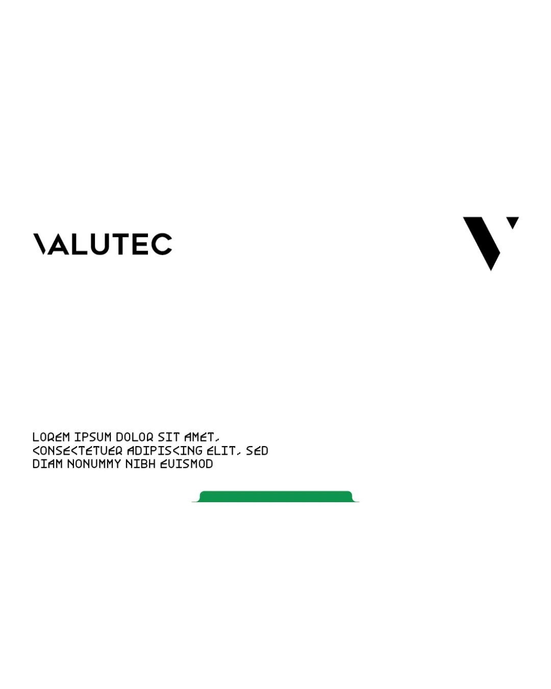
Try it Now!Logo review of VALUTEC
 Logo analysis by AI
Logo type:
Style:
Detected symbol:
Negative space:
Detected text:
Business industry:
Review requested by Neilsavio
**If AI can recognize or misinterpret it, so can people.
Structured logo review
Legibility
![]() The wordmark uses a clear, bold sans-serif typeface that is easily readable at various sizes.
The wordmark uses a clear, bold sans-serif typeface that is easily readable at various sizes.![]() Spacing between letters ensures clarity and prevents crowding.
Spacing between letters ensures clarity and prevents crowding.
Scalability versatility
![]() The clean geometric shapes scale well for digital use and print.
The clean geometric shapes scale well for digital use and print.![]() Logo would be visible in small applications due to its simplicity.
Logo would be visible in small applications due to its simplicity.
![]() The thin angle of the backslash in the wordmark may disappear at very small sizes or when embroidered.
The thin angle of the backslash in the wordmark may disappear at very small sizes or when embroidered.![]() The symbol and wordmark are disconnected, which could present branding inconsistency if used separately.
The symbol and wordmark are disconnected, which could present branding inconsistency if used separately.
200x250 px
100×125 px
50×62 px
Balance alignment
![]() Wordmark is visually balanced, with even letter spacing and strong left alignment.
Wordmark is visually balanced, with even letter spacing and strong left alignment.
![]() Symbol and wordmark are placed far apart, breaking compositional cohesion and making the logo feel disjointed.
Symbol and wordmark are placed far apart, breaking compositional cohesion and making the logo feel disjointed.![]() No clear visual relationship or alignment between logomark and wordmark.
No clear visual relationship or alignment between logomark and wordmark.

Originality
![]() Abstract approach to designing the letter V adds a distinctive element.
Abstract approach to designing the letter V adds a distinctive element.![]() Minimalist direction avoids cliches and overused motifs.
Minimalist direction avoids cliches and overused motifs.
![]() Abstract V with a triangle is somewhat generic in technology branding.
Abstract V with a triangle is somewhat generic in technology branding.![]() No additional creative twist or unique conceptual tie-in to the brand name or potential services.
No additional creative twist or unique conceptual tie-in to the brand name or potential services.
Logomark wordmark fit
![]() Both elements share a minimalist, geometric style.
Both elements share a minimalist, geometric style.
![]() Stylistic unity exists, but the sizing and placement disconnect the two elements.
Stylistic unity exists, but the sizing and placement disconnect the two elements.![]() No proportional relationship between logomark and wordmark; both fight for attention rather than reinforce each other.
No proportional relationship between logomark and wordmark; both fight for attention rather than reinforce each other.
Aesthetic look
![]() Modern, minimalist look is appealing and professional.
Modern, minimalist look is appealing and professional.![]() Visual simplicity offers strong brand recall.
Visual simplicity offers strong brand recall.
![]() Overall composition feels sparse due to the large separation of elements.
Overall composition feels sparse due to the large separation of elements.
Dual meaning and misinterpretations
![]() No inappropriate or ambiguous imagery detected.
No inappropriate or ambiguous imagery detected.![]() Shapes are clear and free from misinterpretations.
Shapes are clear and free from misinterpretations.
Color harmony
![]() Limited color palette creates a strong and harmonious look.
Limited color palette creates a strong and harmonious look.![]() Black provides excellent contrast and adaptability to different backgrounds.
Black provides excellent contrast and adaptability to different backgrounds.
Black
#000000
Green
#19A25E
White
#FFFFFF