Wondering how your logo performs? 🧐
Get professional logo reviews in seconds and catch design issues in time.
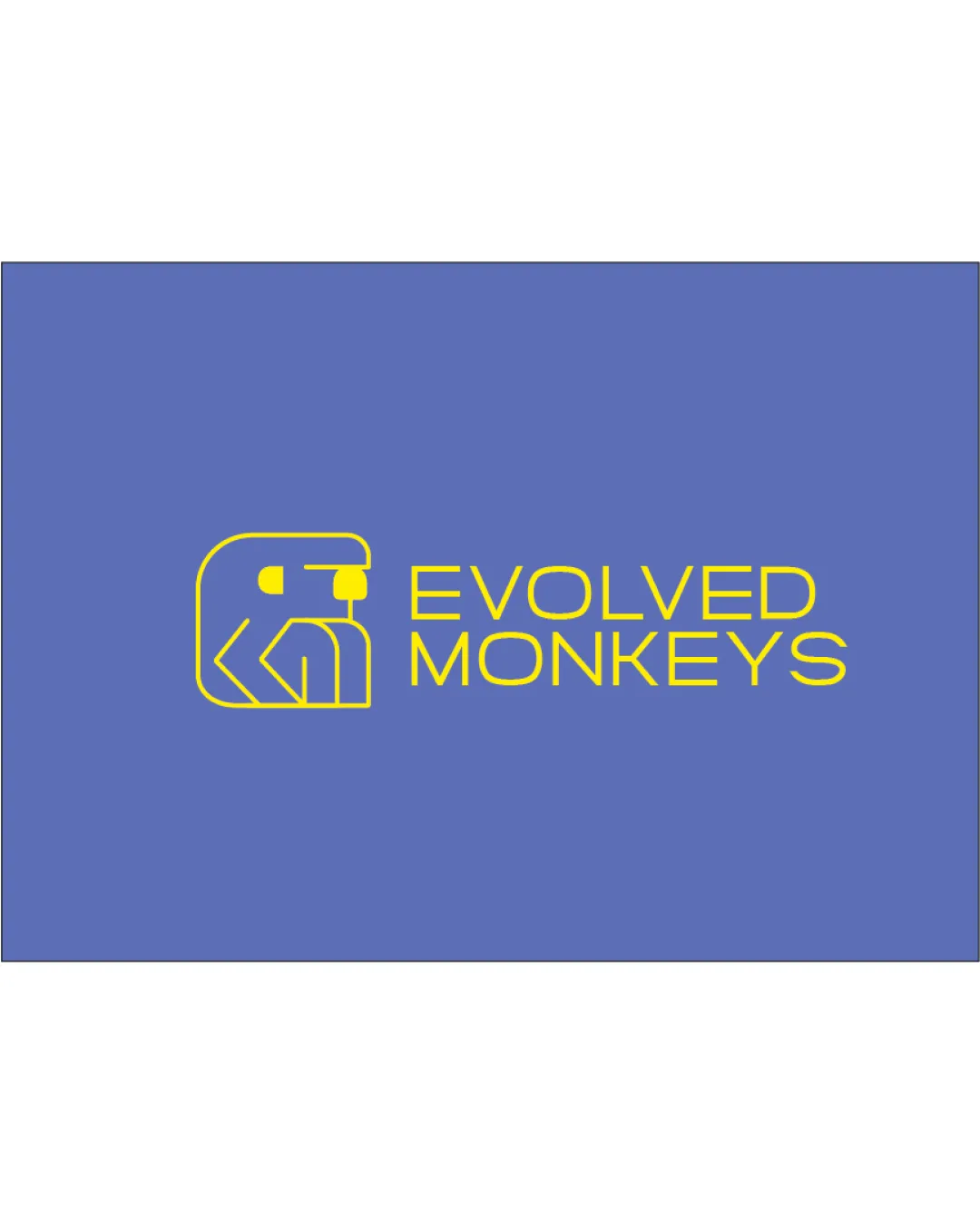
Try it Now!Logo review of EVOLVED MONKEYS
 Logo analysis by AI
Logo type:
Style:
Detected symbol:
Negative space:
Detected text:
Business industry:
Review requested by Neilsavio
**If AI can recognize or misinterpret it, so can people.
Structured logo review
Legibility
![]() Text is clear and easily readable against the background.
Text is clear and easily readable against the background.![]() Good contrast between yellow and blue enhances visibility.
Good contrast between yellow and blue enhances visibility.
![]() The rounded, all-caps geometric font may be slightly harder to read at very small sizes.
The rounded, all-caps geometric font may be slightly harder to read at very small sizes.
Scalability versatility
![]() Simple lines make the symbol recognizable at various sizes.
Simple lines make the symbol recognizable at various sizes.![]() Will reproduce well in digital formats and moderate print sizes.
Will reproduce well in digital formats and moderate print sizes.
![]() Thin lines may lose clarity on very small applications like favicons or embroidery.
Thin lines may lose clarity on very small applications like favicons or embroidery.![]() Low contrast or complex detail may hinder scaling for small merchandise or social avatars.
Low contrast or complex detail may hinder scaling for small merchandise or social avatars.
200x250 px
100×125 px
50×62 px
Balance alignment
![]() Symbol and text are horizontally aligned for a clean layout.
Symbol and text are horizontally aligned for a clean layout.![]() Positive spacing between icon and text.
Positive spacing between icon and text.
![]() Monkey symbol feels slightly heavier on the left, making the composition subtly unbalanced.
Monkey symbol feels slightly heavier on the left, making the composition subtly unbalanced.![]() Wordmark may appear disconnected from symbol due to lack of size hierarchy.
Wordmark may appear disconnected from symbol due to lack of size hierarchy.

Originality
![]() Geometric abstraction of a monkey face is unique and engaging.
Geometric abstraction of a monkey face is unique and engaging.![]() Negative space use is clever, creating facial features with minimal lines.
Negative space use is clever, creating facial features with minimal lines.
![]() The abstract geometric animal face approach is becoming more common in tech/startup circles.
The abstract geometric animal face approach is becoming more common in tech/startup circles.
Logomark wordmark fit
![]() Minimal geometric style is consistent between symbol and wordmark.
Minimal geometric style is consistent between symbol and wordmark.![]() Both elements use similar line weights and curvature, creating visual harmony.
Both elements use similar line weights and curvature, creating visual harmony.
![]() The thickness of the lines in the symbol could be better matched with the font weight for stronger unity.
The thickness of the lines in the symbol could be better matched with the font weight for stronger unity.
Aesthetic look
![]() Design is clean, modern, and visually appealing.
Design is clean, modern, and visually appealing.![]() Color choice is bold and energetic.
Color choice is bold and energetic.
![]() Feels slightly generic among modern minimalist tech logos.
Feels slightly generic among modern minimalist tech logos.![]() Could risk blending in with similar brands using line-art animal faces.
Could risk blending in with similar brands using line-art animal faces.
Dual meaning and misinterpretations
![]() No suggestive or inappropriate double meanings detected.
No suggestive or inappropriate double meanings detected.![]() Monkey face abstraction is clear and non-offensive.
Monkey face abstraction is clear and non-offensive.
Color harmony
![]() Limited to two contrasting, complementary colors for strong impact.
Limited to two contrasting, complementary colors for strong impact.![]() Colors foster youthful, energetic, and innovative associations.
Colors foster youthful, energetic, and innovative associations.
Yellow
#FFF200
Space Cadet
#5065AE