Wondering how your logo performs? 🧐
Get professional logo reviews in seconds and catch design issues in time.
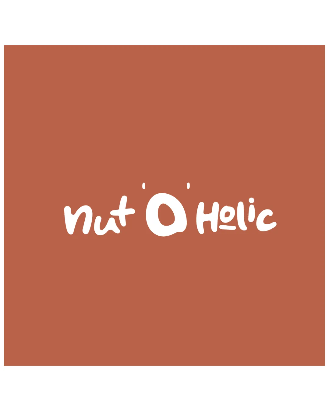
Try it Now!Logo review of nut O holic
 Logo analysis by AI
Logo type:
Style:
Detected symbol:
Detected text:
Business industry:
Review requested by Neilsavio
**If AI can recognize or misinterpret it, so can people.
Structured logo review
Legibility
![]() Text is generally easy to decipher despite the playful typeface.
Text is generally easy to decipher despite the playful typeface.![]() Oversized 'O' effectively stands out as a visual focal point.
Oversized 'O' effectively stands out as a visual focal point.
![]() Organic lettering style reduces recognition speed at a glance.
Organic lettering style reduces recognition speed at a glance.![]() The spacing and informal script could cause minor confusion especially with the word 'Holic' which appears almost lowercase.
The spacing and informal script could cause minor confusion especially with the word 'Holic' which appears almost lowercase.
Scalability versatility
![]() Simple design with consistent weight enhances reproduction on most media.
Simple design with consistent weight enhances reproduction on most media.![]() Should maintain visibility on store shelves, packaging, and larger print.
Should maintain visibility on store shelves, packaging, and larger print.
![]() Thin lines in some letterforms may be lost at very small scales (e.g., app icons, business cards).
Thin lines in some letterforms may be lost at very small scales (e.g., app icons, business cards).![]() Handwritten style might lose clarity or character on embroidery or embossed applications.
Handwritten style might lose clarity or character on embroidery or embossed applications.
200x250 px
100×125 px
50×62 px
Balance alignment
![]() Central oversized 'O' creates a strong visual axis anchoring the layout.
Central oversized 'O' creates a strong visual axis anchoring the layout.
![]() Letterforms on the left and right feel uneven in height and weight, generating slight imbalance.
Letterforms on the left and right feel uneven in height and weight, generating slight imbalance.![]() A more controlled baseline would improve professionalism without losing playfulness.
A more controlled baseline would improve professionalism without losing playfulness.

Originality
![]() Distinctive playful take with a large central 'O' that doubles as a product reference.
Distinctive playful take with a large central 'O' that doubles as a product reference.![]() Organic script style stands out from conventional geometric wordmarks.
Organic script style stands out from conventional geometric wordmarks.
![]() Handwritten scripts are not uncommon in food/snack branding.
Handwritten scripts are not uncommon in food/snack branding.![]() No negative space symbolism or deeper double-meaning.
No negative space symbolism or deeper double-meaning.
Aesthetic look
![]() Friendly, casual appearance suits a snack brand and grabs attention.
Friendly, casual appearance suits a snack brand and grabs attention.![]() Strong, simple color contrast.
Strong, simple color contrast.
![]() Overall look verges on amateurish due to irregular letter placement.
Overall look verges on amateurish due to irregular letter placement.![]() Visual execution could be refined for a sleeker brand image while retaining fun character.
Visual execution could be refined for a sleeker brand image while retaining fun character.
Dual meaning and misinterpretations
![]() No inappropriate shapes or connotations detected.
No inappropriate shapes or connotations detected.![]() Brand intent is clear.
Brand intent is clear.
Color harmony
![]() Limited palette of warm brown and white evokes nutty, earthy, wholesome associations.
Limited palette of warm brown and white evokes nutty, earthy, wholesome associations.![]() Good contrast between text and background.
Good contrast between text and background.
![]() Flat color scheme could feel dull or limiting if not paired with strong packaging visuals.
Flat color scheme could feel dull or limiting if not paired with strong packaging visuals.
Copper
#B76B4A
White
#FFFFFF