Wondering how your logo performs? 🧐
Get professional logo reviews in seconds and catch design issues in time.
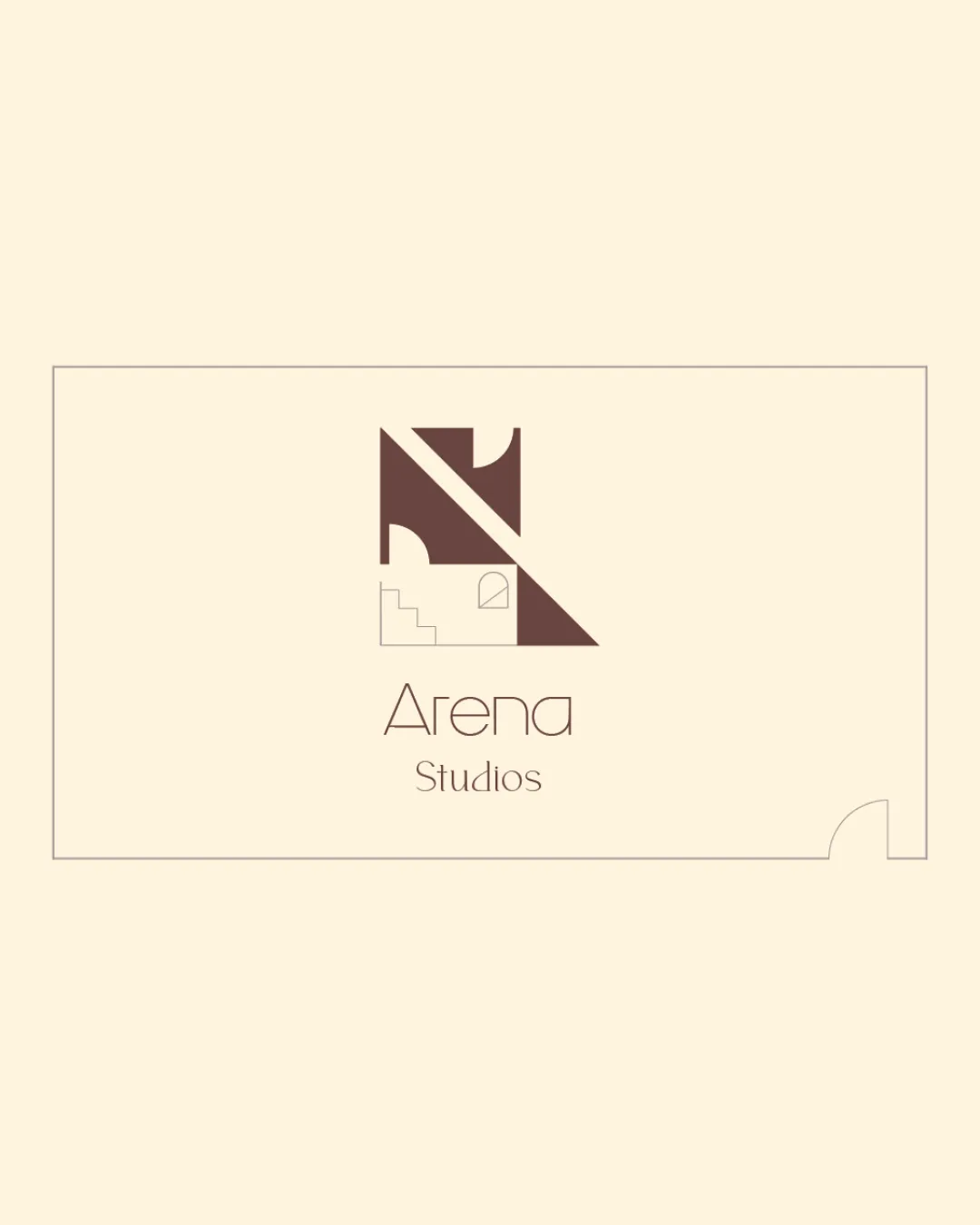
Try it Now!Logo review of Arena Studios
 Logo analysis by AI
Logo type:
Style:
Detected symbol:
Negative space:
Detected text:
Business industry:
Review requested by Neilsavio
**If AI can recognize or misinterpret it, so can people.
Structured logo review
Legibility
![]() The font is clean and modern, making 'Arena Studios' very easy to read.
The font is clean and modern, making 'Arena Studios' very easy to read.![]() Letter spacing and alignment support optimal legibility.
Letter spacing and alignment support optimal legibility.
Scalability versatility
![]() The symbol is quite geometric and simple, allowing for decent scalability.
The symbol is quite geometric and simple, allowing for decent scalability.![]() The thin lines in the text may look crisp on large prints like posters or signs.
The thin lines in the text may look crisp on large prints like posters or signs.
![]() Fine lines in the staircase and text could be lost at small sizes, such as on business cards, app icons, or embroidery.
Fine lines in the staircase and text could be lost at small sizes, such as on business cards, app icons, or embroidery.![]() The details of the window and stairs do not translate well to small-scale or low-res applications.
The details of the window and stairs do not translate well to small-scale or low-res applications.
200x250 px
100×125 px
50×62 px
Balance alignment
![]() The logo feels well-balanced with both the mark and the wordmark centered and proportionate.
The logo feels well-balanced with both the mark and the wordmark centered and proportionate.![]() The geometric forms and text arrangement support visual harmony.
The geometric forms and text arrangement support visual harmony.

Originality
![]() Architectural symbolism is integrated with geometric abstraction, setting it apart from generic architectural logos.
Architectural symbolism is integrated with geometric abstraction, setting it apart from generic architectural logos.![]() Use of negative space for stairs and a window adds a unique dimension.
Use of negative space for stairs and a window adds a unique dimension.
![]() Some structural motifs, like arches and stairs, are familiar in architectural branding, making the concept not entirely unprecedented.
Some structural motifs, like arches and stairs, are familiar in architectural branding, making the concept not entirely unprecedented.
Logomark wordmark fit
![]() Both the logomark and wordmark share a minimalist geometric style that feels cohesive.
Both the logomark and wordmark share a minimalist geometric style that feels cohesive.![]() Thin strokes in both design elements create a unified visual identity.
Thin strokes in both design elements create a unified visual identity.
Aesthetic look
![]() The minimalist color scheme and geometric forms are pleasing and contemporary.
The minimalist color scheme and geometric forms are pleasing and contemporary.![]() The design feels sleek and professional with no overcrowding.
The design feels sleek and professional with no overcrowding.
![]() Slight risk of the logo feeling cold or impersonal due to strict geometry and muted tones.
Slight risk of the logo feeling cold or impersonal due to strict geometry and muted tones.
Dual meaning and misinterpretations
![]() No inappropriate or ambiguous symbols present; architectural cues are clear and intentional.
No inappropriate or ambiguous symbols present; architectural cues are clear and intentional.
Color harmony
![]() Muted beige and mocha create a sophisticated and harmonious palette appropriate for architecture/design.
Muted beige and mocha create a sophisticated and harmonious palette appropriate for architecture/design.![]() Limited color usage promotes versatility and elegance.
Limited color usage promotes versatility and elegance.
Beige
#E8DFCB
Mocha
#6B4B3A