Wondering how your logo performs? 🧐
Get professional logo reviews in seconds and catch design issues in time.
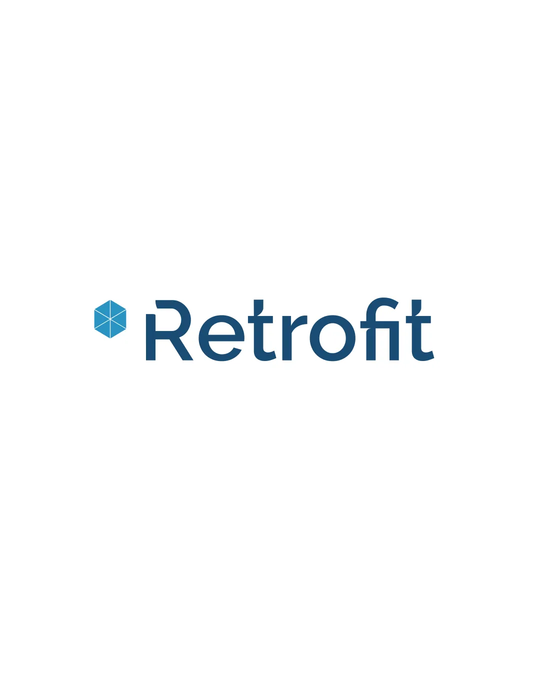
Try it Now!Logo review of Retrofit
 Logo analysis by AI
Logo type:
Style:
Detected symbol:
Detected text:
Business industry:
Review requested by Silaspitanga
**If AI can recognize or misinterpret it, so can people.
Structured logo review
Legibility
![]() Text is highly readable with clean, modern sans-serif typography.
Text is highly readable with clean, modern sans-serif typography.![]() Good spacing between letters enhances clarity.
Good spacing between letters enhances clarity.
Scalability versatility
![]() Clean lines and minimal detail ensure clarity at various scales.
Clean lines and minimal detail ensure clarity at various scales.![]() Symbol and text are clearly separable for use in app icons or avatars.
Symbol and text are clearly separable for use in app icons or avatars.
![]() Thin geometric lines within the hexagon could lose detail at very small sizes, such as favicons or embroidery.
Thin geometric lines within the hexagon could lose detail at very small sizes, such as favicons or embroidery.
200x250 px
100×125 px
50×62 px
Balance alignment
![]() Logo mark is well proportioned to the wordmark, sitting comfortably to the left.
Logo mark is well proportioned to the wordmark, sitting comfortably to the left.![]() Vertical alignment of symbol and text is harmonious.
Vertical alignment of symbol and text is harmonious.

Originality
![]() Hexagonal geometric symbol provides some uniqueness.
Hexagonal geometric symbol provides some uniqueness.![]() Typography is customized and modern.
Typography is customized and modern.
![]() Hexagon with geometric lines is a fairly common symbol in technology and engineering industries.
Hexagon with geometric lines is a fairly common symbol in technology and engineering industries.![]() No evident creative twist or dual meaning in the symbol.
No evident creative twist or dual meaning in the symbol.
Logomark wordmark fit
![]() Symbol’s geometric style aligns well with the clean, modern typeface.
Symbol’s geometric style aligns well with the clean, modern typeface.![]() Color palette is consistent throughout both elements.
Color palette is consistent throughout both elements.
Aesthetic look
![]() Simple and modern, with no clutter or unnecessary decoration.
Simple and modern, with no clutter or unnecessary decoration.![]() Color contrast is pleasant and contemporary.
Color contrast is pleasant and contemporary.
![]() Visual look is clean but leans slightly toward generic due to the ubiquity of hexagonal forms in tech.
Visual look is clean but leans slightly toward generic due to the ubiquity of hexagonal forms in tech.
Dual meaning and misinterpretations
![]() No inappropriate, confusing or unintended imagery present.
No inappropriate, confusing or unintended imagery present.![]() Symbol is abstract enough to avoid misinterpretation.
Symbol is abstract enough to avoid misinterpretation.
Color harmony
![]() Uses a constrained palette of blue and white for a professional look.
Uses a constrained palette of blue and white for a professional look.![]() Strong contrast between symbol/text and background.
Strong contrast between symbol/text and background.
Steel Blue
#2272A5
White
#FFFFFF