Wondering how your logo performs? 🧐
Get professional logo reviews in seconds and catch design issues in time.
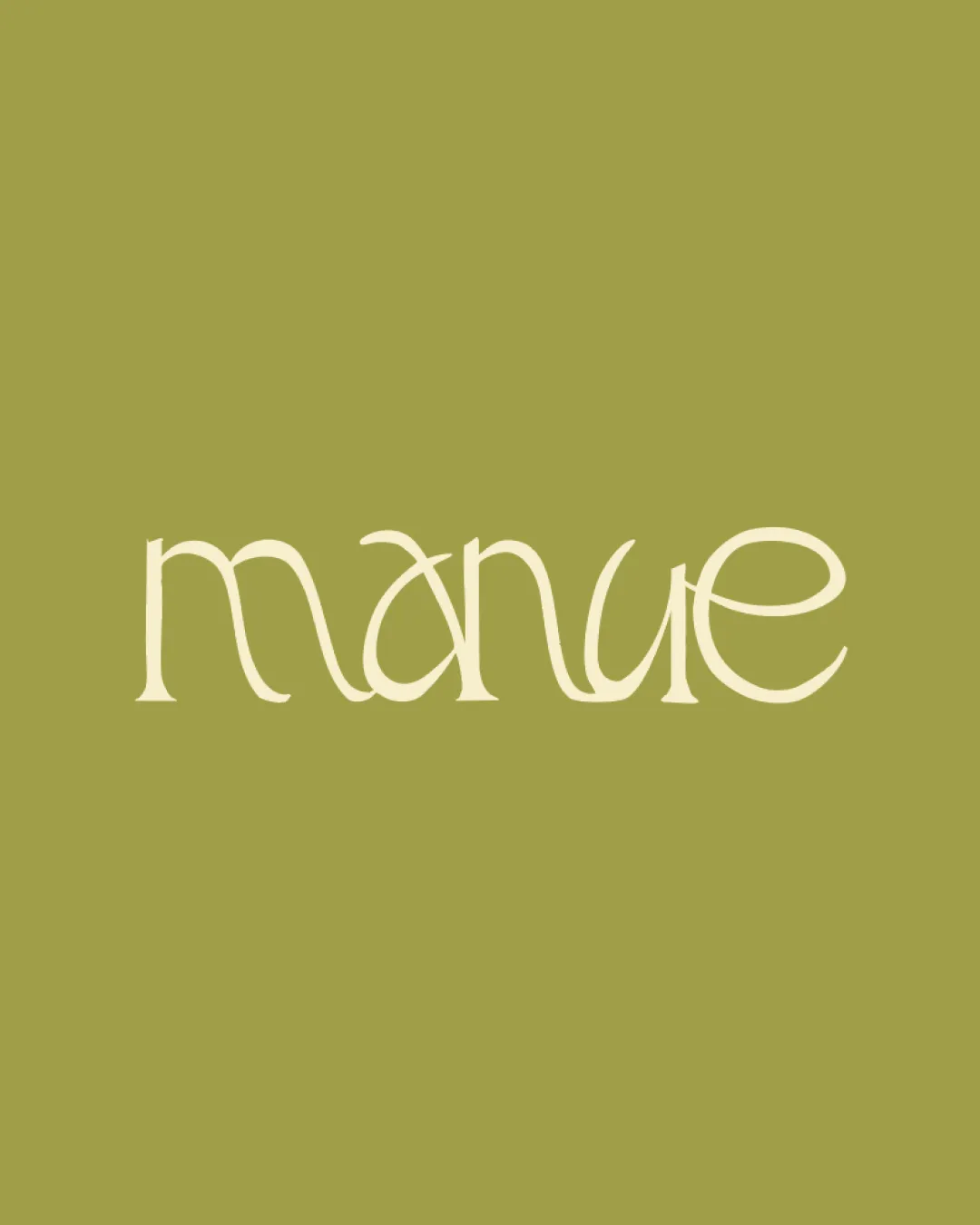
Try it Now!Logo review of manue
 Logo analysis by AI
Logo type:
Style:
Detected text:
Business industry:
Review requested by Wena
**If AI can recognize or misinterpret it, so can people.
Structured logo review
Legibility
![]() Unique typography may catch attention.
Unique typography may catch attention.
![]() Letterforms are overly stylized, making it difficult to read at a glance.
Letterforms are overly stylized, making it difficult to read at a glance.![]() Ambiguity between 'u' and 'n' could confuse viewers.
Ambiguity between 'u' and 'n' could confuse viewers.![]() Letter spacing creates awkward gaps that hurt definition.
Letter spacing creates awkward gaps that hurt definition.
Scalability versatility
![]() Single color could be versatile on flat backgrounds.
Single color could be versatile on flat backgrounds.![]() Distinct forms might stand out in larger applications such as posters or shop signs.
Distinct forms might stand out in larger applications such as posters or shop signs.
![]() Thin strokes make the logo hard to read when scaled down.
Thin strokes make the logo hard to read when scaled down.![]() Complex letter shapes will lose clarity in smaller uses like business cards or web icons.
Complex letter shapes will lose clarity in smaller uses like business cards or web icons.![]() Poor legibility makes embroidery or engraving very challenging.
Poor legibility makes embroidery or engraving very challenging.
200x250 px
100×125 px
50×62 px
Balance alignment
![]() Loose symmetry between the first and last letters gives a certain balance.
Loose symmetry between the first and last letters gives a certain balance.
![]() Letter heights and curves are inconsistent, leading to a jagged, unbalanced appearance.
Letter heights and curves are inconsistent, leading to a jagged, unbalanced appearance.![]() Irregular negative space and x-height disrupts overall alignment.
Irregular negative space and x-height disrupts overall alignment.

Originality
![]() Custom serif letterforms show originality.
Custom serif letterforms show originality.![]() Flowing lines create a visually distinctive logo.
Flowing lines create a visually distinctive logo.
![]() Originality comes at the cost of legibility.
Originality comes at the cost of legibility.![]() No negative space creativity used despite the opportunity in letter arrangement.
No negative space creativity used despite the opportunity in letter arrangement.
Aesthetic look
![]() Modern, whimsical serif style has an elegant personality.
Modern, whimsical serif style has an elegant personality.![]() Limited palette keeps the design uncluttered.
Limited palette keeps the design uncluttered.
![]() Imbalanced proportions give a slightly amateur impression.
Imbalanced proportions give a slightly amateur impression.![]() Letter manipulation makes the construction feel unresolved rather than harmonious.
Letter manipulation makes the construction feel unresolved rather than harmonious.
Dual meaning and misinterpretations
![]() No inappropriate symbols or unintended readings detected.
No inappropriate symbols or unintended readings detected.
Color harmony
![]() Earthy, harmonious combination between text and background.
Earthy, harmonious combination between text and background.![]() Consistent monochromatic style avoids contrast issues.
Consistent monochromatic style avoids contrast issues.
![]() Color pairing feels safe and doesn't stand out; could benefit from a touch more contrast for readability.
Color pairing feels safe and doesn't stand out; could benefit from a touch more contrast for readability.
Bone
#CFC49F
Olive Green
#A29D49