Wondering how your logo performs? 🧐
Get professional logo reviews in seconds and catch design issues in time.
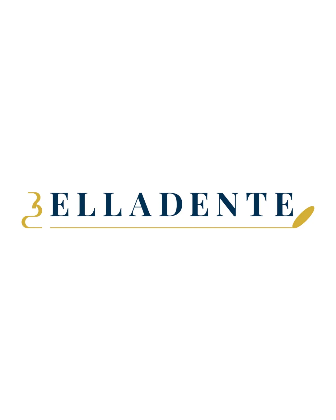
Try it Now!Logo review of ELLADENTE
 Logo analysis by AI
Logo type:
Style:
Detected symbol:
Detected text:
Business industry:
Review requested by Auliyyaz.9
**If AI can recognize or misinterpret it, so can people.
Structured logo review
Legibility
![]() The serif typeface is clear and readable in all caps.
The serif typeface is clear and readable in all caps.![]() Color contrast ensures visibility against a light background.
Color contrast ensures visibility against a light background.
Scalability versatility
![]() Simple shapes and minimal details aid reproduction at smaller scales.
Simple shapes and minimal details aid reproduction at smaller scales.![]() Can adapt well across business cards, menus, restaurant signage, and web.
Can adapt well across business cards, menus, restaurant signage, and web.
![]() The fine gold underline and left curly bracket may lose clarity at very small sizes (e.g., favicon, small labels).
The fine gold underline and left curly bracket may lose clarity at very small sizes (e.g., favicon, small labels).![]() The brush/spoon tip might blur on embroidery or tiny applications.
The brush/spoon tip might blur on embroidery or tiny applications.
200x250 px
100×125 px
50×62 px
Balance alignment
![]() The underline unifies the composition and gives structure.
The underline unifies the composition and gives structure.![]() Wordmark is horizontally centered, providing overall balance.
Wordmark is horizontally centered, providing overall balance.
![]() The heavy curly bracket at left pulls the weight off-center.
The heavy curly bracket at left pulls the weight off-center.![]() The decorative underline ending in a thick spoon causes slight visual imbalance to the right.
The decorative underline ending in a thick spoon causes slight visual imbalance to the right.

Originality
![]() Creative integration of a curly bracket and underline as visual elements.
Creative integration of a curly bracket and underline as visual elements.![]() Spoon/brush tip adds a unique touch signifying food.
Spoon/brush tip adds a unique touch signifying food.
![]() Curly bracket as a symbol is not highly distinctive and can be seen in other logos.
Curly bracket as a symbol is not highly distinctive and can be seen in other logos.![]() General composition feels safe rather than innovative.
General composition feels safe rather than innovative.
Logomark wordmark fit
![]() Spoon/brush underline complements the refined serif font.
Spoon/brush underline complements the refined serif font.![]() Color coordination between mark and type supports unity.
Color coordination between mark and type supports unity.
Aesthetic look
![]() Minimal color palette is visually appealing.
Minimal color palette is visually appealing.![]() Typography choice provides a premium, refined look.
Typography choice provides a premium, refined look.![]() Design is clean and professional.
Design is clean and professional.
![]() Curly bracket could be misinterpreted or seen as slightly out of context to the right audience.
Curly bracket could be misinterpreted or seen as slightly out of context to the right audience.
Dual meaning and misinterpretations
![]() No inappropriate forms or unintended negative meanings detected.
No inappropriate forms or unintended negative meanings detected.
Color harmony
![]() Color palette is harmonious, limited to two main tones with high elegance.
Color palette is harmonious, limited to two main tones with high elegance.![]() Gold and blue create a sophisticated, calm look without overwhelming the viewer.
Gold and blue create a sophisticated, calm look without overwhelming the viewer.
Biscay
#19344D
Gold
#D7B24A
White
#FFFFFF