Wondering how your logo performs? 🧐
Get professional logo reviews in seconds and catch design issues in time.
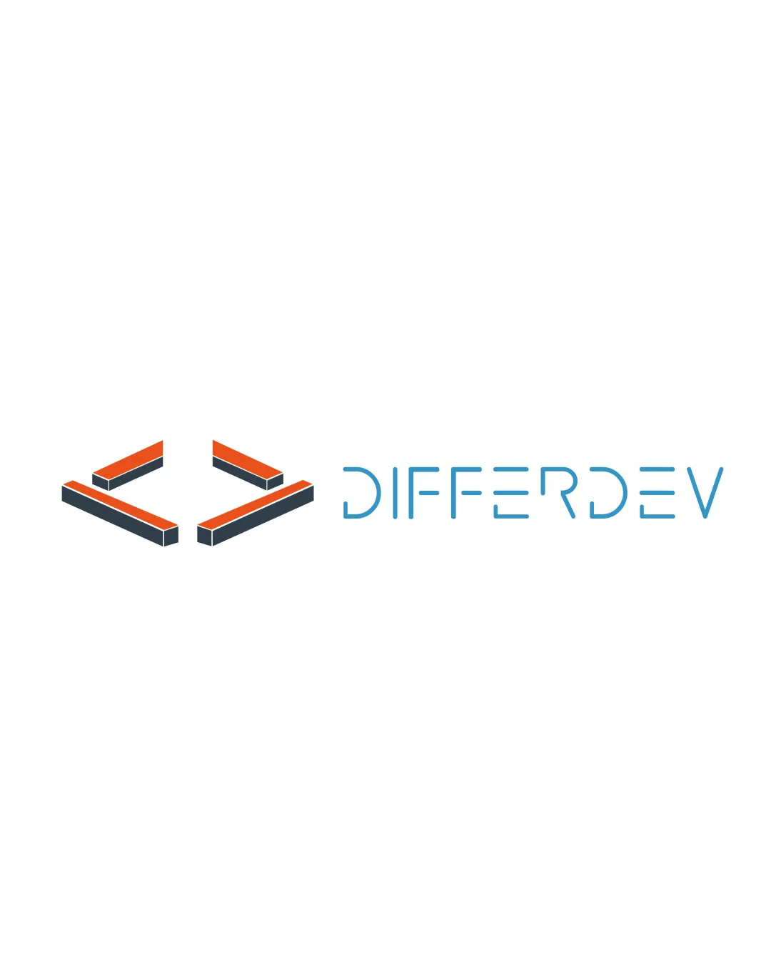
Try it Now!Logo review of DIFFERDEV
 Logo analysis by AI
Logo type:
Style:
Detected symbol:
Negative space:
Detected text:
Business industry:
Review requested by Silaspitanga
**If AI can recognize or misinterpret it, so can people.
Structured logo review
Legibility
![]() Text is clean and sufficiently spaced.
Text is clean and sufficiently spaced.![]() Distinct letterforms allow easy reading.
Distinct letterforms allow easy reading.
![]() Some custom letterforms, particularly the 'E's and 'D,' may slightly hinder instant recognition for unfamiliar viewers.
Some custom letterforms, particularly the 'E's and 'D,' may slightly hinder instant recognition for unfamiliar viewers.
Scalability versatility
![]() Stacked lines are bold enough to retain visibility at smaller scales.
Stacked lines are bold enough to retain visibility at smaller scales.![]() Works for digital applications, signage, and print collateral.
Works for digital applications, signage, and print collateral.
![]() 3D effect on brackets may lose detail in very small sizes, such as a favicon or embroidery on apparel.
3D effect on brackets may lose detail in very small sizes, such as a favicon or embroidery on apparel.![]() The logomark may visually collapse at tiny scales due to parallel lines.
The logomark may visually collapse at tiny scales due to parallel lines.
200x250 px
100×125 px
50×62 px
Balance alignment
![]() Good spatial relationship between logomark and wordmark.
Good spatial relationship between logomark and wordmark.![]() Logo feels generally well-weighted horizontally.
Logo feels generally well-weighted horizontally.
![]() Minor imbalance as the logomark visually outweighs the thinner wordmark; a slightly bolder font could improve harmony.
Minor imbalance as the logomark visually outweighs the thinner wordmark; a slightly bolder font could improve harmony.

Originality
![]() Isometric brackets put a fresh twist on the common coding bracket icon.
Isometric brackets put a fresh twist on the common coding bracket icon.![]() Wordmark uses customized letters, adding brand personality.
Wordmark uses customized letters, adding brand personality.
![]() Brackets are a standard symbol for development and are heavily used in tech logos.
Brackets are a standard symbol for development and are heavily used in tech logos.
Logomark wordmark fit
![]() Both elements embrace sharp angles and geometric shapes for visual unity.
Both elements embrace sharp angles and geometric shapes for visual unity.
![]() Logomark is heavy and dramatic, while wordmark is delicate and minimal, causing a disconnect in visual weight and presence.
Logomark is heavy and dramatic, while wordmark is delicate and minimal, causing a disconnect in visual weight and presence.
Aesthetic look
![]() Modern and sleek isometric effect.
Modern and sleek isometric effect.![]() Color palette is sophisticated and tech-oriented.
Color palette is sophisticated and tech-oriented.
![]() Slightly busy due to isometric shading, which can feel unnecessary in some applications.
Slightly busy due to isometric shading, which can feel unnecessary in some applications.![]() Could feel dated if isometric trends fade.
Could feel dated if isometric trends fade.
Dual meaning and misinterpretations
![]() No inappropriate or accidental imagery detected.
No inappropriate or accidental imagery detected.![]() Brackets universally read as a coding/developer reference.
Brackets universally read as a coding/developer reference.
Color harmony
![]() Limited palette with excellent contrast between orange, blue, and dark gray.
Limited palette with excellent contrast between orange, blue, and dark gray.![]() Colors complement the tech/software industry.
Colors complement the tech/software industry.
Orange
#EE5731
Dark Gray
#2D3437
Blue
#42A2C2
White
#FFFFFF