Wondering how your logo performs? 🧐
Get professional logo reviews in seconds and catch design issues in time.
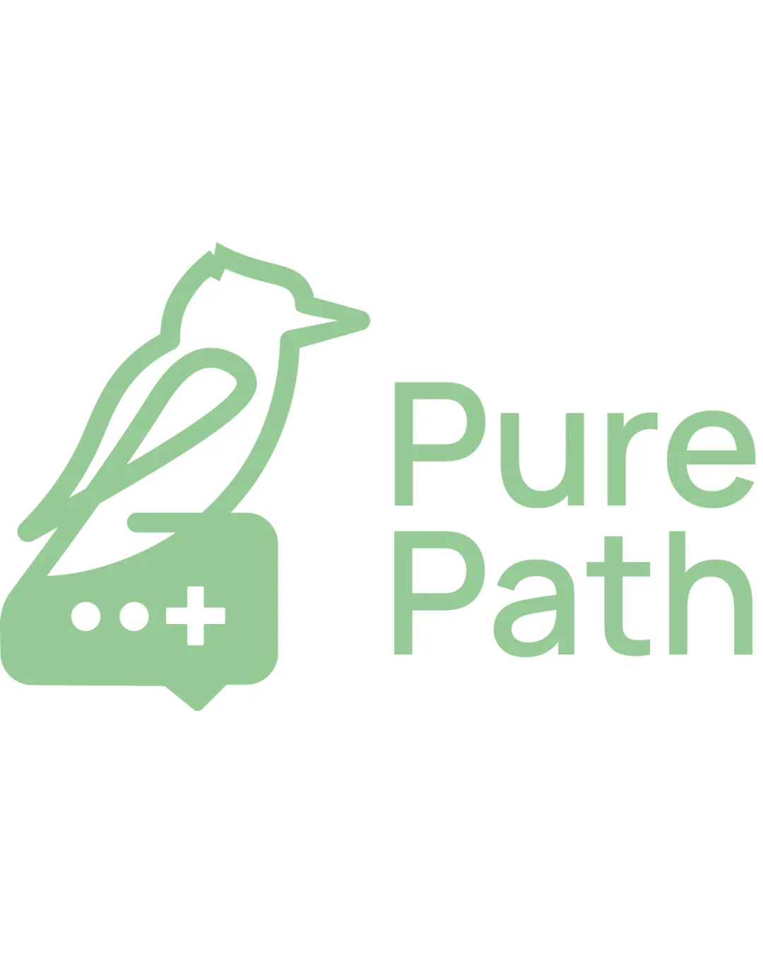
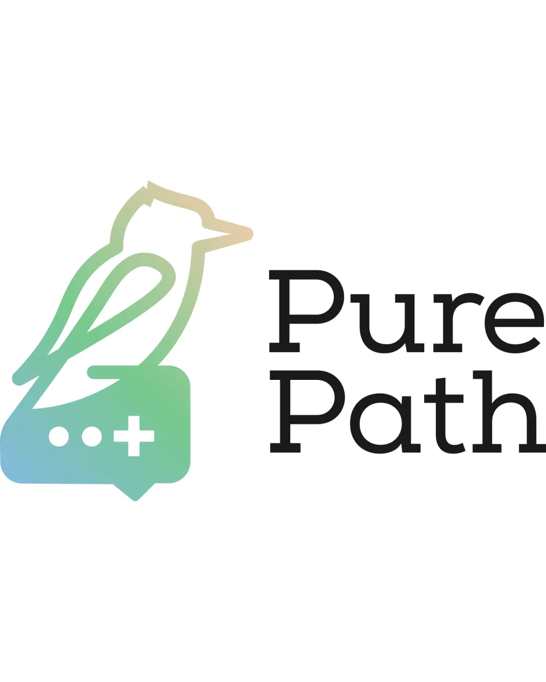
Try it Now!Logo review of Pure Path
 Logo analysis by AI
Logo type:
Style:
Detected symbol:
Negative space:
Detected text:
Business industry:
Review requested by Abdouker
**If AI can recognize or misinterpret it, so can people.
Structured logo review
Legibility
![]() Clear and highly readable sans-serif text.
Clear and highly readable sans-serif text.![]() Excellent spacing and size balance between 'Pure' and 'Path.'
Excellent spacing and size balance between 'Pure' and 'Path.'
Scalability versatility
![]() Symbol is minimal and should hold up well at moderate sizes.
Symbol is minimal and should hold up well at moderate sizes.![]() Design is relatively clean for digital applications.
Design is relatively clean for digital applications.
![]() Gradient outline may lose visibility or detail at small sizes.
Gradient outline may lose visibility or detail at small sizes.![]() Thin lines in the bird may not reproduce well on embroidery or very small favicons.
Thin lines in the bird may not reproduce well on embroidery or very small favicons.![]() Medical cross and ellipsis details could become hard to distinguish at tiny scales.
Medical cross and ellipsis details could become hard to distinguish at tiny scales.
200x250 px
100×125 px
50×62 px
Balance alignment
![]() Thoughtful alignment between logo mark and wordmark.
Thoughtful alignment between logo mark and wordmark.![]() Proportional sizing helps with balance and visual stability.
Proportional sizing helps with balance and visual stability.
![]() Bird and speech bubble ensemble feels slightly lighter than bold black text, causing a mild imbalance.
Bird and speech bubble ensemble feels slightly lighter than bold black text, causing a mild imbalance.

Originality
![]() Creative blend of bird, speech bubble, and medical cross is unusual and bespoke.
Creative blend of bird, speech bubble, and medical cross is unusual and bespoke.![]() Gradient color approach adds a contemporary twist.
Gradient color approach adds a contemporary twist.
![]() Speech bubble and cross are widely used healthcare symbols, introducing a touch of generic feel.
Speech bubble and cross are widely used healthcare symbols, introducing a touch of generic feel.![]() Lettermark lacks distinctive custom work.
Lettermark lacks distinctive custom work.
Logomark wordmark fit
![]() Good relationship and proportionality between logomark and wordmark.
Good relationship and proportionality between logomark and wordmark.![]() Complementary styles—clean sans-serif text versus smooth outline.
Complementary styles—clean sans-serif text versus smooth outline.
![]() Slight mismatch in visual weight; gradient outline feels lighter than solid text.
Slight mismatch in visual weight; gradient outline feels lighter than solid text.![]() More cohesion could be achieved by echoing color or gradient in the wordmark.
More cohesion could be achieved by echoing color or gradient in the wordmark.
Aesthetic look
![]() Modern, visually appealing minimalist aesthetic.
Modern, visually appealing minimalist aesthetic.![]() Gradient brings fresh, calming feel appropriate for healthcare.
Gradient brings fresh, calming feel appropriate for healthcare.![]() Linework feels precise and intentional.
Linework feels precise and intentional.
![]() Gradient could be distracting in print or monochrome applications.
Gradient could be distracting in print or monochrome applications.![]() Complexity from multiple symbol elements (bird, bubble, cross, ellipsis) makes it slightly busier than optimal.
Complexity from multiple symbol elements (bird, bubble, cross, ellipsis) makes it slightly busier than optimal.
Dual meaning and misinterpretations
![]() No inappropriate or confusing secondary shapes detected.
No inappropriate or confusing secondary shapes detected.![]() All visual elements support the healthcare and communication themes.
All visual elements support the healthcare and communication themes.
Color harmony
![]() Well-blended cool gradient conveys health and calmness.
Well-blended cool gradient conveys health and calmness.![]() Contrast to the black type improves legibility and modernity.
Contrast to the black type improves legibility and modernity.
![]() Gradients can present consistency and printing issues.
Gradients can present consistency and printing issues.![]() Wordmark and icon could be harmonized with subtle hint of color matching.
Wordmark and icon could be harmonized with subtle hint of color matching.
light turquoise
#BFD6B2
mint green
#82C7B7
light blue
#83BDE0
black
#000000