Wondering how your logo performs? 🧐
Get professional logo reviews in seconds and catch design issues in time.
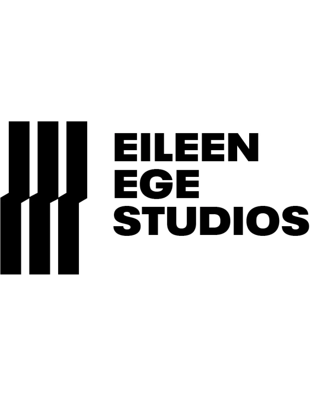
Try it Now!Logo review of EILEEN EGE STUDIOS
 Logo analysis by AI
Logo type:
Style:
Detected symbol:
Detected text:
Business industry:
Review requested by TiffySoso
**If AI can recognize or misinterpret it, so can people.
Structured logo review
Legibility
![]() Text is clear, bold, and highly readable.
Text is clear, bold, and highly readable.![]() Consistent use of uppercase sans-serif type ensures clarity at any size.
Consistent use of uppercase sans-serif type ensures clarity at any size.
Scalability versatility
![]() Simple, bold forms ensure readability and recognition at small and large sizes.
Simple, bold forms ensure readability and recognition at small and large sizes.![]() Works for signage, letterhead, apparel, and digital platforms.
Works for signage, letterhead, apparel, and digital platforms.
![]() Thicker lines may lose detail if reduced to very small sizes, such as app favicons.
Thicker lines may lose detail if reduced to very small sizes, such as app favicons.![]() Contrast between symbol and type may not stand out on darker backgrounds without color adaptation.
Contrast between symbol and type may not stand out on darker backgrounds without color adaptation.
200x250 px
100×125 px
50×62 px
Balance alignment
![]() Vertical alignment between the symbol and stacked text feels intentional and strong.
Vertical alignment between the symbol and stacked text feels intentional and strong.![]() Spacing between logomark and wordmark prevents clutter.
Spacing between logomark and wordmark prevents clutter.
![]() The left-heavy symbol can feel slightly dominant compared to the text block.
The left-heavy symbol can feel slightly dominant compared to the text block.![]() A minor imbalance as the visual weight is heavier on the left.
A minor imbalance as the visual weight is heavier on the left.

Originality
![]() Simple geometric bars convey a contemporary, professional tone.
Simple geometric bars convey a contemporary, professional tone.![]() Diagonal cuts add subtle uniqueness.
Diagonal cuts add subtle uniqueness.
![]() Vertical bars are a fairly common motif and could feel generic without further context or industry relatability.
Vertical bars are a fairly common motif and could feel generic without further context or industry relatability.![]() Lacks a unique visual metaphor connecting directly to creative fields.
Lacks a unique visual metaphor connecting directly to creative fields.
Logomark wordmark fit
![]() Both logomark and wordmark share a bold, geometric aesthetic.
Both logomark and wordmark share a bold, geometric aesthetic.![]() The styles complement each other with cohesive thickness.
The styles complement each other with cohesive thickness.
![]() The boxed symbol could integrate better if the text had matching or echoing angles.
The boxed symbol could integrate better if the text had matching or echoing angles.
Aesthetic look
![]() Minimalism and boldness create a memorable first impression.
Minimalism and boldness create a memorable first impression.![]() Straight lines and angles are clean and modern.
Straight lines and angles are clean and modern.
![]() The strict geometric approach is visually safe and could be pushed further for greater uniqueness.
The strict geometric approach is visually safe and could be pushed further for greater uniqueness.
Dual meaning and misinterpretations
![]() The mark avoids inappropriate or ambiguous visual meanings.
The mark avoids inappropriate or ambiguous visual meanings.
Color harmony
![]() Monochrome palette offers optimal contrast and timelessness.
Monochrome palette offers optimal contrast and timelessness.![]() Easy adaptability to different media and backgrounds.
Easy adaptability to different media and backgrounds.
Black
#000000
White
#FFFFFF