Wondering how your logo performs? 🧐
Get professional logo reviews in seconds and catch design issues in time.
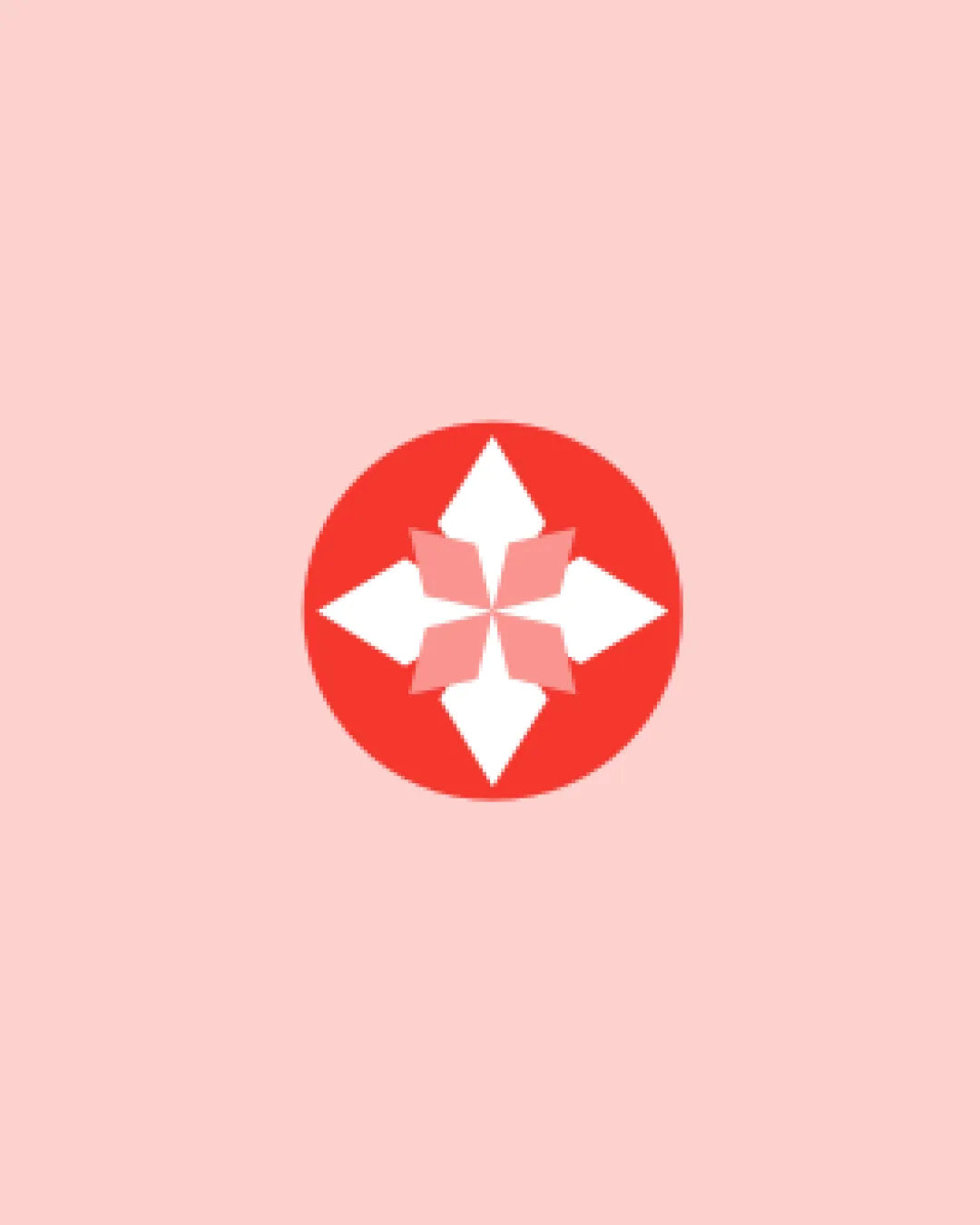
Try it Now!Logo review of geometric flower or starburst within a circle
 Logo analysis by AI
Logo type:
Style:
Detected symbol:
Negative space:
Business industry:
Review requested by PTMarble
**If AI can recognize or misinterpret it, so can people.
Structured logo review
Scalability versatility
![]() Simple geometric shapes maintain clarity at many sizes.
Simple geometric shapes maintain clarity at many sizes.![]() Flat design ensures the logo prints well in monochrome.
Flat design ensures the logo prints well in monochrome.
![]() Thin internal shapes may become indistinct at very small scales, such as favicon sizes.
Thin internal shapes may become indistinct at very small scales, such as favicon sizes.![]() Some subtle details could be lost in embroidery or small merchandise.
Some subtle details could be lost in embroidery or small merchandise.
200x250 px
100×125 px
50×62 px
Balance alignment
![]() Strong radial symmetry gives the logo an impeccably balanced presence.
Strong radial symmetry gives the logo an impeccably balanced presence.![]() Central alignment is precise and eye-catching.
Central alignment is precise and eye-catching.

Originality
![]() Radial geometric approach has aesthetic appeal and potential brand uniqueness.
Radial geometric approach has aesthetic appeal and potential brand uniqueness.
![]() Mark resembles generic compass rose or floral shapes commonly used in a variety of industries.
Mark resembles generic compass rose or floral shapes commonly used in a variety of industries.![]() No distinct elements that would make this immediately ownable or memorable.
No distinct elements that would make this immediately ownable or memorable.
Aesthetic look
![]() Color palette is pleasing and harmonious with good contrast.
Color palette is pleasing and harmonious with good contrast.![]() Minimalist style is modern and professional.
Minimalist style is modern and professional.
![]() Generic appearance could be seen as uninspired for a competitive brand.
Generic appearance could be seen as uninspired for a competitive brand.
Dual meaning and misinterpretations
![]() No overtly inappropriate or confusing symbols.
No overtly inappropriate or confusing symbols.![]() Composition remains abstract but clear.
Composition remains abstract but clear.
Color harmony
![]() Excellent control of palette with only 2-3 tones.
Excellent control of palette with only 2-3 tones.![]() Strong contrast between red, white, and pink.
Strong contrast between red, white, and pink.
Red
#F53F3F
Light Pink
#FFD6D6
White
#FFFFFF