Wondering how your logo performs? 🧐
Get professional logo reviews in seconds and catch design issues in time.
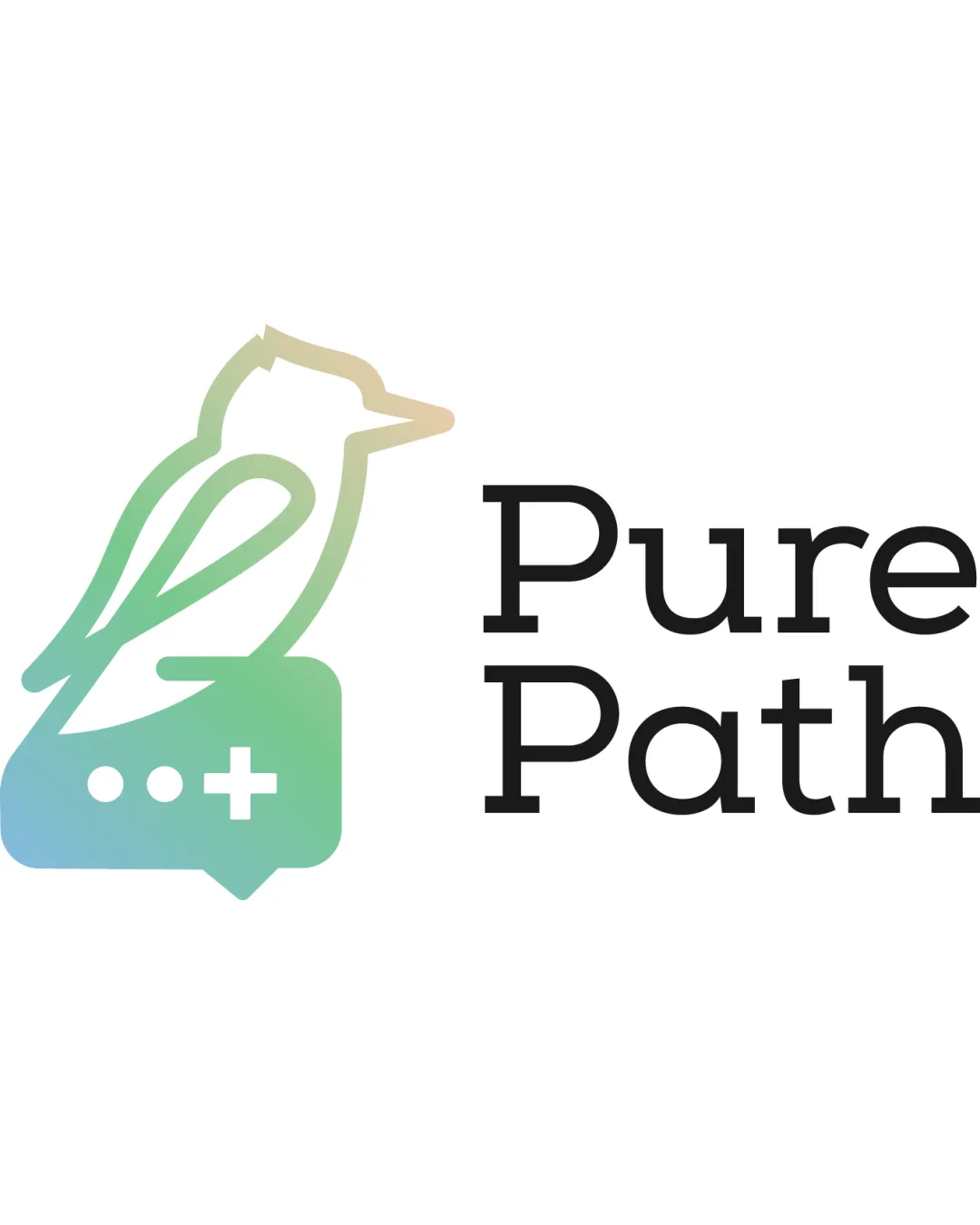
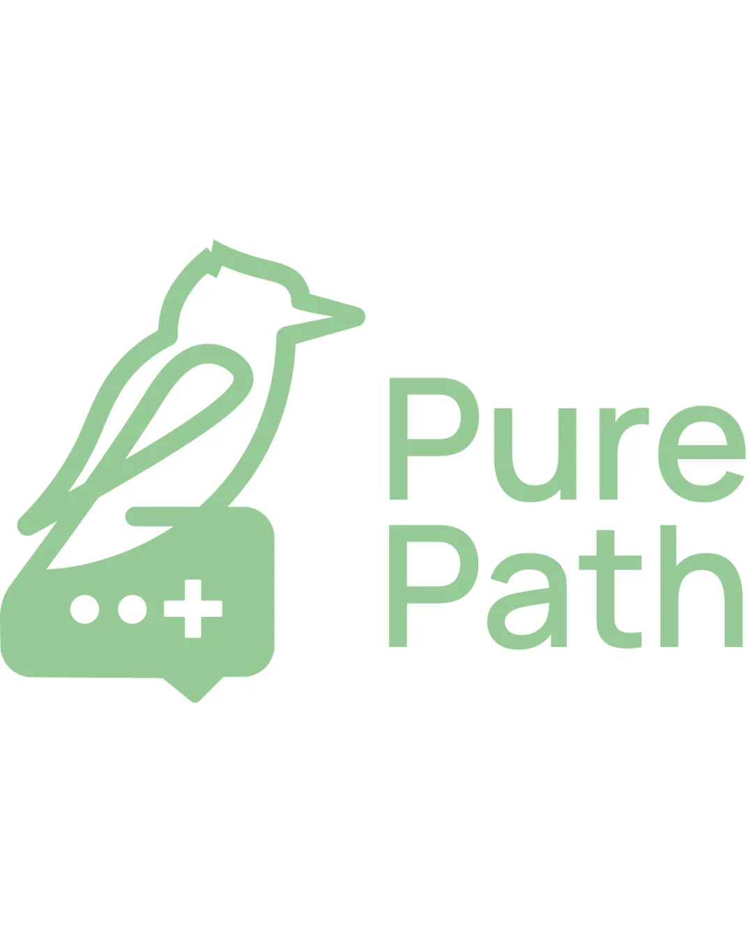
Try it Now!Logo review of Pure Path
 Logo analysis by AI
Logo type:
Style:
Detected symbol:
Negative space:
Detected text:
Business industry:
Review requested by Abdouker
**If AI can recognize or misinterpret it, so can people.
Structured logo review
Legibility
![]() Clear sans-serif typeface with excellent readability
Clear sans-serif typeface with excellent readability![]() Strong contrast with the white background
Strong contrast with the white background
Scalability versatility
![]() Simple line-based symbol supports medium and large-scale use
Simple line-based symbol supports medium and large-scale use![]() Minimal details allow for reasonable reduction in size
Minimal details allow for reasonable reduction in size
![]() Thin outlines and small details (chat bubble elements) may disappear or lose clarity at favicon or icon scale
Thin outlines and small details (chat bubble elements) may disappear or lose clarity at favicon or icon scale![]() The logo may not embroider well on clothing due to thin linework
The logo may not embroider well on clothing due to thin linework
200x250 px
100×125 px
50×62 px
Balance alignment
![]() Balanced visual weight between symbol and wordmark
Balanced visual weight between symbol and wordmark![]() Even vertical alignment of icon and text elements
Even vertical alignment of icon and text elements
![]() The icon is visually heavier on the left, creating slight imbalance in certain layouts compared to the lighter wordmark
The icon is visually heavier on the left, creating slight imbalance in certain layouts compared to the lighter wordmark

Originality
![]() Creative merging of bird, chat bubble, and medical cross conveys multilayered industry relevance
Creative merging of bird, chat bubble, and medical cross conveys multilayered industry relevance![]() Effective use of negative space for the bird shape
Effective use of negative space for the bird shape
![]() Birds and medical crosses are somewhat common symbols; combination is clever but not groundbreaking
Birds and medical crosses are somewhat common symbols; combination is clever but not groundbreaking
Logomark wordmark fit
![]() Both logomark and wordmark share a similar stroke weight and minimal style, creating harmony
Both logomark and wordmark share a similar stroke weight and minimal style, creating harmony
![]() Logomark feels slightly bolder than the wordmark, creating a minor hierarchy imbalance
Logomark feels slightly bolder than the wordmark, creating a minor hierarchy imbalance
Aesthetic look
![]() Minimalist and modern aesthetic
Minimalist and modern aesthetic![]() Clean and professional appearance
Clean and professional appearance
![]() Single-color approach limits brand depth
Single-color approach limits brand depth![]() May appear overly sterile or generic for some applications
May appear overly sterile or generic for some applications
Dual meaning and misinterpretations
![]() No inappropriate or ambiguous shapes detected in the symbol
No inappropriate or ambiguous shapes detected in the symbol
Color harmony
![]() Consistent use of light green creates a clean, calm appearance appropriate for healthcare
Consistent use of light green creates a clean, calm appearance appropriate for healthcare![]() Good contrast with a white background
Good contrast with a white background
![]() Monochrome color use could feel bland on certain backgrounds or in print
Monochrome color use could feel bland on certain backgrounds or in print
Light Green
#A6D8A8
White
#FFFFFF