Wondering how your logo performs? 🧐
Get professional logo reviews in seconds and catch design issues in time.
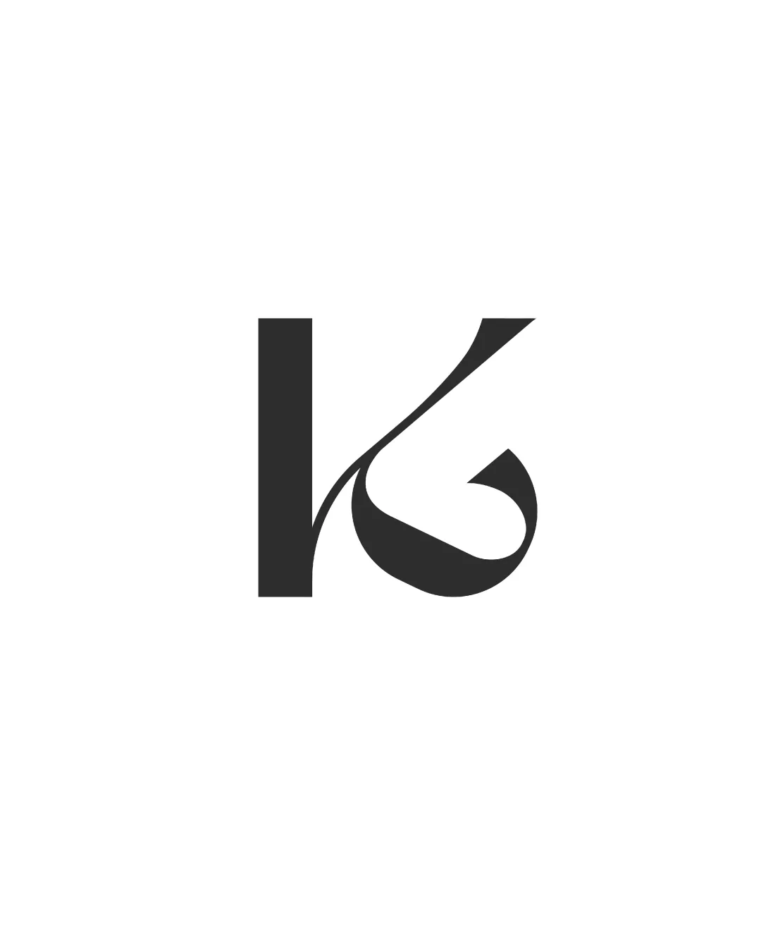
Try it Now!Logo review of K or G
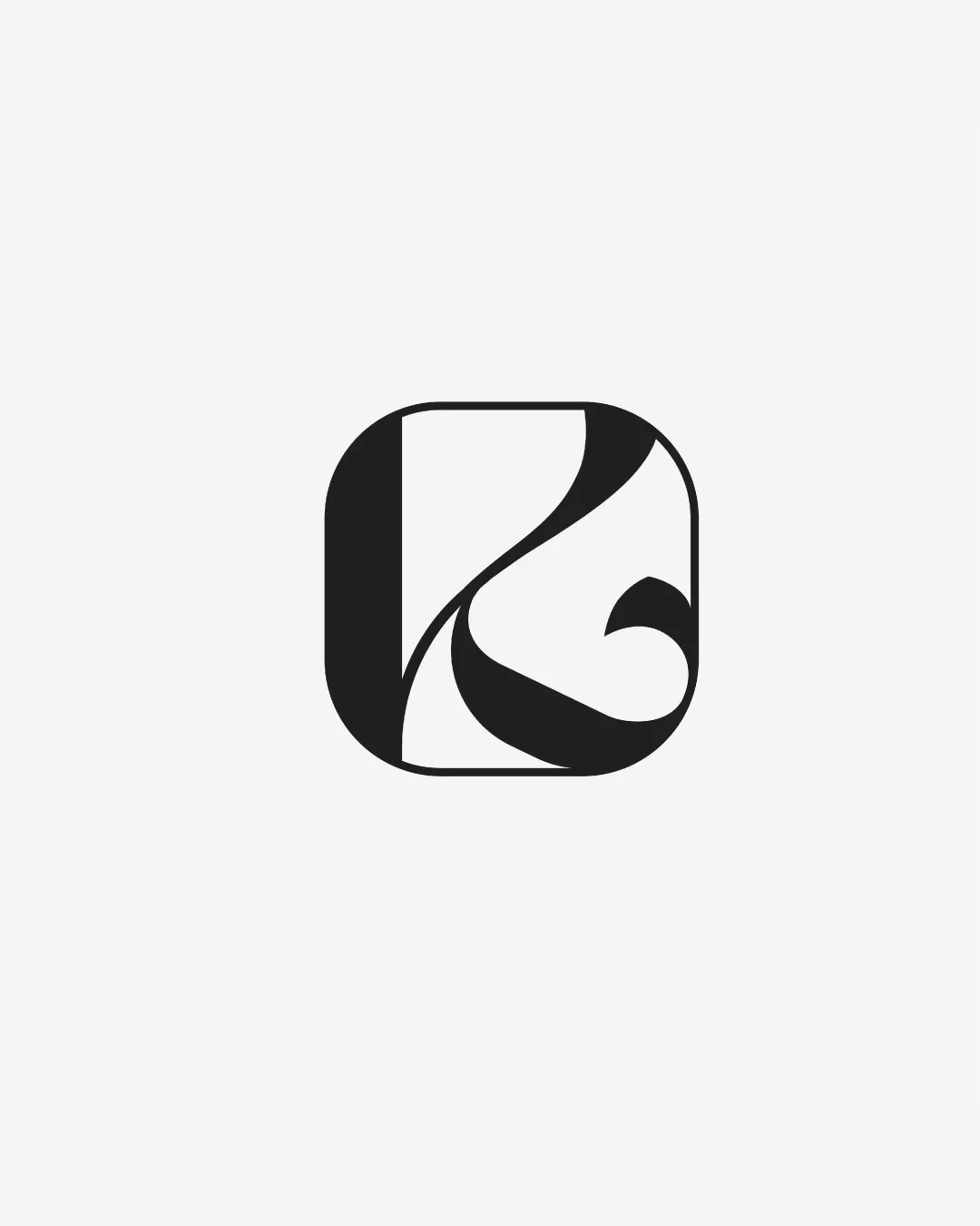
 Logo analysis by AI
Logo type:
Style:
Detected symbol:
Negative space:
Detected text:
Business industry:
Review requested by Emra
**If AI can recognize or misinterpret it, so can people.
Structured logo review
Scalability versatility
![]() Bold, simple forms ensure readability at small sizes.
Bold, simple forms ensure readability at small sizes.![]() Works well as an app icon and can be embossed on tech devices or printed on various media.
Works well as an app icon and can be embossed on tech devices or printed on various media.
![]() Fine lines and thin-to-thick transitions may lose clarity when reduced to extremely small sizes, such as tiny favicons or intricate embroidery.
Fine lines and thin-to-thick transitions may lose clarity when reduced to extremely small sizes, such as tiny favicons or intricate embroidery.
200x250 px
100×125 px
50×62 px
Balance alignment
![]() Centralized symbol with consistent rounded corners delivers a stable appearance.
Centralized symbol with consistent rounded corners delivers a stable appearance.![]() Negative and positive spaces balanced.
Negative and positive spaces balanced.
![]() The heavy lower right section can make the overall logo feel bottom-heavy, reducing feeling of equilibrium slightly.
The heavy lower right section can make the overall logo feel bottom-heavy, reducing feeling of equilibrium slightly.

Originality
![]() Monogram integration is creative.
Monogram integration is creative.![]() Stylized letter with dynamic flow stands out among typical geometric icons.
Stylized letter with dynamic flow stands out among typical geometric icons.
![]() Still reminiscent of some monogram-based app icons, not entirely groundbreaking in overall approach.
Still reminiscent of some monogram-based app icons, not entirely groundbreaking in overall approach.
Aesthetic look
![]() Clean, modern, and visually appealing.
Clean, modern, and visually appealing.![]() Minimalist style works for tech or modern brands.
Minimalist style works for tech or modern brands.
![]() Heavy black shape may feel a bit stark or overpowering, especially on white backgrounds.
Heavy black shape may feel a bit stark or overpowering, especially on white backgrounds.
Dual meaning and misinterpretations
![]() No inappropriate, confusing, or ambiguous forms detected.
No inappropriate, confusing, or ambiguous forms detected.
Color harmony
![]() Monochrome scheme is versatile and universally compatible.
Monochrome scheme is versatile and universally compatible.![]() Simplicity ensures strong contrast and legibility.
Simplicity ensures strong contrast and legibility.
Black
#181818
WhiteSmoke
#F7F9F7