Wondering how your logo performs? 🧐
Get professional logo reviews in seconds and catch design issues in time.
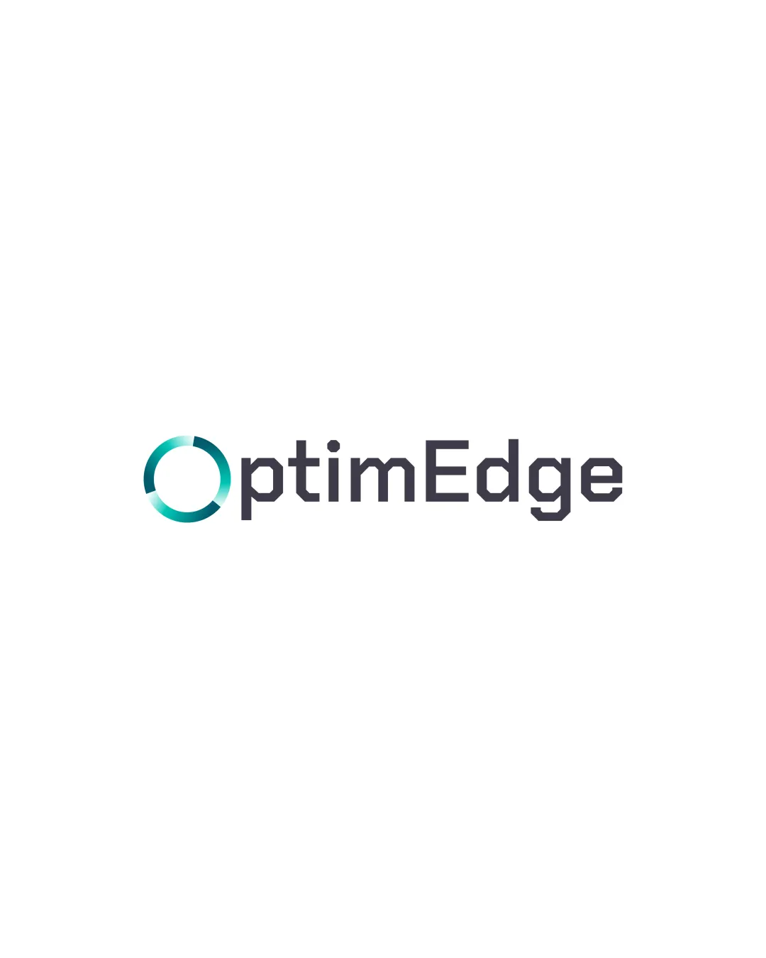
Try it Now!Logo review of OptimEdge
 Logo analysis by AI
Logo type:
Style:
Detected symbol:
Detected text:
Business industry:
Review requested by Balaji5555
**If AI can recognize or misinterpret it, so can people.
Structured logo review
Legibility
![]() Text is clear and easily readable at a glance.
Text is clear and easily readable at a glance.![]() Font selection is solid and suitable for digital and print applications.
Font selection is solid and suitable for digital and print applications.
Scalability versatility
![]() Simple design can scale down reasonably well to small sizes like app icons and stationery.
Simple design can scale down reasonably well to small sizes like app icons and stationery.![]() Thick linework in the symbol ensures it won’t become illegible at small sizes.
Thick linework in the symbol ensures it won’t become illegible at small sizes.
![]() Gradient/color shading in the symbol may lose visual impact or detail when printed in black and white or reduced to a single color.
Gradient/color shading in the symbol may lose visual impact or detail when printed in black and white or reduced to a single color.![]() Might face minor legibility loss at very tiny scales in the ring’s segmented parts.
Might face minor legibility loss at very tiny scales in the ring’s segmented parts.
200x250 px
100×125 px
50×62 px
Balance alignment
![]() Good visual balance between the symbol and the wordmark.
Good visual balance between the symbol and the wordmark.![]() Symbol is well integrated as the letter 'O', creating a strong horizontal alignment.
Symbol is well integrated as the letter 'O', creating a strong horizontal alignment.
![]() The visual weight of the colored 'O' is slightly heavier than the rest of the wordmark, which could create minor imbalance on some applications.
The visual weight of the colored 'O' is slightly heavier than the rest of the wordmark, which could create minor imbalance on some applications.

Originality
![]() Utilizes the first letter as a unique symbol, which is a creative touch.
Utilizes the first letter as a unique symbol, which is a creative touch.
![]() Segmented circular logos are fairly common in tech/consulting industries.
Segmented circular logos are fairly common in tech/consulting industries.![]() The color gradient and segmented circle don’t convey a highly original story, risking a generic look.
The color gradient and segmented circle don’t convey a highly original story, risking a generic look.
Logomark wordmark fit
![]() Excellent stylistic match with the geometric, sans-serif font and the circular, modern symbol.
Excellent stylistic match with the geometric, sans-serif font and the circular, modern symbol.![]() Consistent visual language between logomark and wordmark.
Consistent visual language between logomark and wordmark.
Aesthetic look
![]() Overall clean, modern, and visually appealing.
Overall clean, modern, and visually appealing.![]() Color palette is professional and harmonious.
Color palette is professional and harmonious.
![]() Gradient might feel slightly dated depending on current trends; flats or variable thickness could modernize further.
Gradient might feel slightly dated depending on current trends; flats or variable thickness could modernize further.
Dual meaning and misinterpretations
![]() Circular segment is non-offensive and abstract.
Circular segment is non-offensive and abstract.![]() No inappropriate or confusing visual metaphors.
No inappropriate or confusing visual metaphors.
Color harmony
![]() Teal gradient contrasts well with the dark wordmark.
Teal gradient contrasts well with the dark wordmark.![]() Color choice is minimal and consistent for a tech-forward look.
Color choice is minimal and consistent for a tech-forward look.
Jungle Green
#19B6A6
Ebony
#2E2B38
White
#FFFFFF