Wondering how your logo performs? 🧐
Get professional logo reviews in seconds and catch design issues in time.
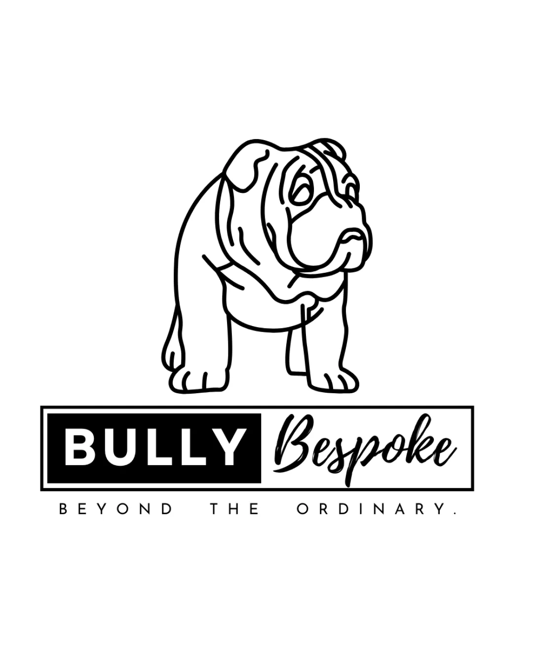
Try it Now!Logo review of BULLY Bespoke BEYOND THE ORDINARY.
 Logo analysis by AI
Logo type:
Style:
Detected symbol:
Detected text:
Business industry:
Review requested by Denarkin
**If AI can recognize or misinterpret it, so can people.
Structured logo review
Legibility
![]() The main text 'BULLY' is bold, uppercase, and highly readable.
The main text 'BULLY' is bold, uppercase, and highly readable.![]() 'Bespoke' is legible with a stylish contrast to the block lettering.
'Bespoke' is legible with a stylish contrast to the block lettering.
![]() Potential minor readability issue for 'Bespoke' in smaller sizes due to script style.
Potential minor readability issue for 'Bespoke' in smaller sizes due to script style.![]() Subtext 'BEYOND THE ORDINARY.' may be too small for smaller applications.
Subtext 'BEYOND THE ORDINARY.' may be too small for smaller applications.
Scalability versatility
![]() Simple color palette ensures good contrast on most backgrounds.
Simple color palette ensures good contrast on most backgrounds.![]() Logo could work well on web banners, packaging, and shop signage.
Logo could work well on web banners, packaging, and shop signage.
![]() Detailed bulldog linework may lose clarity at very small scales or in embroidery.
Detailed bulldog linework may lose clarity at very small scales or in embroidery.![]() Script font for 'Bespoke' and small subtext are susceptible to loss of legibility at reduced sizes (e.g., business cards or favicons).
Script font for 'Bespoke' and small subtext are susceptible to loss of legibility at reduced sizes (e.g., business cards or favicons).
200x250 px
100×125 px
50×62 px
Balance alignment
![]() Central alignment of elements creates a coherent and contained layout.
Central alignment of elements creates a coherent and contained layout.![]() Contrasting font weights offer visual interest and a sense of hierarchy.
Contrasting font weights offer visual interest and a sense of hierarchy.
![]() Upper weight of the outlined bulldog may visually overpower the text below.
Upper weight of the outlined bulldog may visually overpower the text below.![]() 'Bespoke' appears visually lighter than 'BULLY', potentially causing minor imbalance.
'Bespoke' appears visually lighter than 'BULLY', potentially causing minor imbalance.

Originality
![]() The custom bulldog illustration adds unique character and clear relevance to the brand name.
The custom bulldog illustration adds unique character and clear relevance to the brand name.![]() Combination of script and sans-serif fonts provides a distinctive mix.
Combination of script and sans-serif fonts provides a distinctive mix.
![]() Bulldog illustrations are not rare in pet-related branding and do not make the logo exceptionally original.
Bulldog illustrations are not rare in pet-related branding and do not make the logo exceptionally original.
Logomark wordmark fit
![]() The graphic bulldog and the 'BULLY Bespoke' wordmark are related thematically and contextually.
The graphic bulldog and the 'BULLY Bespoke' wordmark are related thematically and contextually.![]() Font choices complement each other and the illustration's style.
Font choices complement each other and the illustration's style.
![]() Bulldog illustration slightly dominates the wordmark, which could affect balance.
Bulldog illustration slightly dominates the wordmark, which could affect balance.
Aesthetic look
![]() Minimalist black-and-white palette is clean and modern.
Minimalist black-and-white palette is clean and modern.![]() Contrast between heavy sans-serif and elegant script is visually appealing.
Contrast between heavy sans-serif and elegant script is visually appealing.
![]() Logo might feel generic to clients seeking a more premium or exclusive feel due to the common bulldog motif.
Logo might feel generic to clients seeking a more premium or exclusive feel due to the common bulldog motif.
Dual meaning and misinterpretations
![]() No inappropriate dual meanings or accidental shape associations detected.
No inappropriate dual meanings or accidental shape associations detected.
Color harmony
![]() Excellent use of monochrome ensures high versatility and clarity.
Excellent use of monochrome ensures high versatility and clarity.![]() No clashing or excessive colors.
No clashing or excessive colors.
Black
#000000
White
#FFFFFF