Wondering how your logo performs? 🧐
Get professional logo reviews in seconds and catch design issues in time.
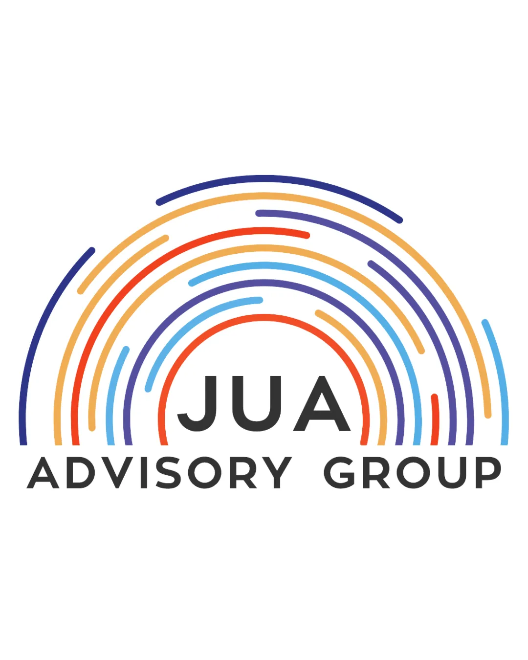
Try it Now!Logo review of JUA ADVISORY GROUP
 Logo analysis by AI
Logo type:
Style:
Detected symbol:
Detected text:
Business industry:
Review requested by Denarkin
**If AI can recognize or misinterpret it, so can people.
Structured logo review
Legibility
![]() Text is highly readable due to strong, clear sans-serif font.
Text is highly readable due to strong, clear sans-serif font.![]() Good use of size hierarchy between 'JUA' and 'ADVISORY GROUP.'
Good use of size hierarchy between 'JUA' and 'ADVISORY GROUP.'
Scalability versatility
![]() Logo is clean and avoids excessive detail.
Logo is clean and avoids excessive detail.![]() Would remain recognizable and clear on most print and digital formats such as business cards, letterheads, and websites.
Would remain recognizable and clear on most print and digital formats such as business cards, letterheads, and websites.
![]() Multiple thin colored rays may lose clarity at smaller sizes (e.g., favicon, embroidery, or small merchandise).
Multiple thin colored rays may lose clarity at smaller sizes (e.g., favicon, embroidery, or small merchandise).![]() Color variety may not translate well to monochrome applications.
Color variety may not translate well to monochrome applications.
200x250 px
100×125 px
50×62 px
Balance alignment
![]() Symbol is centered clearly above the wordmark, providing a stable, symmetrical composition.
Symbol is centered clearly above the wordmark, providing a stable, symmetrical composition.![]() Well-defined hierarchy between logomark and wordmark.
Well-defined hierarchy between logomark and wordmark.
![]() Ray lengths are inconsistent, causing slight visual imbalance toward the left.
Ray lengths are inconsistent, causing slight visual imbalance toward the left.![]() Weight of the colorful symbol may slightly overpower the wordmark at large scale.
Weight of the colorful symbol may slightly overpower the wordmark at large scale.

Originality
![]() Semicircular rainbow motif is visually attractive and abstract.
Semicircular rainbow motif is visually attractive and abstract.![]() Choice of multicolored, segmented rays is somewhat distinctive.
Choice of multicolored, segmented rays is somewhat distinctive.
![]() Rainbow/radiating arc motifs are fairly common in consulting, wellness, and nonprofit spaces.
Rainbow/radiating arc motifs are fairly common in consulting, wellness, and nonprofit spaces.![]() Abstract rays do not strongly tie to a unique brand concept.
Abstract rays do not strongly tie to a unique brand concept.
Logomark wordmark fit
![]() Style and proportions of symbol and typography complement each other.
Style and proportions of symbol and typography complement each other.![]() Colorful, energetic logomark pairs well with simple, grounded wordmark.
Colorful, energetic logomark pairs well with simple, grounded wordmark.
Aesthetic look
![]() Modern, vibrant, and professional appearance.
Modern, vibrant, and professional appearance.![]() Composition feels dynamic, attracting attention while remaining clean.
Composition feels dynamic, attracting attention while remaining clean.
![]() Visual busyness in the multicolored arcs may compete with simpler branding approaches.
Visual busyness in the multicolored arcs may compete with simpler branding approaches.![]() Could feel generic due to overuse of rainbow/arc symbolism in certain industries.
Could feel generic due to overuse of rainbow/arc symbolism in certain industries.
Dual meaning and misinterpretations
![]() No inappropriate or ambiguous connotations detected.
No inappropriate or ambiguous connotations detected.![]() Overall abstraction avoids unintended meanings.
Overall abstraction avoids unintended meanings.
Color harmony
![]() Palette is vivid yet not overly saturated.
Palette is vivid yet not overly saturated.![]() Colors are spaced evenly and used consistently.
Colors are spaced evenly and used consistently.
![]() Four dominant colors plus black risk feeling slightly overwhelming.
Four dominant colors plus black risk feeling slightly overwhelming.![]() Logo may lose impact if reproduced in monochrome or grayscale.
Logo may lose impact if reproduced in monochrome or grayscale.
Violet Blue
#263082
Red Orange
#EA4335
Pastel Orange
#FFB74D
Sky Blue
#42A5F5
Charcoal
#212121