Wondering how your logo performs? 🧐
Get professional logo reviews in seconds and catch design issues in time.
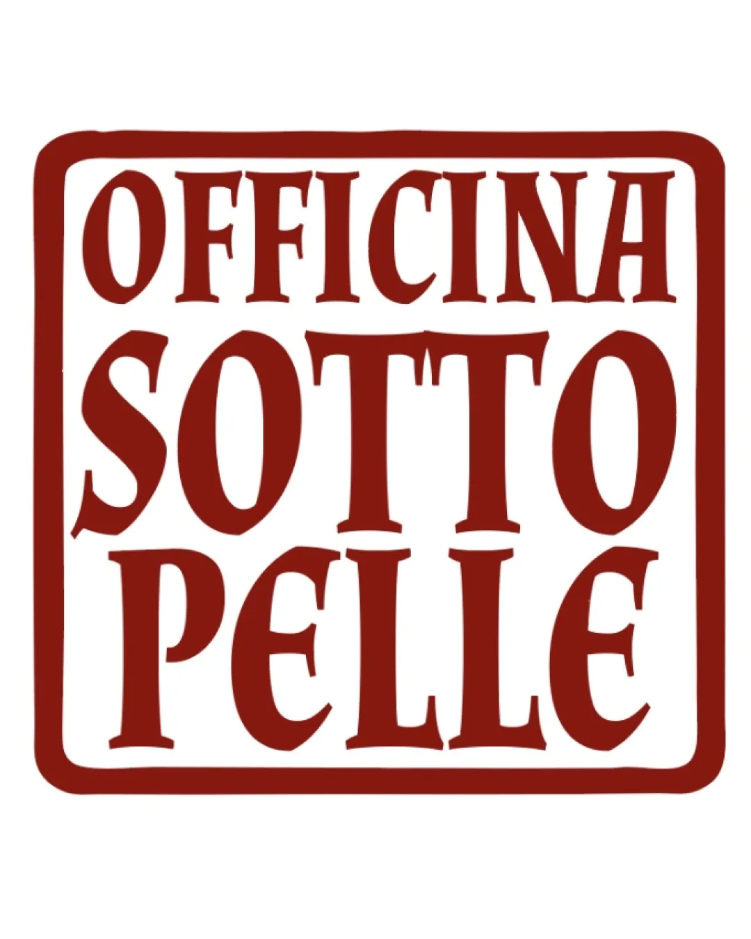
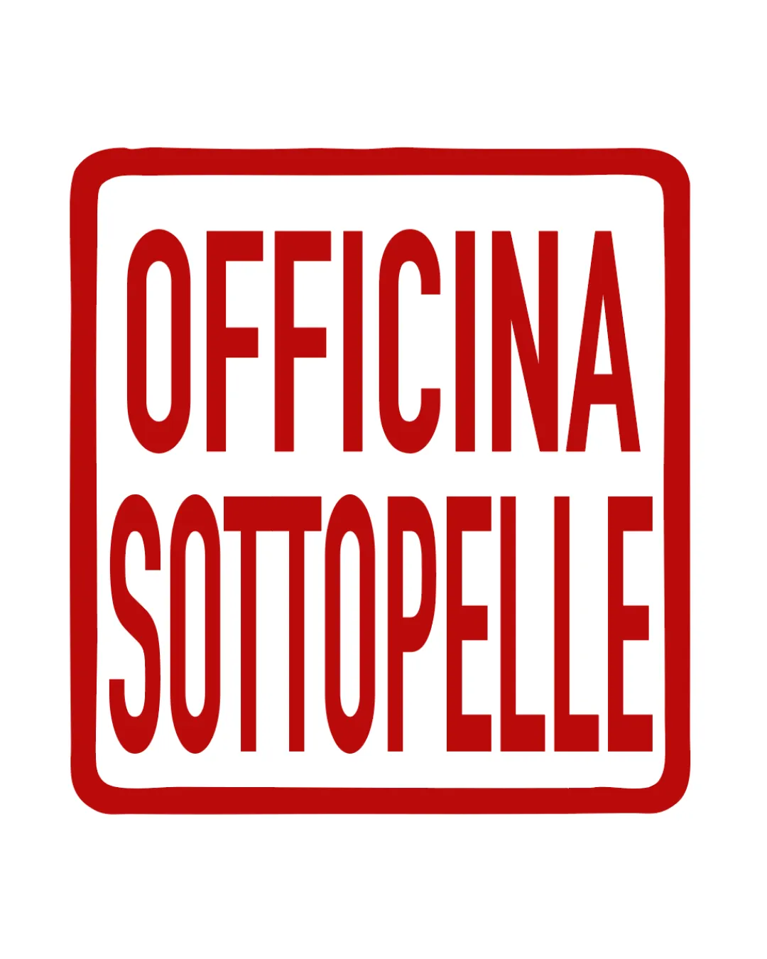
Try it Now!Logo review of OFFICINA SOTTOPELLE
 Logo analysis by AI
Logo type:
Style:
Detected symbol:
Detected text:
Business industry:
Review requested by Onyxnocturna
**If AI can recognize or misinterpret it, so can people.
Structured logo review
Legibility
![]() Text is highly legible with strong contrast against the white background
Text is highly legible with strong contrast against the white background![]() Tall, geometric sans-serif font aids readability
Tall, geometric sans-serif font aids readability
![]() Tall, condensed letters may reduce readability at very small sizes
Tall, condensed letters may reduce readability at very small sizes![]() Stacked format could make quick reading less smooth, especially for long names
Stacked format could make quick reading less smooth, especially for long names
Scalability versatility
![]() Simple design ensures decent translation to different formats
Simple design ensures decent translation to different formats![]() Minimal color palette helps with black-and-white or single-color adaptations
Minimal color palette helps with black-and-white or single-color adaptations
![]() Tall, condensed typography may lose clarity at favicon or embroidery scale
Tall, condensed typography may lose clarity at favicon or embroidery scale![]() Large rectangular format might not adapt well to circular or square mockups (e.g., mobile app icons, social media avatars)
Large rectangular format might not adapt well to circular or square mockups (e.g., mobile app icons, social media avatars)
200x250 px
100×125 px
50×62 px
Balance alignment
![]() Text is well-aligned centrally within the border
Text is well-aligned centrally within the border![]() Consistent spacing between letters and lines
Consistent spacing between letters and lines
![]() Slight unevenness in the spacing between the two text lines due to typography choice
Slight unevenness in the spacing between the two text lines due to typography choice

Originality
![]() Bold presentation and color command attention
Bold presentation and color command attention
![]() Almost entirely generic wordmark—no unique typographic features or clever design elements
Almost entirely generic wordmark—no unique typographic features or clever design elements![]() Red border is a basic frame, not original as a graphic mark
Red border is a basic frame, not original as a graphic mark
Aesthetic look
![]() Minimalist aesthetic and strong visual hierarchy improve clarity
Minimalist aesthetic and strong visual hierarchy improve clarity
![]() Overall look is a bit plain, bordering on uninspired
Overall look is a bit plain, bordering on uninspired![]() Rectangular framing feels dated and adds little to visual interest
Rectangular framing feels dated and adds little to visual interest
Dual meaning and misinterpretations
![]() No inappropriate or misleading imagery detected
No inappropriate or misleading imagery detected
Color harmony
![]() Strong two-color scheme maintains focus and clarity
Strong two-color scheme maintains focus and clarity![]() High contrast between background and text
High contrast between background and text
Red
#C80815
White
#FFFFFF