Wondering how your logo performs? 🧐
Get professional logo reviews in seconds and catch design issues in time.
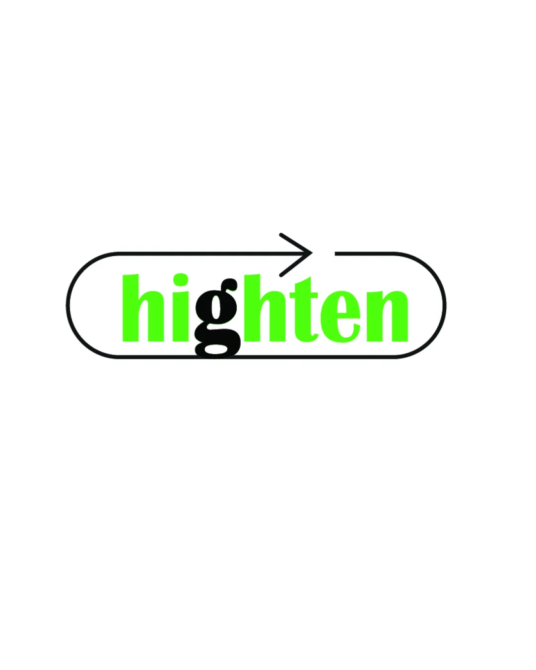
Try it Now!Logo review of highten
 Logo analysis by AI
Logo type:
Style:
Detected symbol:
Detected text:
Business industry:
Review requested by Zahrah_maniar
**If AI can recognize or misinterpret it, so can people.
Structured logo review
Legibility
![]() Most of the wordmark is bold and easy to read due to high color contrast.
Most of the wordmark is bold and easy to read due to high color contrast.![]() Font choice for 'highten' is clean and modern.
Font choice for 'highten' is clean and modern.
![]() The black 'g' overlaps with green letters, causing visual clutter and making the word harder to read at a glance.
The black 'g' overlaps with green letters, causing visual clutter and making the word harder to read at a glance.![]() Contrast between black and green makes the 'g' feel out of place and interrupts word flow.
Contrast between black and green makes the 'g' feel out of place and interrupts word flow.
Scalability versatility
![]() Simple shape and strong colors will generally scale well for digital and print formats.
Simple shape and strong colors will generally scale well for digital and print formats.![]() Minimalist style likely to hold up on business cards or web icons.
Minimalist style likely to hold up on business cards or web icons.
![]() Thin lines in the arrow and enclosure may get lost or appear weak at very small sizes.
Thin lines in the arrow and enclosure may get lost or appear weak at very small sizes.![]() Color overlap may cause legibility issues in small applications like app favicons or embroidery.
Color overlap may cause legibility issues in small applications like app favicons or embroidery.
200x250 px
100×125 px
50×62 px
Balance alignment
![]() Centered text inside the enclosure offers some structural balance.
Centered text inside the enclosure offers some structural balance.
![]() The black 'g' is visually heavier than other letters, creating imbalance in the middle of the wordmark.
The black 'g' is visually heavier than other letters, creating imbalance in the middle of the wordmark.![]() Arrow and enclosure alignment feels slightly disconnected from the word, with the arrow breaking the border in a way that disrupts flow.
Arrow and enclosure alignment feels slightly disconnected from the word, with the arrow breaking the border in a way that disrupts flow.

Originality
![]() Incorporation of an enclosure and arrow adds forward movement and thematic relevance.
Incorporation of an enclosure and arrow adds forward movement and thematic relevance.![]() Split coloring on the 'g' is a novel touch.
Split coloring on the 'g' is a novel touch.
![]() Wordmark plus enclosure, especially with a generic arrow, is not strongly distinctive within the tech space.
Wordmark plus enclosure, especially with a generic arrow, is not strongly distinctive within the tech space.![]() No use of negative space to communicate a hidden concept or secondary idea.
No use of negative space to communicate a hidden concept or secondary idea.
Aesthetic look
![]() Bright green with black and white creates a visually striking palette.
Bright green with black and white creates a visually striking palette.![]() Minimalism gives it a contemporary attitude.
Minimalism gives it a contemporary attitude.
![]() Contrast between the solid black 'g' and the rest of the text harms cohesive aesthetics.
Contrast between the solid black 'g' and the rest of the text harms cohesive aesthetics.![]() Arrow is a common graphic that offers little unique visual appeal.
Arrow is a common graphic that offers little unique visual appeal.
Dual meaning and misinterpretations
![]() Composition is generally straightforward and free from inappropriate forms.
Composition is generally straightforward and free from inappropriate forms.
![]() Black 'g' overlapping green letters could confuse some viewers on first glance.
Black 'g' overlapping green letters could confuse some viewers on first glance.
Color harmony
![]() Limited palette (green, black, white) provides good coherence.
Limited palette (green, black, white) provides good coherence.![]() Bright color offers energy and modernity.
Bright color offers energy and modernity.
![]() Green and black overlap is visually jarring and may not translate well in grayscale or on colored backgrounds.
Green and black overlap is visually jarring and may not translate well in grayscale or on colored backgrounds.
Bright Lime
#1eff00
Black
#000000
White
#ffffff